
You know the drill. You get a fantastic five-star review, a real gem that perfectly captures your product's value. You spend 20 minutes in a design tool, picking a template, dropping in the text, and exporting. The result? A perfectly nice, perfectly generic quote box that looks just like every other testimonial on the feed. It gets a few polite likes and then vanishes.
Your best social proof deserves better. The problem isn't the review; it's the presentation. Pasting text on a colored background doesn't tell a story. To make people stop scrolling, you need to turn the feeling behind the review into a compelling visual. Instead of just showing the words, you show what the words mean. This workflow does exactly that, automatically.
Workflow code: #myup-k4td-9k6z
Minimalist Poster
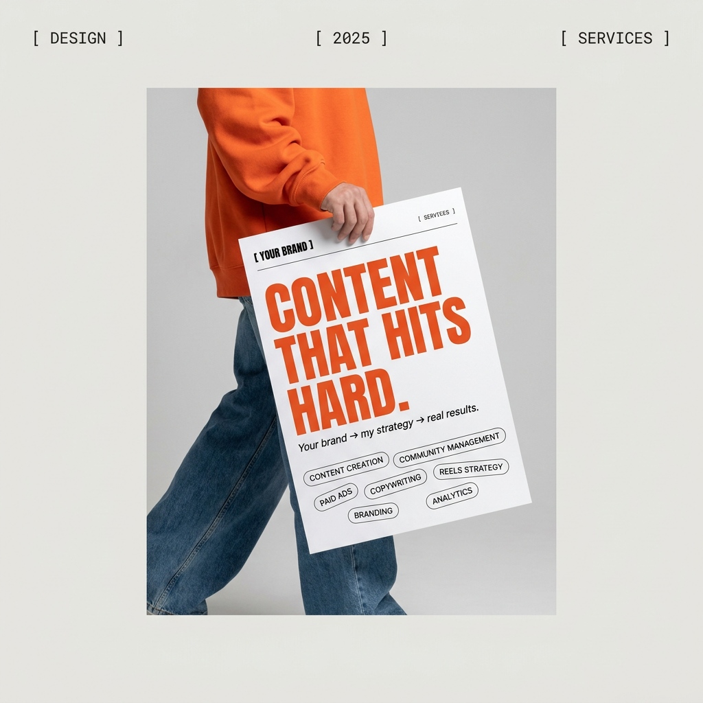
Give your social feed a clean, gallery-like aesthetic. This layout frames your images with structured mono typography and soft, neutral backgrounds for a high-end editorial look. It's perfect for minimal product launches or brand announcements.
Regenerate using your own assets.
Why most testimonial graphics get ignored
The reason those standard quote cards fail is simple: banner blindness. Our brains are trained to filter out anything that looks like a low-effort ad or a generic template. When a user sees a familiar format—big quotation marks, centered text, a name at the bottom—they subconsciously classify it as 'seen it before' and keep scrolling. It doesn't matter how powerful the words are if the visual container is invisible.
A truly effective testimonial graphic doesn't just display the quote; it illustrates the outcome. It provides a visual anchor for the customer's success story. It moves beyond being a formatted text block and becomes a piece of micro-storytelling. This is the difference between social proof that gets acknowledged and social proof that actually persuades.
The 4-step workflow to turn reviews into visual stories
This process shifts your role from manual production to creative direction. You provide the strategic input—the story—and the AI handles the repetitive design and branding work. Here’s how it breaks down.
Step 1: Find the story inside the review
Before you touch any tool, read the customer review and identify the core benefit or emotion. Don't just grab the whole paragraph. Look for the 'after' state. What problem was solved? What feeling was achieved? This is the human validation step that makes the entire workflow effective.
Let’s take a real review for a project management tool:
"This app has been a lifesaver. Our team communication is finally streamlined, and I'm not spending my Mondays chasing down status updates. It feels like we got 10 hours back every week."
The generic approach would be to pull out "This app has been a lifesaver." The story-driven approach is to focus on the outcome: 'clarity, calm, and recovered time.' That's the concept you'll give the AI.
Step 2: Prompt a background that tells that story
Now, translate that core concept into a prompt for an AI image generator. Your goal is to create a background that evokes the feeling from Step 1. You’re not trying to create a literal depiction; you’re creating a mood.
For our example concept of 'clarity, calm, and recovered time,' a good prompt might be:
"A bright, airy, and minimalist office workspace in the morning sun, a single cup of coffee on a clean wooden desk. A sense of calm and productivity. Soft focus, photographic style."
This prompt generates a visual that makes the viewer feel what the customer in the review is feeling. It’s the difference between saying your app saves time and showing what saved time looks like.
Step 3: Combine and brand the final post
This is where the automation pays off. A workflow in MyUP takes the generated visual from Step 2 and combines it with the text of your review. But most importantly, it pulls from your saved Brandkit to ensure complete consistency.
MyUP automatically:
- Applies your primary brand font to the testimonial text.
- Uses your secondary font for the customer's name and title.
- Overlays your logo in a pre-defined position.
- Uses your brand colors for any text or graphic overlays.
The result is a finished, high-quality social media post that is visually unique but instantly recognizable as yours. There’s no manual tweaking of fonts, no hunting for hex codes, and no misplacing the logo. The system executes, you approve.
Step 4: Scale one review into a full campaign
A single great review is not a single asset; it's the source material for a multi-post campaign. Using the same core review and prompt concept, you can instantly generate variations.
- Test different visual styles: Rerun the workflow with a different layout, like the Bold Editorial Grid Poster, to see what resonates most with your audience. Workflow code: #myup-n0bi-2wzk
- Adapt for different platforms: Tweak the prompt and aspect ratio to create a vertical version for Instagram Stories and a wide version for X or LinkedIn.
- Create a series: Turn three different customer reviews into a visually cohesive series that tells a larger story about your brand's impact.
This approach turns content creation from a one-off task into a scalable system. It's a core principle of content atomization: extracting maximum value from your best-performing assets.
The result: Social proof that actually proves something
By moving beyond generic templates, you create social proof that does more than just occupy space in the feed. You create small, compelling visual stories that build trust, communicate value, and reinforce your brand identity with every post. This workflow frees you from the creative bottleneck of manual design and lets you focus on the strategy behind the story.
The final output is not just a pretty image with text on it. It’s a consistently branded, strategically sound asset that works harder for your brand. And because the production is automated, you can produce more of it, faster, ensuring every element down to the on-brand typography is perfect every time.
