
As of today, July 21, 2026, Google Slides has a new AI-powered 'Theme Generation' feature. You type in a prompt, and it produces a basic theme with a color palette and font pairing. It’s a convenient feature for a quick, internal deck. But for any presentation that represents your brand, a theme isn't enough. A theme is a container; your brand needs a system.
A professional presentation requires a cohesive visual language across every element: not just the master slide, but the backgrounds for different sections, the icons used to illustrate points, the spot illustrations for key concepts, and the data visualization styles. These are the assets that generic AI theme generators can't create. This is the workflow for building that complete system.
Step 1: Define your visual truth with a Brandkit
Every great design system starts with a single source of truth. In MyUP.ai, this is your Brandkit. Before you generate a single asset, you establish your brand's core identity. You don't do this by manually inputting hex codes or uploading font files; you just give MyUP your website URL.
MyUP scans your site and automatically extracts your color palette, fonts, logo, and even infers your overall visual style. This Brandkit becomes the engine for every workflow that follows. It ensures that every background, icon, and illustration you generate is automatically constrained by your brand's rules. This isn't about getting 'close enough'—it's about locking in your brand identity from the very beginning so that consistency is the default, not an afterthought.
Step 2: Generate a library of on-brand slide backgrounds
A single, repeating background is the hallmark of a basic template. A professional deck uses a family of related backgrounds to create visual interest and delineate sections without breaking brand cohesion. You might need a high-impact background for the title, a subtle variant for content-heavy slides, and a darker version for transition slides.
Instead of just one static image, the goal is to generate a set of 5-10 complementary visuals. In MyUP, you can run a workflow that uses your Brandkit to produce a series of abstract gradients, subtle textures, or geometric patterns that all feel like they belong together. The AI handles the production; you simply validate the options that work best for your narrative flow. For a deeper dive on this specific task, see our guide to generating infinite on-brand abstract backgrounds.
This workflow for a bold poster is an excellent starting point. Simply adapt the prompt to describe the abstract style you need, and your Brandkit will ensure the colors and mood are perfect.
Workflow code: #myup-n0bi-2wzk
Bold Editorial Grid Poster
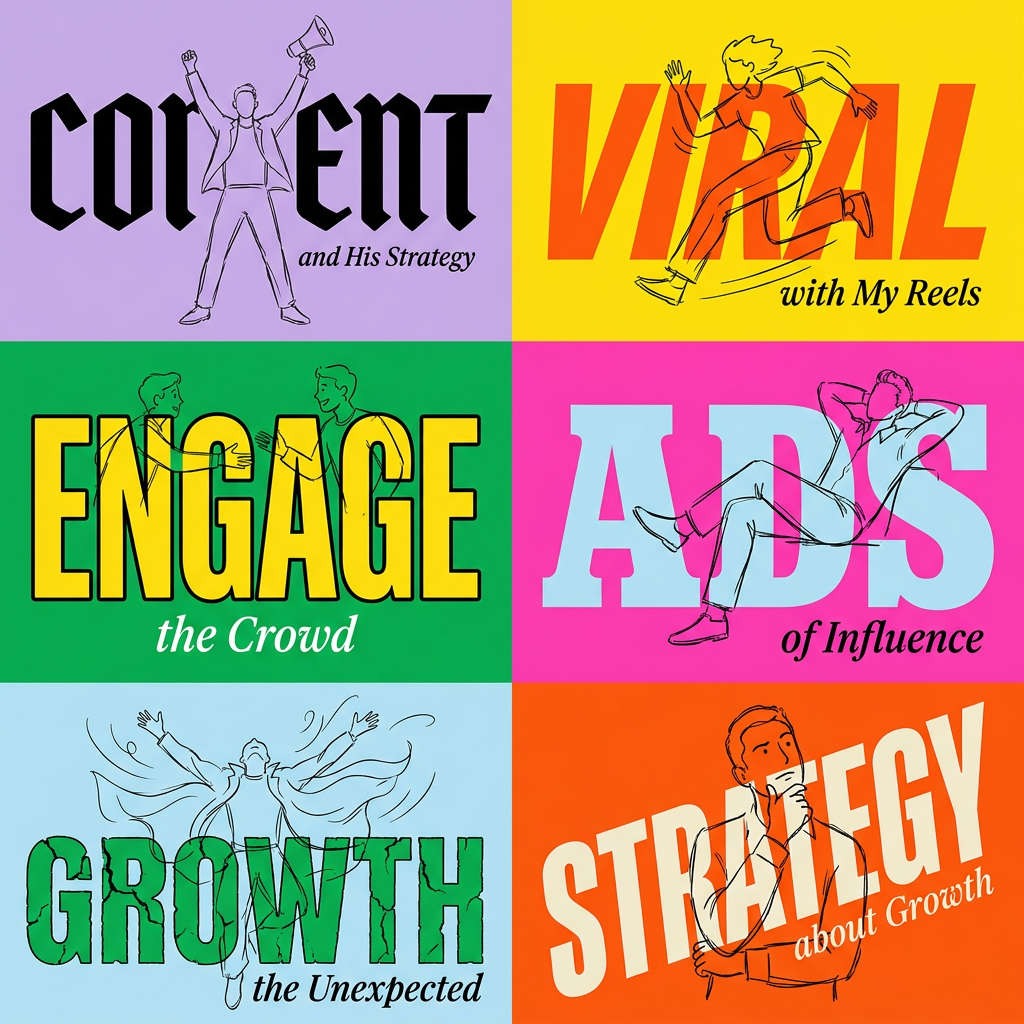
Create striking 2x3 editorial posters with six seamless, flat-color square cards in a perfect 4:5 grid. There are absolutely no gaps between the blocks, giving your content a bold, high-contrast magazine layout. It looks incredibly clean on any social feed.
Regenerate using your own assets.
Step 3: Create a complete, consistent icon set for your key points
Finding a full set of matching icons is one of the most tedious parts of presentation design. You find five icons in the right style, but the sixth one you need doesn't exist. You end up with a mismatched collection that makes the entire presentation feel unprofessional. AI can solve this instantly, but only if it's guided by your design system.
Using a MyUP workflow, you can generate an entire library of icons for your specific needs, all in the same visual style. Whether you need '3D clay-style icons in brand colors' or 'minimalist line-art icons with a single accent color,' the workflow can produce them in batches. Because it's all powered by your Brandkit, the style and color palette are non-negotiable. You get a complete, bespoke icon set that looks like it was created by a single designer specifically for your presentation.
You can adapt a simple product poster workflow for this. Describe the icon you want (e.g., 'a minimalist line icon of a gear') and specify a plain background. Run it for every icon you need.
Workflow code: #myup-sygb-rhnt
Minimalist Vertical Product Advertising Poster
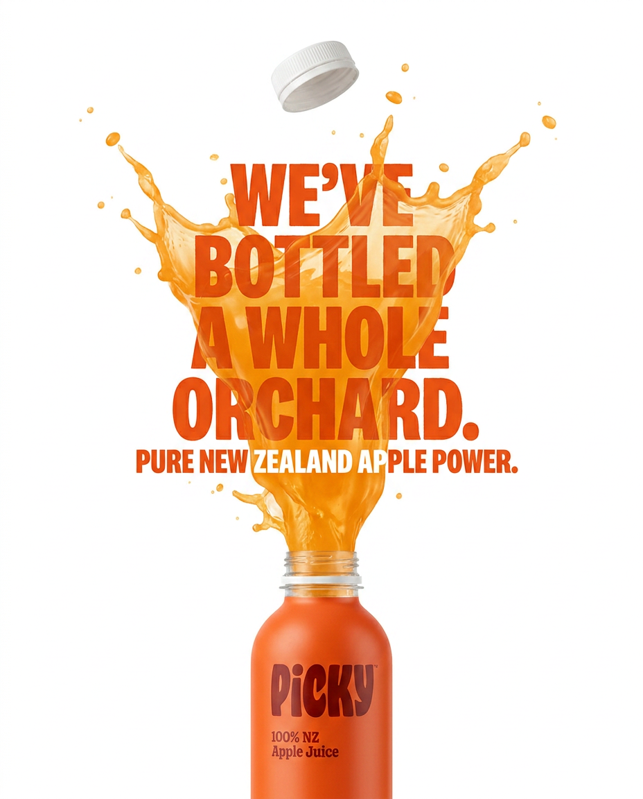
Drop the clutter and put your product in the spotlight. This setup places your item against a pure, seamless white background with a striking vertical flow that draws the eye straight up. It's perfect for creating clean, high-end studio posters.
Regenerate using your own assets.
Step 4: Produce custom spot illustrations and title slide visuals
This is where a design system truly separates a professional presentation from an amateur one. Instead of using generic stock photos, you can generate custom illustrations that visually explain your core concepts. Need a visual metaphor for 'growth,' 'security,' or 'collaboration'? A workflow can generate several options for you to choose from.
The same process applies to your most important slide: the title slide. This needs to be a high-impact visual that sets the tone for the entire presentation. A simple theme generator will give you a title and a subtitle box. A design system workflow allows you to create a unique piece of art for that slide that perfectly captures your topic and brand.
The workflow below is designed for a bold event poster, making it a perfect foundation for a powerful title slide. Let the AI generate the core visual, then add your text in your presentation software.
Workflow code: #myup-xbur-hzoi
Bold Retro Yellow Event Poster
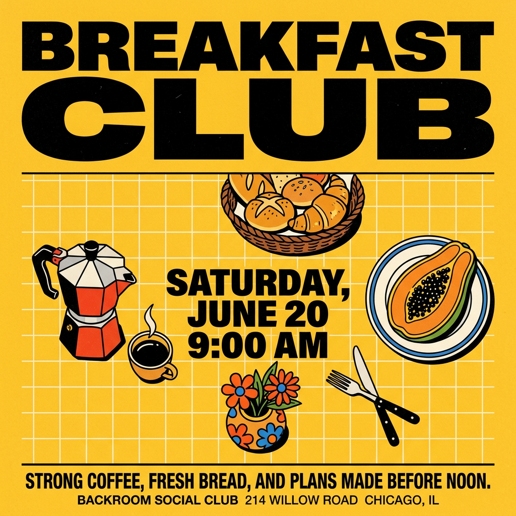
Turn your branding or event details into bold, nostalgic posters. It blends vibrant warm backdrops with a clean, retro square grid pattern to make any announcement look like a classic piece of mid-century graphic design.
Regenerate using your own assets.
From theme to system: The difference is control
Google's AI theme generator is a step in the right direction. It automates the basic container. But it makes the decisions for you. The professional workflow is about flipping that dynamic: you make the strategic decisions, and the AI handles the production.
A theme gives you a template to fill. A design system gives you a library of on-brand assets to build with. This approach gives you full creative control while eliminating the manual labor of creating each element from scratch. You're not just populating slides; you're directing an AI to build a unique and cohesive visual world for your brand. This same system-based thinking can be applied to create a consistent AestheticKit for all your brand visuals, not just presentations. By using MyUP.ai, you move beyond the limits of templates and build a repeatable, scalable system for creating truly on-brand content.
