
YouTube's native A/B testing feature, now widely available in mid-2026, has created a painful new job for every serious creator: the thumbnail variation grinder. It's a powerful way to increase your click-through rate (CTR), but only if you can feed it a steady diet of high-quality, distinct options for every single video. Making them manually is a time sink. Using generic AI generators gives you random, off-brand visuals that erode your channel's identity.
This production bottleneck is where most creators get stuck. But a new generation of specialized AI tools, like Thumbmagic, are proving that high-performing thumbnails aren't random art—they follow a formula. They have identifiable patterns in color, composition, and text. The problem isn't knowing the formula; it's executing it consistently at scale within your brand. This workflow does exactly that.
Workflow code: #myup-xbur-hzoi
Bold Retro Yellow Event Poster
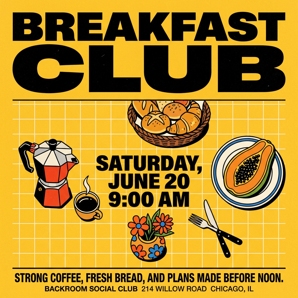
Turn your branding or event details into bold, nostalgic posters. It blends vibrant warm backdrops with a clean, retro square grid pattern to make any announcement look like a classic piece of mid-century graphic design.
Regenerate using your own assets.
The anatomy of a thumbnail that gets clicked
AI tools are getting good at replicating success because they can analyze millions of data points to see what viewers actually click on. The patterns are surprisingly consistent. A high-CTR thumbnail isn't just a pretty picture; it's a piece of strategic communication designed to do one job in under a second. Here are the core components of the formula.
1. High-contrast color and a clear focal point
On a crowded homepage, your thumbnail is competing with a dozen others. The ones that win use bold, often complementary colors to create visual tension that draws the eye. Think bright yellow against deep black, or electric blue against vibrant orange. The goal is to pop, not to blend in. The composition should guide the viewer's eye to a single, obvious focal point—a face, a product, or a key phrase.
2. An expressive human face
Viewers connect with people. Thumbnails featuring a clear, close-up shot of a human face showing a strong, readable emotion (surprise, curiosity, excitement, concern) consistently outperform those without. The emotion creates an instant story and makes the viewer wonder about the context. It’s a shortcut to building curiosity.
3. Oversized, brutally simple text
Thumbnail text has one rule: be readable on a tiny phone screen at a glance. This means using a maximum of 3-4 impactful words in a huge, bold, clean font. The text shouldn't repeat the video title; it should add emotion or context that the title can't. Think of it as a headline for the image, not the video. Getting this right manually is hard, and most AI struggles with text unless it's part of a structured workflow.
Why most AI generators fail the brand consistency test
Knowing the formula is one thing. The execution gap is where generic AI tools fall apart for serious creators. You can prompt Midjourney or DALL-E for a 'surprised man with bold yellow text' and get a technically good image. But it won't be *your* brand.
The colors won't match your channel's palette. The font will be random, not the one your audience recognizes. The overall aesthetic will be disconnected from your last video. This inconsistency kills brand recognition. A viewer should be able to identify your video on their homepage before they even read the title. Generic AI, by its nature, produces one-off results that make building a recognizable visual identity impossible.
This is the difference between a tool and a system. A tool gives you a single output. A system, built around a Brandkit, applies the high-CTR formula using your specific visual identity—your colors, your fonts, your logo. You get the benefit of the proven tactics without sacrificing the brand you've worked hard to build.
Workflow: generate 3 on-brand thumbnail variations in 2 minutes
Here is how you move from theory to production. We’ll use a high-impact poster workflow and adapt it for thumbnail A/B testing. It's designed for bold text and strong visuals, making it a perfect starting point.
Step 1: Set up your Brandkit. Before you start, make sure your MyUP Brandkit is loaded with your brand's primary and secondary colors, your specific headline fonts, and your logo. This is a one-time setup that makes every future creation on-brand automatically.
Step 2: Launch the workflow. Start a new creation in MyUP and use the Bold Retro Yellow Event Poster workflow. You can load it instantly with this code: #myup-xbur-hzoi
Step 3: Provide your core concept. The workflow will ask for the topic. Input your video title or a short, punchy concept. For example, 'My new camera setup for 2026'. The AI will generate the first thumbnail concept, applying the high-contrast formula using your Brandkit assets.
Step 4: Generate variations for your A/B test. This is where the system shines. Now, instruct the AI to create testable alternatives. The user validates; MyUP executes.
- Variation A (Control): The first result is your baseline.
- Variation B (Color Test): Tell the AI, 'Generate another version using my secondary brand color for the background.'
- Variation C (Focus Test): Say, 'Create a third option, but make it an extreme close-up on the person's face expressing surprise.'
In about two minutes, you have three distinct, on-brand thumbnail concepts ready to upload directly into YouTube’s A/B testing tool. You didn't have to open a design tool or fight with an AI to remember your font.
From a single thumbnail to a growth system
The goal isn't just to make one better thumbnail. The goal is to build a repeatable process that increases your CTR over time. Once you run this workflow, you can save it as a custom template for your channel.
For every new video, you simply run your saved 'Thumbnail A/B Test' workflow. The production process becomes a predictable, two-minute task instead of an hour of creative guesswork. You're no longer just creating content; you're building a growth engine for your channel, fueled by data on what your audience actually clicks.
This is how you stop making thumbnails one-by-one and start building a system. You blend the data-driven science of what works with the unique identity of your brand, turning a creative chore into your most powerful lever for audience growth.
