The era of generic AI motion is over
The world of AI animation split into a 'before' and 'after' this week. On June 24, 2026, Runway released Gen-3 with granular Motion Control. A day later, Adobe unveiled its Motion Brush for Firefly. The message is clear: the era of the cheap, wobbly, one-size-fits-all AI zoom is officially over. We finally have control.
But control alone doesn't guarantee a good result. It just gives you more ways to create bad design faster. The real challenge isn't finding a tool that can make an image move; it's implementing a workflow that produces a finished, on-brand asset that actually works. Most 'AI animated poster generators' are just glorified template libraries that ignore your brand's typography, color palette, and visual hierarchy. They give you motion, but they strip away identity.
A professional result requires a different approach: one that layers subtle, controlled motion onto a strong static image, then applies your brand's unique visual system. This is the only way to create something that feels custom, not generic. You can run this exact workflow below.
Workflow code: #myup-msop-hlxf
Retro Zine Style Event Poster
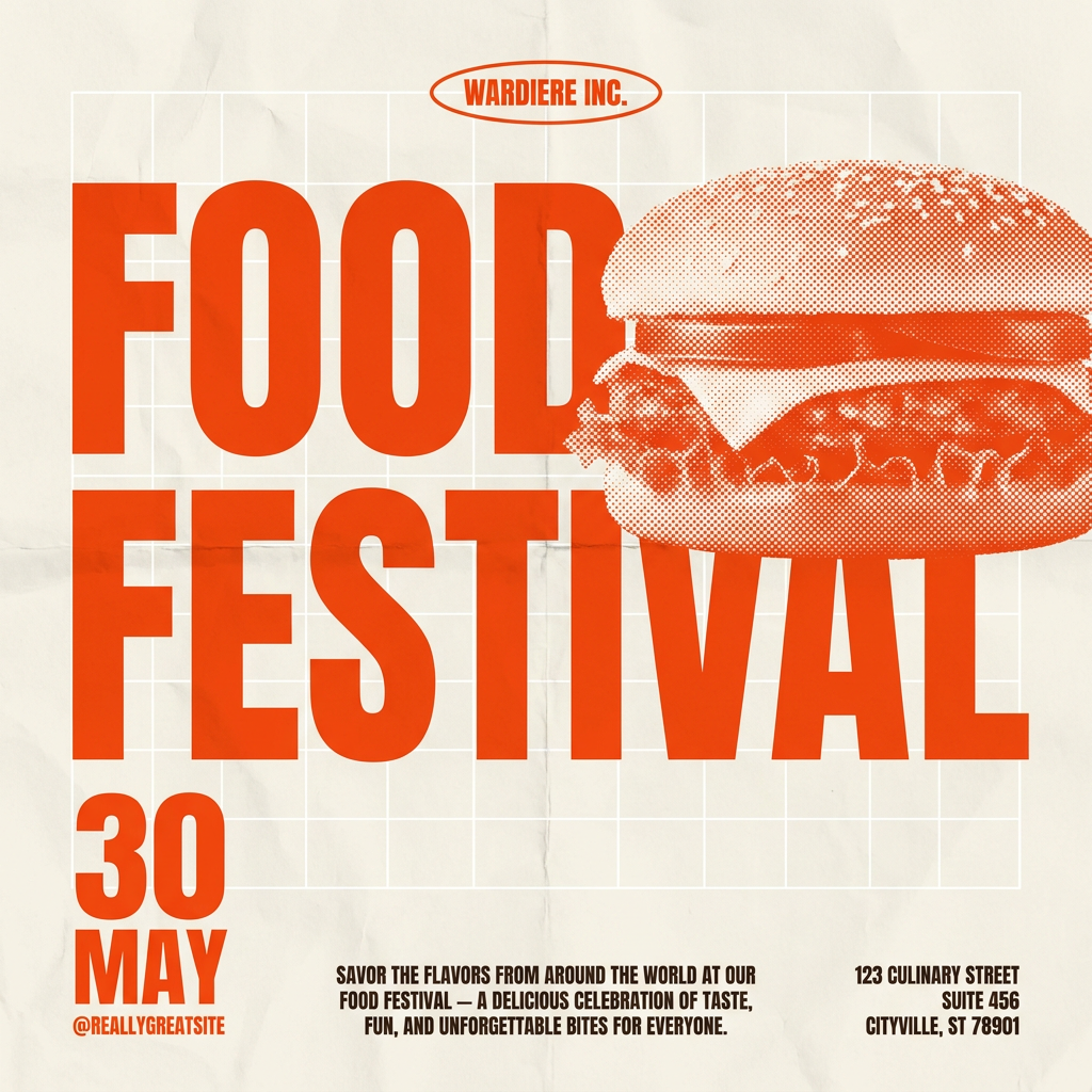
Give your social posts a gritty, analog zine aesthetic. It layers a crumpled paper texture and a subtle grid over a warm cream background to make any event graphic look like a tactile, photocopied flyer. Perfect for DIY gigs and bold promos.
Regenerate using your own assets.
The 3-step workflow for professional animated posters
Creating a high-quality animated poster isn't about one magic button. It's a sequence of three distinct stages, each building on the last. Skipping a step or doing them out of order is why most AI-generated motion graphics look cheap.
Step 1: Generate a strong static base image
Your animation is only as good as the foundation it's built on. Before you even think about motion, you need a visually compelling static poster. This means solid composition, clear visual hierarchy, and—critically—coherent typography. Until recently, getting clean text from AI image models was impossible, requiring a clumsy trip to a design tool. Models like FLUX.1 Pro are changing that, but the principle remains: the static design must work perfectly before it moves.
Step 2: Add subtle, controlled motion
This is where the new tools come in, but subtlety is key. The goal is a 'living photo' effect, not a chaotic morphing animation. Instead of animating the entire image, identify one or two elements that would benefit from gentle movement. Think of a slow camera push, light shimmering across a texture, or a single typographic element subtly fading in. This is about adding intrigue, not distraction. MyUP's workflows are built around this principle, allowing you to select a motion style and have the AI execute it while you validate the result. It's a far more directed process than the unpredictable output of many image-to-video tools. For a deeper dive on this, see how to turn a static product photo into an animated Story.
Step 3: Apply on-brand typography and logos with a Brandkit
This is the step that 99% of AI tools miss, and it's the most important for brand integrity. After the motion is applied, the final layer of text, logos, and call-to-actions must be perfect. A MyUP workflow solves this automatically. Because it's connected to your Brandkit—your saved library of fonts, colors, and logos—it applies these assets in the correct way every time. There's no manual work, no eyeballing the brand guidelines PDF. The AI handles the production of adding the text and logo to the animated base, and you simply approve the final, perfectly on-brand result.
What 'good' motion design actually looks like
To understand the target aesthetic, go to Behance and search for 'Kinetic Posters'. You'll see work from top design studios that feels alive but controlled. The motion isn't the main event; it's a supporting actor that enhances the core message. It directs the eye, adds a premium feel, and respects the typographic grid.
These high-end examples share a few principles:
- Subtlety: The best motion is often barely noticeable at first glance. It's a shimmer, a slow drift, or a gentle pulse that makes the design feel dynamic without screaming for attention.
- Hierarchy: Motion should reinforce the existing visual hierarchy, not fight it. If the headline is the most important element, its animation should draw the eye there first.
- Brand Integrity: The movement feels like a natural extension of the brand's personality—be it elegant and smooth or energetic and sharp. It never feels like a generic effect applied as an afterthought.
Achieving this level of quality isn't about having the most powerful AI model. It's about having a workflow that enforces design principles. You can get started with a design that already has this aesthetic built-in.
Workflow code: #myup-3xus-3l9x
Vintage Risograph Event Poster
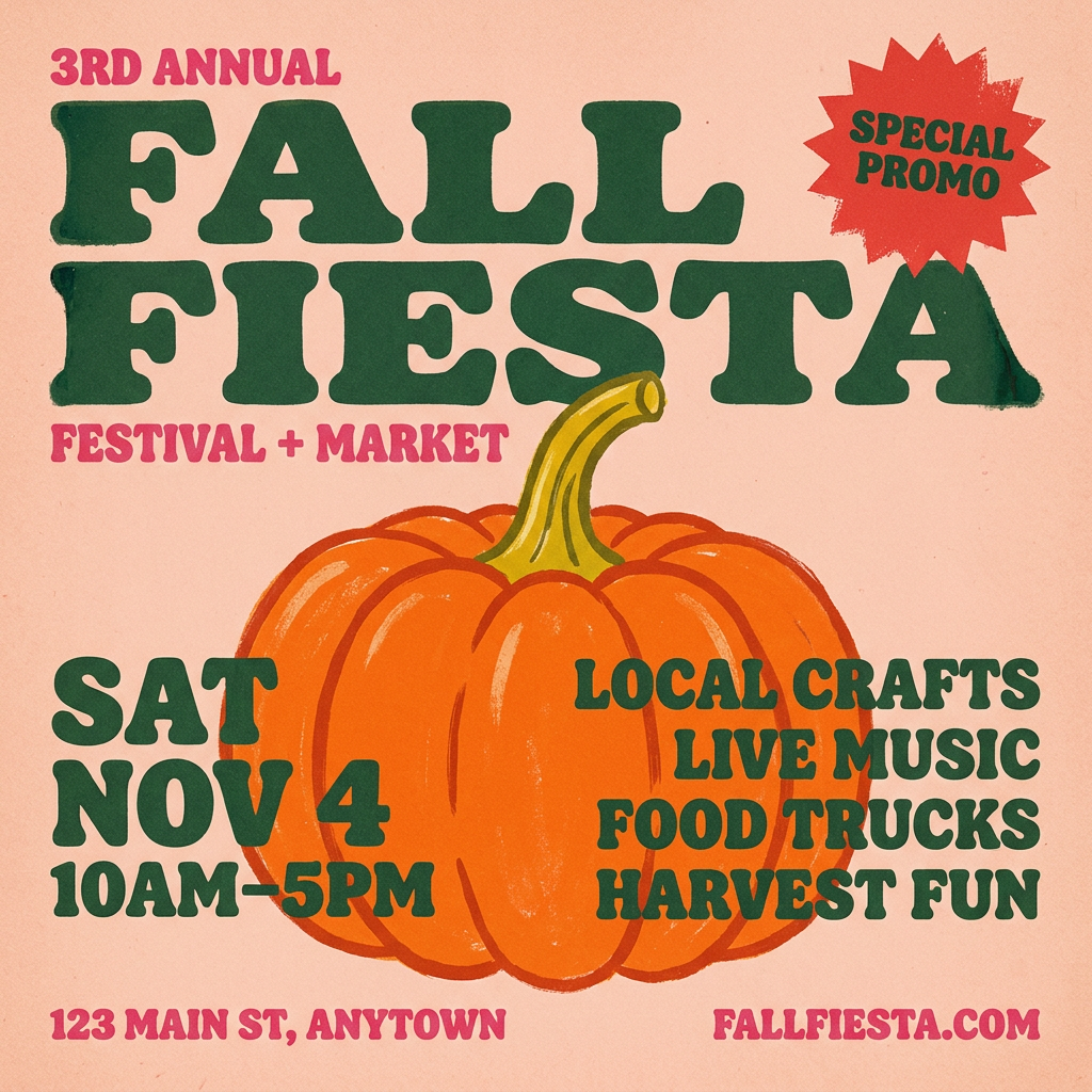
Turn any announcement into a gritty, tactile gig poster. It layers your text with an uneven letterpress ink texture over a dusty, warm pink risograph paper background. It’s perfect for giving social posts a real analog, screenprinted vibe.
Regenerate using your own assets.
Common pitfalls that make animated posters look cheap
The new wave of controllable AI motion tools is powerful, but it also makes it easy to make mistakes that instantly signal 'low-effort AI content'. Here’s what to watch out for:
- Over-animation: The equivalent of using ten different fonts in one document. When every element is sliding, fading, and zooming, the viewer has no idea where to look. The message is lost in the noise.
- Distorted Morphing: A common artifact of early image-to-video models is a 'breathing' or 'melting' effect where objects warp unnaturally. Unless this is a specific creative choice, it looks like a technical error and undermines the professionalism of the design.
- Off-Brand Typography: Slapping your brand's logo and a URL in a system font over a beautiful, animated image is a classic mistake. The typography must be as art-directed as the visuals. This is where a Brandkit-driven system is non-negotiable for creating consistently on-brand kinetic typography.
- Motion Without Purpose: Movement should always serve a purpose—to reveal information, guide the eye, or create a mood. A random, looping zoom effect adds nothing but visual clutter.
From a single poster to a repeatable campaign
Creating one great animated poster is a good start. But the real value for any brand or social media manager is the ability to create a dozen high-quality, on-brand variations for a full campaign without starting from scratch every time. This is the fundamental difference between using a single-purpose tool and a repeatable workflow.
In MyUP, the entire 3-step process—from generating the base image to applying controlled motion and layering on-brand assets—is saved as a single, reusable workflow. Need a new poster for next week's event? Rerun the workflow with new text. Expanding the campaign to a new platform? Duplicate the workflow and adjust the dimensions. The system ensures that every output maintains perfect brand consistency, turning a time-consuming creative task into a simple, scalable production line.
This workflow-based approach is how you escape the template trap and build a system for creating a consistent stream of custom content, whether it's posters, social posts, or even entire slide decks. You can try a workflow built for this kind of high-volume production right now.
Workflow code: #myup-n0bi-2wzk
Bold Editorial Grid Poster
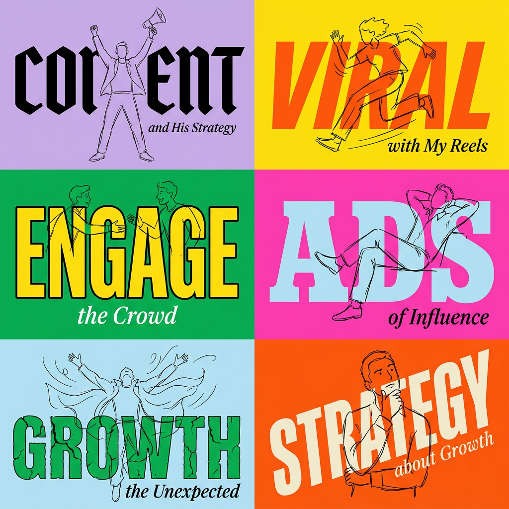
Create striking 2x3 editorial posters with six seamless, flat-color square cards in a perfect 4:5 grid. There are absolutely no gaps between the blocks, giving your content a bold, high-contrast magazine layout. It looks incredibly clean on any social feed.
Regenerate using your own assets.
