
If you've spent any time on Reddit or X in late June 2026, you've seen the posts. A stunning image from Stable Diffusion 3, perfect in every way... except for the text, which looks like an alien trying to write English. You've prompted for a clean, bold headline and received 'SLLEL ANNUEL' instead. It's the last, most infuriating hurdle between a great AI concept and a finished, usable asset.
But what if the problem isn't your prompt? What if trying to force an image model to be a typesetter is fundamentally the wrong approach? There's a better method: a two-step workflow that uses AI for what it's good at—visuals—and a brand-aware design system for what it can't do—typography. You can create a perfect poster with this approach in minutes. Here’s a simple workflow to get started.
Workflow code: #myup-k4td-9k6z
Minimalist Poster
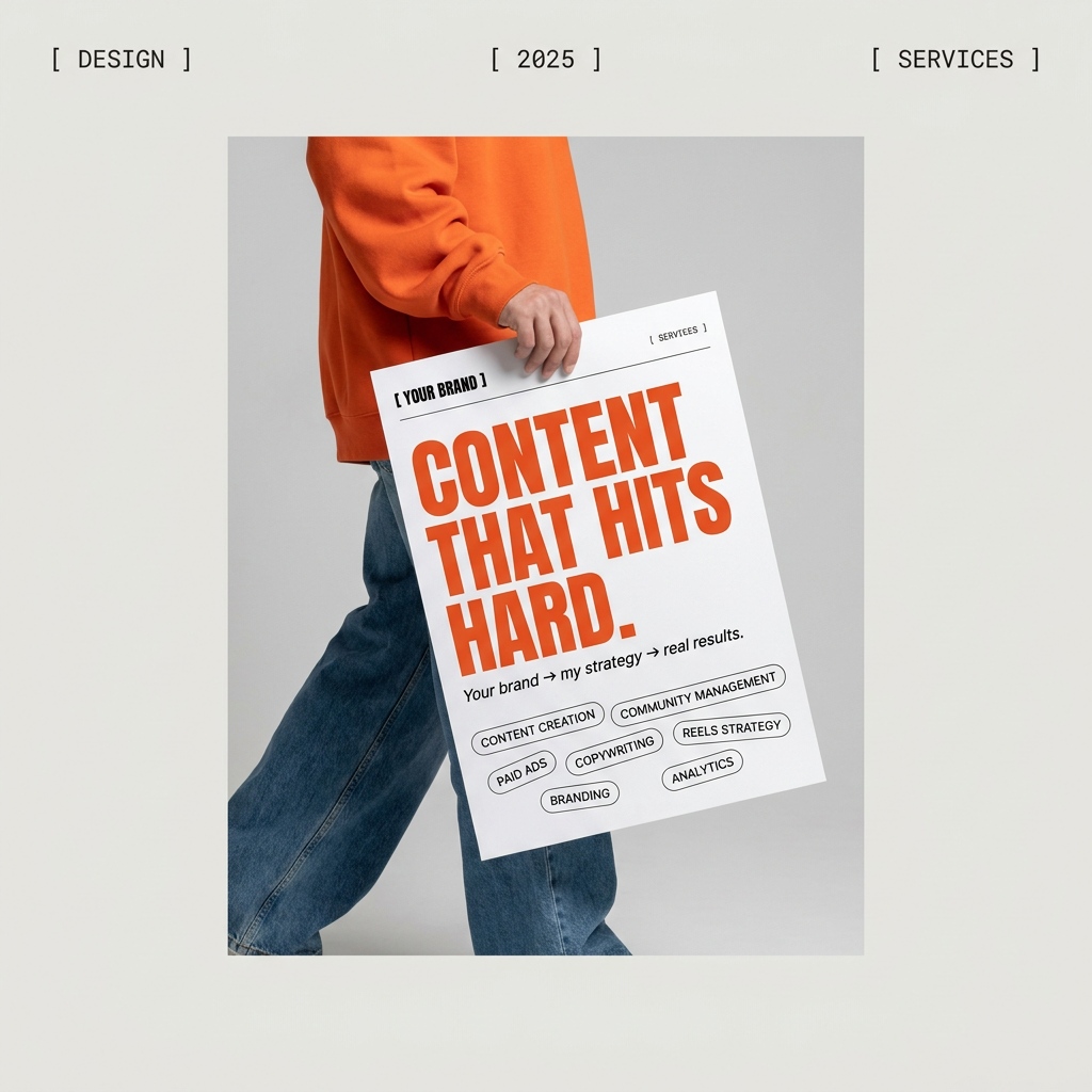
Give your social feed a clean, gallery-like aesthetic. This layout frames your images with structured mono typography and soft, neutral backgrounds for a high-end editorial look. It's perfect for minimal product launches or brand announcements.
Regenerate using your own assets.
Why even the best AI models can't spell
Diffusion models like Stable Diffusion 3, Midjourney, and Ideogram don't 'write' text. They draw it. Think of it like asking a master painter to add a line of text to a canvas. They will paint the shape of the letters beautifully, mimicking the style you asked for, but they aren't using a font file. They're interpreting 'text' as just another visual element, like a tree or a cloud. This is why you get weird letter combinations, extra limbs on a 'T', or beautifully rendered nonsense.
Professional design tools, on the other hand, use vector-based fonts. These are mathematical instructions that render letters perfectly every single time, at any size. The two systems are built on completely different principles. This isn't a bug that will be 'fixed' in the next update. It's a fundamental limitation of the technology. For reliable, brand-accurate text, you need to separate the two processes.
The broken workflow: Generate, export, repair
For most creators, the unreliability of AI text means a clunky, multi-app process. You spend time crafting the perfect prompt in your favorite generator. You get a 90% great image with garbled text. You then export that image, open it in Photoshop or Canva, find your brand font, manually type the text, try to match the lighting and color, and finally export again.
This isn't just inefficient; it's a creativity killer. Each step introduces friction and a chance for brand inconsistency. It turns a 2-minute AI task into a 20-minute manual repair job, defeating the purpose of using AI for speed in the first place.
The fix: A workflow for perfect, on-brand text every time
The professional solution is to build a workflow that treats image generation and typography as separate, specialized steps. In MyUP, this is built around your Brandkit.
Step 1: Build Your Brandkit
Before you generate anything, you build your Brandkit once. You upload your specific brand fonts (the actual .otf or .ttf files), define your color palette, and add your logos. This becomes the single source of truth for your visual identity.
Step 2: Use a Two-Step Workflow
Instead of prompting for 'a poster with the text SUMMER SALE', you run a workflow that does two things in sequence:
- Generate Visual: The first step prompts the AI to create a beautiful background image, with instructions like 'a vibrant abstract background with empty space at the top for a headline'.
- Apply Brandkit Text: The second step automatically overlays your text using the fonts and colors from your Brandkit. You simply input 'SUMMER SALE', and it's rendered perfectly in your brand's typeface. You, the user, validate the result and can adjust the text content with full control before finalizing.
In practice: From raw image to a finished event poster in 2 minutes
Let's say you need a poster for a music festival. Instead of wrestling with prompts, you use a dedicated workflow that understands how to build a finished design. This is a great example of how you can create a finished piece of collateral, not just a raw image.
This 'Bold Retro Yellow Event Poster' is a perfect example. Workflow code: #myup-xbur-hzoi
Bold Retro Yellow Event Poster
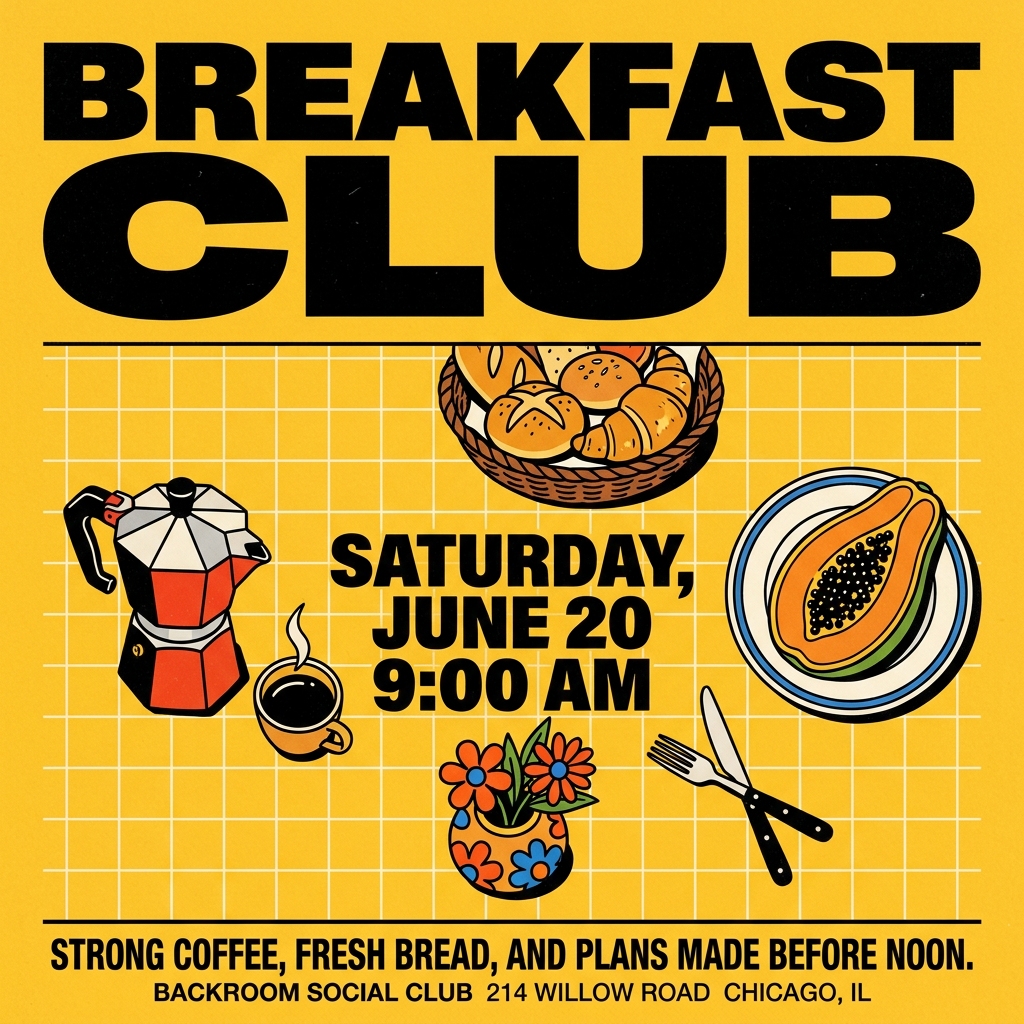
Turn your branding or event details into bold, nostalgic posters. It blends vibrant warm backdrops with a clean, retro square grid pattern to make any announcement look like a classic piece of mid-century graphic design.
Regenerate using your own assets.
When you run it, the first stage generates a dynamic, retro-inspired visual based on your input. The second stage then presents you with pre-defined text fields for the event name, date, and venue. You just fill in the blanks. The typography is already set to use your brand's fonts, ensuring it's 100% correct and on-brand. No exporting, no repairing, no guesswork. The same logic applies to social posts, ads, and even making branded GIFs.
Stop prompting for text. Start designing with it.
The promise of AI is to accelerate creation, not to add more steps of manual clean-up. Trying to get perfect text out of an image generator is a game of chance. For any professional creating content for a brand, that's not good enough.
By separating the visual creation from the typographic design, you regain control. You use AI for its strengths and a proper design system for brand precision. This is the only way to produce consistent, high-quality visual content at scale. Stop wrestling with text prompts. Build your Brandkit in MyUP and start using workflows that deliver finished assets, not just pretty pictures.
