You’ve seen them. The abstract swooshes for a tech startup. The minimalist leaf for an eco-brand. The geometric fox for a consultancy. You type “logo for a coffee shop” into an AI logo generator and get back a dozen variations of the same steaming cup icon. It’s frustratingly predictable.
The problem isn’t the AI. It's the tool. Most AI logo generators are designed for speed, not originality. They pull from a narrow set of visual clichés because it’s the fastest path to a plausible, but ultimately generic, result. You get a single, isolated image file that’s a creative dead end.
A real brand needs more than an icon. It needs a flexible, reusable visual identity. This guide provides the professional workflow for creating just that: a complete logo system built with AI, but guided by your unique vision. We’ll move beyond one-off image generation and build a brand asset that works everywhere.
Why your AI-generated logo looks like everyone else's
The core issue with most one-click logo generators is that they oversimplify the process. They are trained on vast datasets of existing logos, which means they are experts at identifying and replicating common patterns—the very definition of a cliché. When you give them a simple prompt like “logo for a law firm,” they default to the most statistically common visual ideas: scales of justice, gavels, or stately columns.
Furthermore, these tools are built to minimize friction, which means they don't ask for the kind of conceptual input that leads to unique design. They don't ask about your brand's values, your audience, or the story you want to tell. They just ask for keywords and a color preference.
The result is a logo that is technically competent but conceptually empty. It doesn't differentiate your brand because it was never designed to. To break out of this trap, you need a workflow that puts your strategy first and uses AI as a powerful execution engine, not a shallow idea machine.
Step 1: Define your concept (before you write a single prompt)
A unique logo starts with a unique idea. Before you touch any AI tools, you need to do the human work of brand strategy. This is where you, the user, take control and provide the conceptual direction that the AI will execute. Spend 20 minutes answering these three questions:
- What is the core feeling? If your brand were a person, what are three adjectives to describe its personality? (e.g., “Bold, witty, and direct” vs. “Calm, natural, and reassuring”).
- What is the key metaphor or symbol? Move beyond the literal. If you’re a data analytics company, don't just think about charts and graphs. Maybe the core idea is about “clarity,” so your visual metaphor could be a lens, a beacon, or a clear path through a forest.
- Who is this for? A logo for a Gen-Z streetwear brand will have a completely different visual language than one for a luxury retirement community. Define your audience to guide your aesthetic choices.
This simple brief is your creative foundation. It gives you the raw material for prompts that go far beyond “a logo for X.” Now you have a point of view, and you can guide the AI with intention.
Step 2: Build your visual foundation in a MyUP Brandkit
A logo doesn't exist in a vacuum. It lives alongside specific colors and fonts that make up your brand's visual identity. The professional workflow is to define these elements *before* you finalize the logo, so everything is cohesive from the start.
This is why the process begins inside MyUP.ai's Brandkit. A Brandkit is the central, single source of truth for your visual identity. Instead of generating a logo and then trying to find colors that match, you establish the entire system at once.
In MyUP, you can create a Brandkit in seconds. Simply enter your website URL, and MyUP will automatically extract your existing logo (if you have one), color palette, and fonts. If you're starting from scratch, you can define your colors and typography manually based on the conceptual work you did in Step 1. This ensures that every asset you generate from this point on—including your new logo—is automatically on-brand. This is the core of building a system, not just an image. Learn more about how to set up your visual identity in our guide to creating an AI brand kit that actually works.
Step 3: Generate and refine your core logomark
With your Brandkit established in MyUP, you can now start generating the visual heart of your logo: the logomark (the iconic symbol). This is where you translate your conceptual brief into a structured prompt. The latest models, like Stable Diffusion 3 which is available in MyUP, are much better at interpreting nuanced instructions.
Instead of a simple prompt, use a more descriptive structure:
[Style] logomark of a [Symbol/Metaphor], representing [Core Feeling]. [Composition details]. Use a palette of [Your Brand Colors].
Here’s a practical example for a cybersecurity brand whose concept is “a digital fortress that is elegant and impenetrable”:
Minimalist line art logomark of a keyhole morphing into a shield, representing elegant security. Symmetrical, clean lines, with negative space. Use a palette of deep navy blue and silver.
Generate a dozen variations in MyUP. Your role is not to accept the first output, but to curate and refine. Look for the options with the strongest composition and clearest concept. Select the best one and save it directly to your MyUP Brandkit. This single action turns a generated image into a reusable brand asset.
Step 4: From one icon to a complete logo system
You now have a unique logomark saved in your Brandkit. This is your core asset, but it's not your entire logo. A complete logo system includes several variations for different contexts:
- Wordmark: The brand name styled in your brand font.
- Combination Mark: The logomark and wordmark together (horizontal and vertical versions).
- Social Media Icon: The logomark adapted for a small square or circle format.
- Favicon: A simplified version for browser tabs.
In MyUP, this isn't a manual design process. Because your logomark, colors, and fonts are already in your Brandkit, MyUP's workflows can automatically generate these variations for you. You simply ask the AI to combine your brand assets into the required formats. The system does the production work; you validate the results.
This is also where you can start applying your new logo to real content. For example, you can instantly see how it looks on merchandise or a social media post. The workflow below generates a branded apparel post using the assets from your Brandkit.
Workflow code: #myup-3sro-edbt
Brand Clothes Post

Turn any outfit photo into a high-end fashion promo poster. It centers your subject in a full-body shot against a dark, dramatic studio backdrop, perfectly cropped for social feeds. It gives your apparel a moody, editorial look instantly.
Regenerate using your own assets.
Step 5: Put your new brand system to work instantly
The true value of a logo system is its immediate utility. A one-off logo file sits in a folder. A logo system integrated into a MyUP Brandkit is ready to be deployed across all your marketing content instantly.
You don't have to download the logo and upload it to another design tool. You can stay right inside MyUP and start creating. Every template and workflow automatically pulls from your Brandkit, ensuring every single piece of content is perfectly consistent.
Need to create a striking ad for a new product? Your logo, colors, and fonts are already locked in. This workflow for a minimalist poster is a perfect example.
Workflow code: #myup-sygb-rhnt
Minimalist Vertical Product Advertising Poster
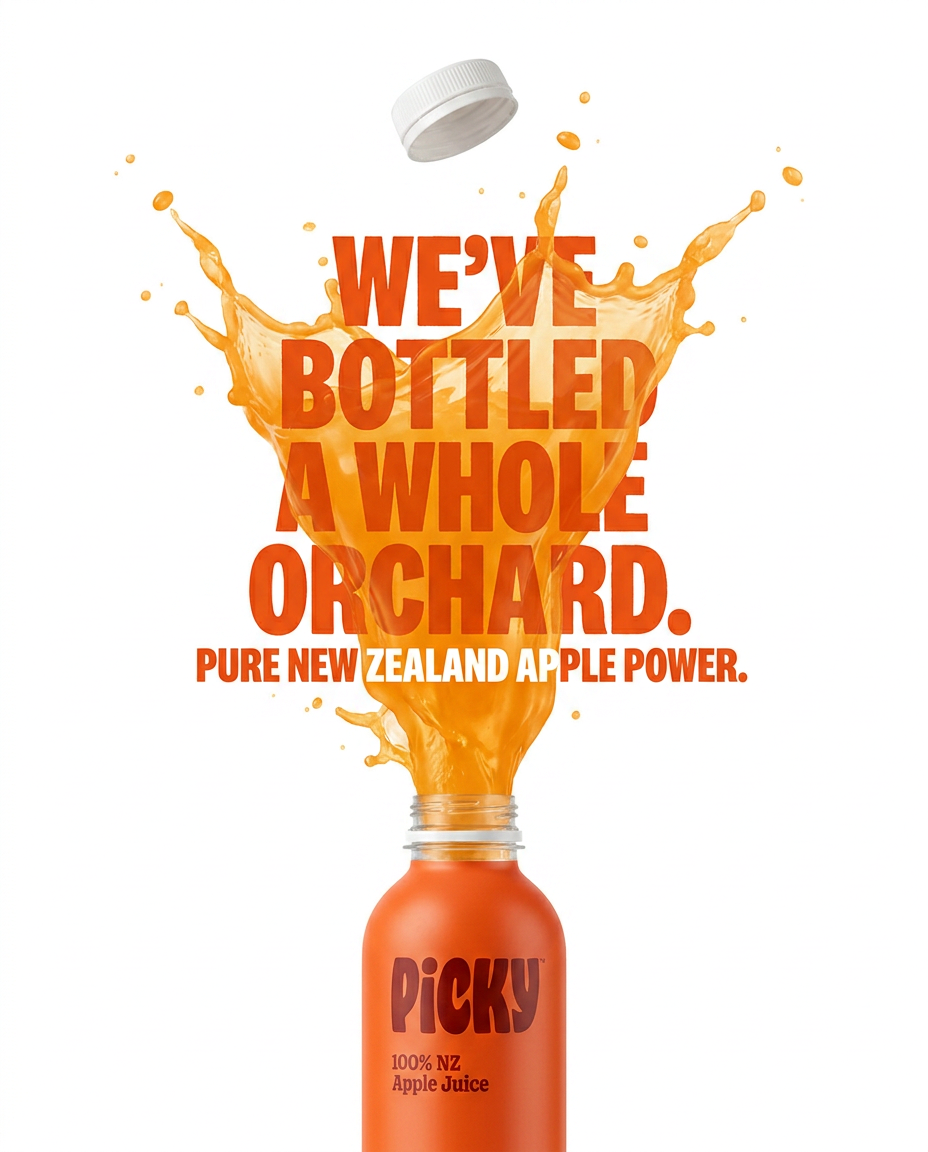
Drop the clutter and put your product in the spotlight. This setup places your item against a pure, seamless white background with a striking vertical flow that draws the eye straight up. It's perfect for creating clean, high-end studio posters.
Regenerate using your own assets.
Announcing a launch or an event? You don't need to brief a designer. Just run a workflow that leverages your new brand identity to create a bold, eye-catching visual that feels like it came from a professional studio.
Workflow code: #myup-xbur-hzoi
Bold Retro Yellow Event Poster
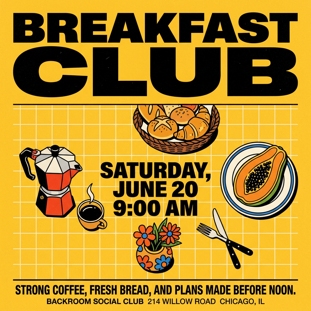
Turn your branding or event details into bold, nostalgic posters. It blends vibrant warm backdrops with a clean, retro square grid pattern to make any announcement look like a classic piece of mid-century graphic design.
Regenerate using your own assets.
This is the payoff. The time you invested in building a proper brand system pays off in speed and consistency for every piece of content you create moving forward.
Your logo is not an image, it's the start of your brand
The temptation of a 30-second AI logo is strong, but the result is a creative dead end. It gives you a disposable image, not a durable brand identity. The professional approach is to treat your logo as the foundational element of a larger visual system.
By starting with strategy, building your foundation in a MyUP Brandkit, and using AI as a powerful tool for execution and systemization, you create something unique and, more importantly, usable. You create a living brand asset that saves you time and ensures consistency on every single thing you produce.
Stop generating dead-end images. Start building a real brand system on MyUP.ai.
