
You’ve written a sharp analysis for your company blog or LinkedIn. The topic is complex: market disruption, strategic alignment, digital transformation. You turn to an AI image generator for a visual and it gives you… a glowing lightbulb. A chess board. Two generic business people shaking hands. Suddenly, your sophisticated idea looks like a stock photo cliché from 2005.
This is the core frustration for professionals using AI for content. The models are powerful, but without a brand-aware workflow, they default to the most literal, overused visual tropes. The result doesn't just fail to add value; it actively undermines the intelligence of your message.
A great conceptual image communicates your brand's unique perspective. It makes an abstract idea tangible and memorable. This guide provides a repeatable workflow to do exactly that, moving from generic prompts to a system for creating a unique visual language for your ideas—all on-brand.
Step 1: Translate your business concept into a visual metaphor
Before you write a single prompt, you need to do the thinking the AI can't. The first step is to translate your abstract business concept into a concrete visual metaphor. AI models don't understand 'synergy,' but they can draw 'interlocking geometric shapes' or 'two distinct rivers flowing together into one.' Your job is to make that translation.
Start by breaking down the concept:
- What is the core action or relationship? (e.g., connecting, growing, protecting, disrupting)
- What objects or scenes represent that action?
Let's take a few examples:
- Concept: 'Sustainable Growth'Translation: Instead of a generic upward-trending arrow, think more specifically. How about 'a healthy green sprout emerging from a discarded smartphone,' or 'a series of gears made of reclaimed wood and moss.'
- Concept: 'Data Security'Translation: Move beyond the obvious padlock. Consider 'a digital stream of 1s and 0s flowing into a locked, transparent vault,' or 'an intricate, glowing shield protecting a network of nodes.'
- Concept: 'Market Disruption'Translation: Forget the chess board. Visualize 'a sleek, modern paper boat cutting through a fleet of old wooden galleons,' or 'a single glowing domino starting a chain reaction that changes direction midway.'
This translation from abstract term to visual scene is the most critical creative step. It’s what separates a unique illustration from a forgettable piece of AI art.
Step 2: Define your visual language with a Brandkit
A great metaphor rendered in a generic AI style is still a failure. Your 'paper boat disrupting galleons' will look cheap if it doesn't align with your brand's aesthetic. This is where most creators get stuck, spending hours trying to coax a consistent style out of a model with complex prompts. The solution isn't a better prompt; it's a better system.
In MyUP.ai, you solve this with a Brandkit. A Brandkit is more than just your logo and brand colors; it's a set of rules that governs your entire visual identity, including a specific illustration style. You define it once, and MyUP applies it every time you create.
Instead of adding 'in the style of flat vector art' to every prompt, you select your pre-defined 'Flat Vector' style from your Brandkit. This could be anything:
- Minimalist line art
- Isometric 3D illustrations
- Textured paper cut-outs
- Abstract geometric shapes
By defining this upfront, you ensure every conceptual image—whether it represents growth, security, or disruption—feels like it belongs to the same cohesive visual system. The user—you—validates the concept, while MyUP handles the stylistic execution automatically. This is how you achieve scale and consistency without hiring an entire illustration team.
For instance, if you want all your conceptual visuals to have a consistent tactile feel, you can use a workflow designed for a specific texture and mood. This template helps establish that look instantly.
Workflow code: #myup-hcix-fsva
Textured Paper Calendar Close-Up
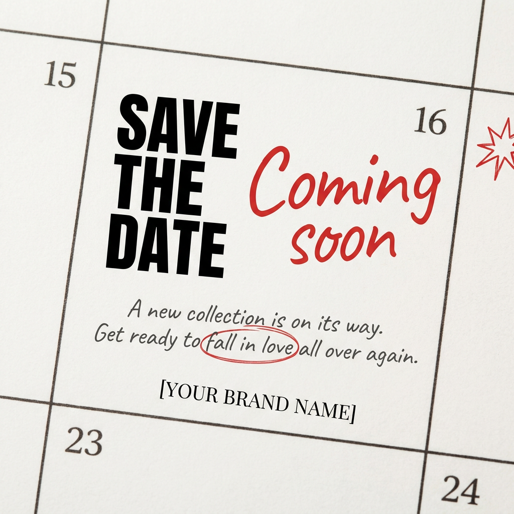
Turn your upcoming dates or launch schedule into a beautiful, tactile physical calendar. It renders crisp minimalist grids on heavy textured paper with realistic macro focus. Perfect for sharing events on social media without looking like a generic graphic.
Regenerate using your own assets.
Step 3: The prompting workflow for on-brand abstraction
Now, combine the metaphor from Step 1 with the style from Step 2. The workflow inside MyUP simplifies this process. Since your Brandkit is already loaded, your main job is to clearly describe the visual scene you defined earlier.
Your prompt structure becomes simple:
[Detailed description of the visual metaphor] + [Reference to your MyUP Brandkit]
In practice, the second part is automatic. You just focus on the first.
Before MyUP: 'An illustration showing synergy, professional, corporate, blue and green, flat vector style, minimalist, clean background.' (Results are unpredictable and require constant style reinforcement).
With a MyUP Workflow: 'Minimalist illustration of several different colored geometric shapes—a circle, a square, a triangle—smoothly interlocking at their edges to form a single, harmonious new shape.' (The Brandkit automatically applies the pre-defined 'flat vector style,' brand colors, and clean background).
The difference is control. You spend your effort describing the *concept*, not wrestling with the *style*. This is especially critical when creating a series of visuals for something like a presentation, where every slide needs to feel connected. You can learn more about this in our guide to creating on-brand presentations with AI.
Step 4: Create a cohesive visual series, not just one-off images
The real power of this workflow emerges when you create more than one image. Your goal isn't a single great visual; it's a library of on-brand assets that make your thought leadership instantly recognizable. Because the Brandkit is constant, you can generate a dozen different conceptual illustrations for an entire campaign, and they will all share the same visual DNA.
- For a blog post on 'business strategy': You might generate one image of a 'stylized map with a glowing path' and another of 'abstract figures moving unique chess pieces on a circular board.' Both will use your brand's colors and illustration style.
- For a marketing campaign: Create visuals for 'customer acquisition' (a friendly magnet pulling in abstract shapes) and 'retention' (a protective transparent sphere around a group of shapes). They will look like a matched set.
This consistency transforms your content from a collection of random posts into a body of work with a distinct point of view. To take it a step further, you can use templates designed to arrange these visuals into a polished, editorial layout, perfect for carousels or web content.
Workflow code: #myup-n0bi-2wzk
Bold Editorial Grid Poster
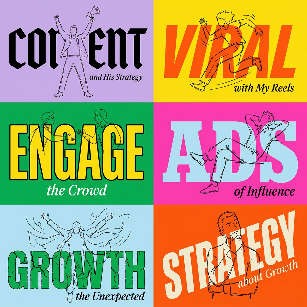
Create striking 2x3 editorial posters with six seamless, flat-color square cards in a perfect 4:5 grid. There are absolutely no gaps between the blocks, giving your content a bold, high-contrast magazine layout. It looks incredibly clean on any social feed.
Regenerate using your own assets.
Step 5: Add the finishing touches for a professional asset
A raw AI image is rarely the final asset. You often need to add a headline, a data point, or your logo to make it ready for publishing. While recent model updates have improved AI's ability to render text, achieving brand consistency with typography requires a design workflow.
Instead of exporting the image to another tool, you can use MyUP to complete the asset. By using a workflow that combines your generated image with text layers, you ensure the final output uses your Brandkit's approved fonts, sizes, and colors. The AI generates the core visual, and the workflow automates the branding and formatting.
This final step turns a great image into a usable piece of marketing collateral in seconds. A template like the one below is perfect for quickly packaging your new conceptual art into a clean, professional format for social media or ads.
Workflow code: #myup-sygb-rhnt
Minimalist Vertical Product Advertising Poster
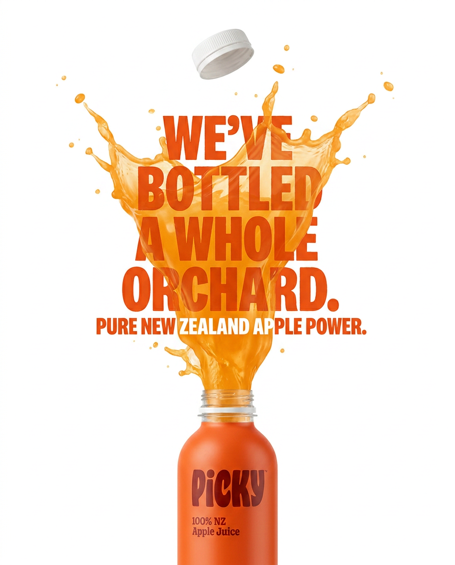
Drop the clutter and put your product in the spotlight. This setup places your item against a pure, seamless white background with a striking vertical flow that draws the eye straight up. It's perfect for creating clean, high-end studio posters.
Regenerate using your own assets.
Stop illustrating ideas, start building a visual identity
Generating conceptual art with AI isn't about finding the magic prompt that spits out a masterpiece. It's about building a system. By separating the conceptual work (the metaphor) from the stylistic work (the Brandkit), you gain control and consistency.
This workflow allows you to move beyond the endless cycle of generating one-off, disconnected images. Instead, you can build a unique and recognizable visual language that makes your most important ideas stand out. This is how you make AI a true partner in building your brand, not just a shortcut to the same old stock clichés. See our pricing plans to get started with your own Brandkit.
