
You tried an AI presentation maker. You fed it your outline, and in 60 seconds, it delivered a 20-slide deck. The bullet points were fine, but the visuals were a disaster: cheesy stock photos, mismatched icons, and a color palette that looked nothing like your brand. So you spent the next two hours manually fixing every slide.
This is the central failure of one-click AI presentation tools. They trade creative control for a burst of initial speed, leaving you with a generic product that erodes your brand's credibility. Even pro tools fall short; a viral post just this week showed a designer struggling to maintain consistent layouts for a slide deck in Midjourney. The style was there, but the structure was chaos.
The market knows this is a problem. Competitors like Gamma and Pitch are rolling out basic 'Brand Hubs,' and Microsoft's new PowerPoint AI still leans on its generic stock photo library. They're patching the symptoms, not solving the core issue. A great presentation isn't a collection of random assets; it's a cohesive visual system. This article isn't a review of those tools. It’s the workflow they can't offer: how to build a reusable system of on-brand presentation assets in MyUP, so every deck you create is born from your brand's DNA.
Step 1: Build your presentation's visual foundation with a Brandkit
Before you generate a single slide, you need a central source of truth for your visual identity. A generic AI presentation maker might let you upload a logo and pick a primary color. This isn't enough. It's the reason your slides feel disconnected. A professional visual system is built on more than a logo—it's defined by typography, a full color palette, logo variations, and a consistent photographic or illustrative style.
In MyUP, this system is called a Brandkit. Instead of a one-time upload, you build it once and it's automatically applied to every asset you create. It captures:
- Colors: Your full palette, not just a primary and secondary color.
- Fonts: The specific typefaces that define your brand's voice.
- Logo: High-resolution versions for different uses.
- Style Prompts: A description of your visual style (e.g., 'minimalist photography with warm, natural light' or 'bold, graphic illustrations with clean lines') that guides the AI's aesthetic choices.
This isn't just a folder of assets; it's an instruction set for the AI. By establishing this foundation, you stop the AI from guessing and start directing it. Every slide, icon, and chart it generates will now inherit these core brand rules, solving the consistency problem before it begins.
Step 2: Create your core layouts: title slides and section dividers
The biggest giveaway of a generic AI deck is inconsistent structure. The title slide has one layout, the section dividers have another, and the content slides are a free-for-all. True brand consistency requires structural consistency.
Instead of prompting for 'a presentation about Q3 financial results,' you need to think like a designer building a template. In MyUP, you can use a workflow to generate specific, structurally-defined slide types. Your goal is to create a small library of core layouts that you can reuse.
Start with the most important ones: the title slide and the section divider. Your prompt should define both the content and the layout. For example:
'A minimalist title slide for a corporate presentation. The company logo is in the top left corner. The title 'Q3 Financial Review' is in large, bold, sans-serif type in the center. The background is a subtle abstract gradient using the brand's primary and secondary colors.'
By specifying placement ('top left corner,' 'center'), you force the AI to respect a consistent grid. To create a clean, professional title slide immediately, the Minimalist Poster workflow is the perfect starting point. It's designed for clear typography and balanced composition.
Workflow code: #myup-k4td-9k6z
Minimalist Poster
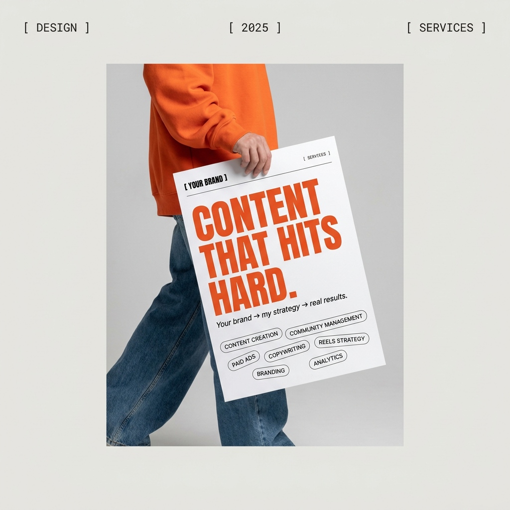
Give your social feed a clean, gallery-like aesthetic. This layout frames your images with structured mono typography and soft, neutral backgrounds for a high-end editorial look. It's perfect for minimal product launches or brand announcements.
Regenerate using your own assets.
Run this prompt and similar ones for your section dividers ('A section divider slide, clean and modern, with the title 'Key Growth Metrics' on the right side...') a few times to get variations. You now have the core building blocks of your deck.
Step 3: Generate on-brand charts and diagrams that used to be impossible
Until very recently, asking an AI to create a bar chart with accurate labels was a lost cause. You’d get a pretty picture of a chart, but the text would be gibberish, forcing you to rebuild it manually. Thanks to model updates that drastically improve in-image text generation (like those seen in Ideogram's latest model), this is no longer a barrier.
This changes everything for presentations. You can now prompt for data visualizations that are both accurate and on-brand from the start. Your Brandkit in MyUP ensures the chart uses your brand colors and fonts automatically. Your prompt handles the data and structure.
For example, a prompt for a data slide could be:
'A clean bar chart showing user growth from 2024 to 2026. The x-axis is labeled with the years. The y-axis is labeled 'Users in Millions'. Bars should show 2.5M for 2024, 4.1M for 2025, and 7.2M for 2026. Use the brand's primary color for the bars. The slide title is 'Annual User Growth'.'
For a more complex, editorial-style data slide, you can use a workflow designed for structured content. The Bold Editorial Grid Poster workflow helps organize information into a clean, magazine-like layout, which is ideal for presenting key stats or a project timeline.
Workflow code: #myup-n0bi-2wzk
Bold Editorial Grid Poster
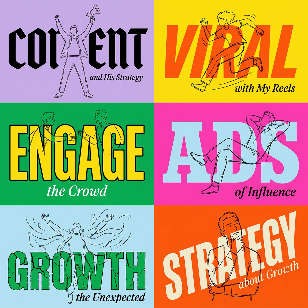
Create striking 2x3 editorial posters with six seamless, flat-color square cards in a perfect 4:5 grid. There are absolutely no gaps between the blocks, giving your content a bold, high-contrast magazine layout. It looks incredibly clean on any social feed.
Regenerate using your own assets.
This leap in capability means you can stop creating visuals in one tool and data in another. You can generate presentation-ready charts and diagrams in a single step.
Step 4: Batch-create a full set of consistent icons
Nothing screams 'unprofessional' like a deck with five different styles of icons. Finding or creating a matched set is a tedious task, and it's a common frustration in AI communities, with users sharing complex hacks just to get a consistent set of 10 icons. This shouldn't be so hard.
A workflow in MyUP can solve this instantly. Because your Brandkit has already defined your core visual style, you can run a single prompt to generate a full library of matching icons. The key is to ask for the entire set in one go.
A simple and effective prompt would be:
'A set of 12 minimalist line-art icons for a business presentation. The icons should represent: sales, marketing, engineering, support, finance, HR, growth, data, security, product, mobile, and web. All icons in a unified style on a clean white background.'
MyUP will generate an image containing all 12 icons, ensuring they share the exact same line weight, color, and aesthetic. You can then easily separate them for use on different slides. For a slightly more playful or sticker-like icon set, the Product Stickers workflow is an excellent tool. It generates multiple assets in a single image, all sharing a consistent style.
Workflow code: #myup-swqt-4zo3
Product Stickers
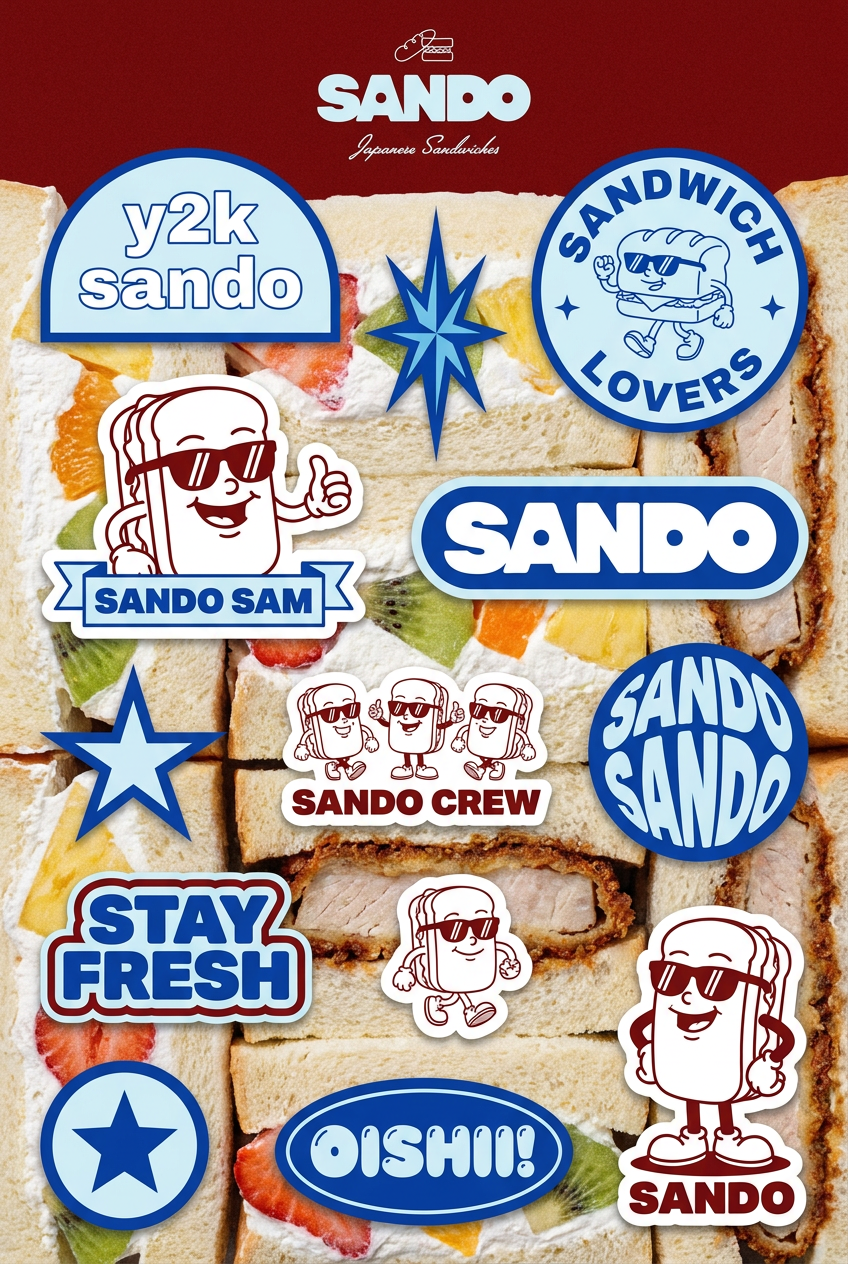
Turn your logo into a nostalgic, vibrant Y2K-style vertical ad. It automatically pulls your brand colors to create matching sweet treats like custom donuts or cupcakes in the background, giving you a super playful retro-pop aesthetic.
Regenerate using your own assets.
In under a minute, you have a complete, custom, on-brand icon library that would have previously taken hours of searching or design work.
Step 5: Assemble your deck with full creative control
After running these workflows, you don't have a finished, locked-in presentation. You have something much more valuable: a library of bespoke, on-brand visual assets. You have your title slides, section dividers, data visualizations, and a full set of icons, all perfectly aligned with your visual identity.
Now you can open your preferred presentation tool—PowerPoint, Google Slides, Keynote—and assemble your narrative. This is where the MyUP philosophy becomes clear: the AI handles the repetitive, time-consuming production, but you, the human, retain full control over the story and the final output. You curate the best assets, arrange them to support your points, and add your text.
This workflow-based approach turns presentation design from a manual chore into a creative system. You're not just making one deck; you're building an asset factory. The next time you need to create a presentation, your library of on-brand assets is ready, saving you from ever having to fix a generic, off-brand AI slide again.
