
You prompted Midjourney for a simple bar chart showing your 70/30 quarterly results. What you got was a beautiful, abstract painting of a chart. The colors are perfect, the style is slick, but the labels are gibberish and the bars are proportioned randomly. If you’ve spent any time on creative forums in June 2026, you know you’re not alone. This is one of the most common and frustrating failures of modern AI image generators.
The good news is that it’s not your prompt that’s broken. It’s your workflow. AI can be an incredible tool for data visualization, but not in the way you think. Here’s why it fails and the two-step process that actually works.
Why your AI image generator is a terrible data analyst
The core problem is simple: AI image generators are visual pattern matchers, not data processors. A diffusion model like those behind DALL-E or Midjourney has been trained on billions of images. It knows what a bar chart *looks like*. It has seen thousands of them and understands the general arrangement of bars, axes, and labels. But it has zero understanding of what the numbers 70 or 30 actually mean. It cannot perform calculations or represent proportions accurately.
When you ask for a “70/30 bar chart,” the AI isn’t calculating a 70% bar and a 30% bar. It’s searching its vast visual memory for images tagged with words like “bar chart,” “70,” and “30,” and then creating a new image that looks statistically similar. The result is a plausible-looking *picture* of a chart, not a logically constructed data visualization. It’s the same reason AI struggles to generate perfect, legible text—it's drawing the shape of letters, not writing words. Getting the visuals right requires a different approach, one that separates the task of generating text and labels from generating the image itself.
The right workflow: separate style from data
Instead of asking AI to be a data analyst, use it for what it excels at: being a brilliant visual stylist. The most effective workflow isn't about finding a magic prompt; it's about changing the process.
The goal is to use AI to create a beautiful, perfectly on-brand *chart template*—the visual shell—and then add your precise data in a separate, simple step. This gives you the best of both worlds: AI-powered speed and creativity for the design, and 100% human-validated accuracy for the data. MyUP is built for this logic: the platform executes the creative production, and you provide the final validation.
Step 1: Generate your on-brand chart template
First, prompt for the visual container of your chart. Be descriptive about the style, not the data. Instead of focusing on numbers, describe the layout, colors, and overall aesthetic you want. For example:
“A clean, minimalist bar chart template with 3 vertical bars. The background is off-white. There is clear space for a title at the top and labels on the x-axis. The style is professional and modern.”
This is where a Brandkit becomes essential. In MyUP, your brand’s specific colors, fonts, and logo are saved once and automatically applied to every generation. When you run a prompt like the one above, the output isn't just a generic chart; it’s a chart that uses your exact brand palette and typographic style, ensuring every piece of data visualization feels consistent. This turns a one-off image into a reusable asset for your team. You can start with a basic layout and build from there.
Workflow code: #myup-k4td-9k6z
Minimalist Poster
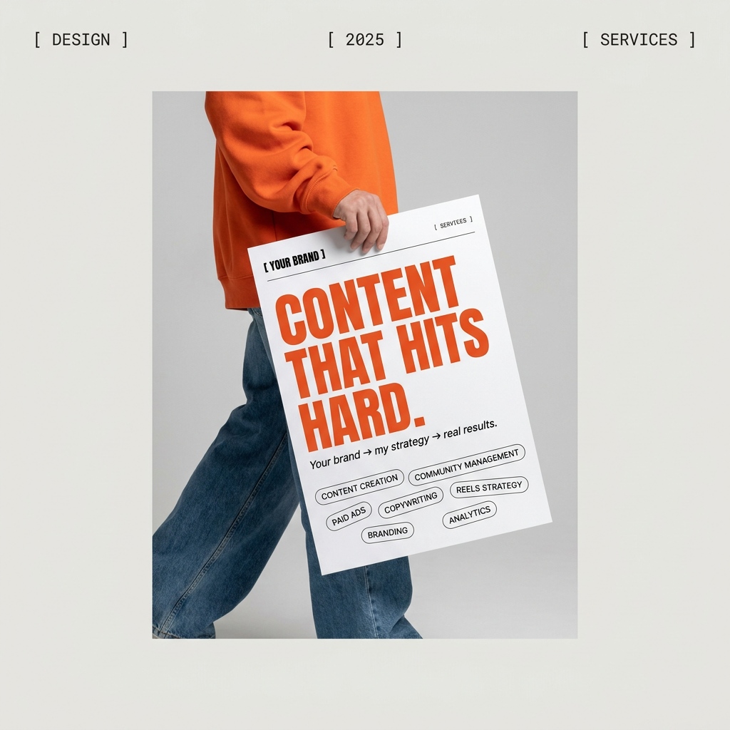
Give your social feed a clean, gallery-like aesthetic. This layout frames your images with structured mono typography and soft, neutral backgrounds for a high-end editorial look. It's perfect for minimal product launches or brand announcements.
Regenerate using your own assets.
Step 2: Add your data and labels for 100% accuracy
Once you have your beautiful, on-brand chart template, the final step is quick and easy. Open the generated image in any simple image editor, presentation software like PowerPoint, or a design tool like Canva or Figma.
From there, simply add text boxes to overlay your accurate data:
- The chart title
- Axis labels (e.g., Q1, Q2, Q3)
- Data point values (e.g., 70%, 30%, 100%)
- A source or legend if needed
This part of the process takes seconds but guarantees total factual accuracy. You've outsourced the time-consuming design work to AI while retaining complete control over the information. The AI handles the production; you validate the critical details.
Beyond charts: applying the template method to all branded visuals
This “style first, content second” workflow is a powerful model for more than just charts. It’s the key to scaling any kind of branded visual content where a consistent layout is required. Think about social media quote cards, event announcements, hiring posts, or product feature highlights. In each case, you can use AI to generate a structured, on-brand template and then drop in the specific text or data.
This templated approach is the foundation for building a truly useful and on-brand AI image library. Instead of generating endless one-off images, you’re creating a system of reusable, flexible assets. MyUP workflows are designed for exactly this, allowing you to create everything from a simple post to a complex grid layout that’s always locked into your brand identity.
Workflow code: #myup-eiob-7tbc
Modern Hiring Poster
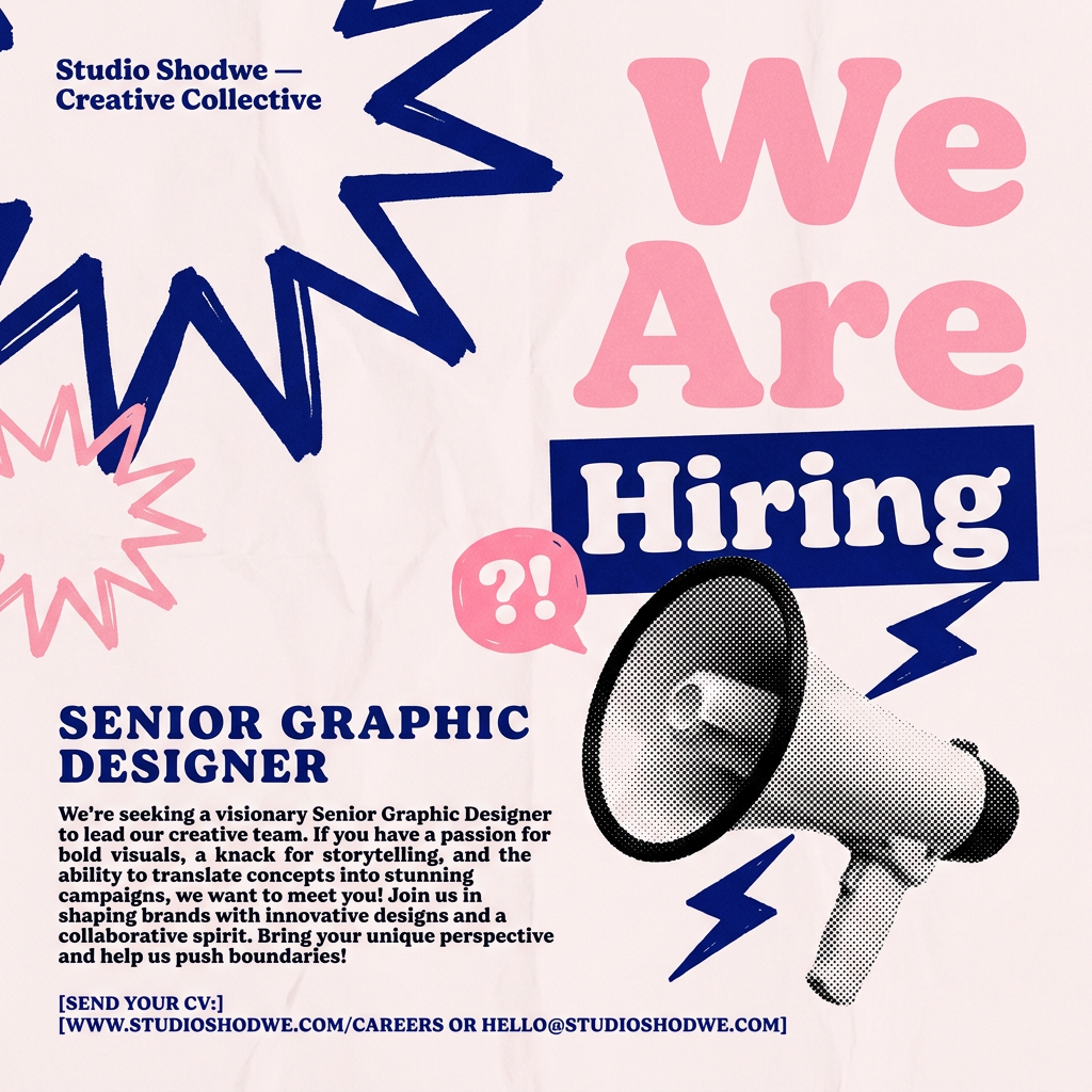
Turn your open roles into stylish social announcements. It sets your hiring details against a soft, textured paper background with clean, editorial typography. Perfect for giving your brand a polished, modern look when you're looking to hire.
Regenerate using your own assets.
Workflow code: #myup-n0bi-2wzk
Bold Editorial Grid Poster
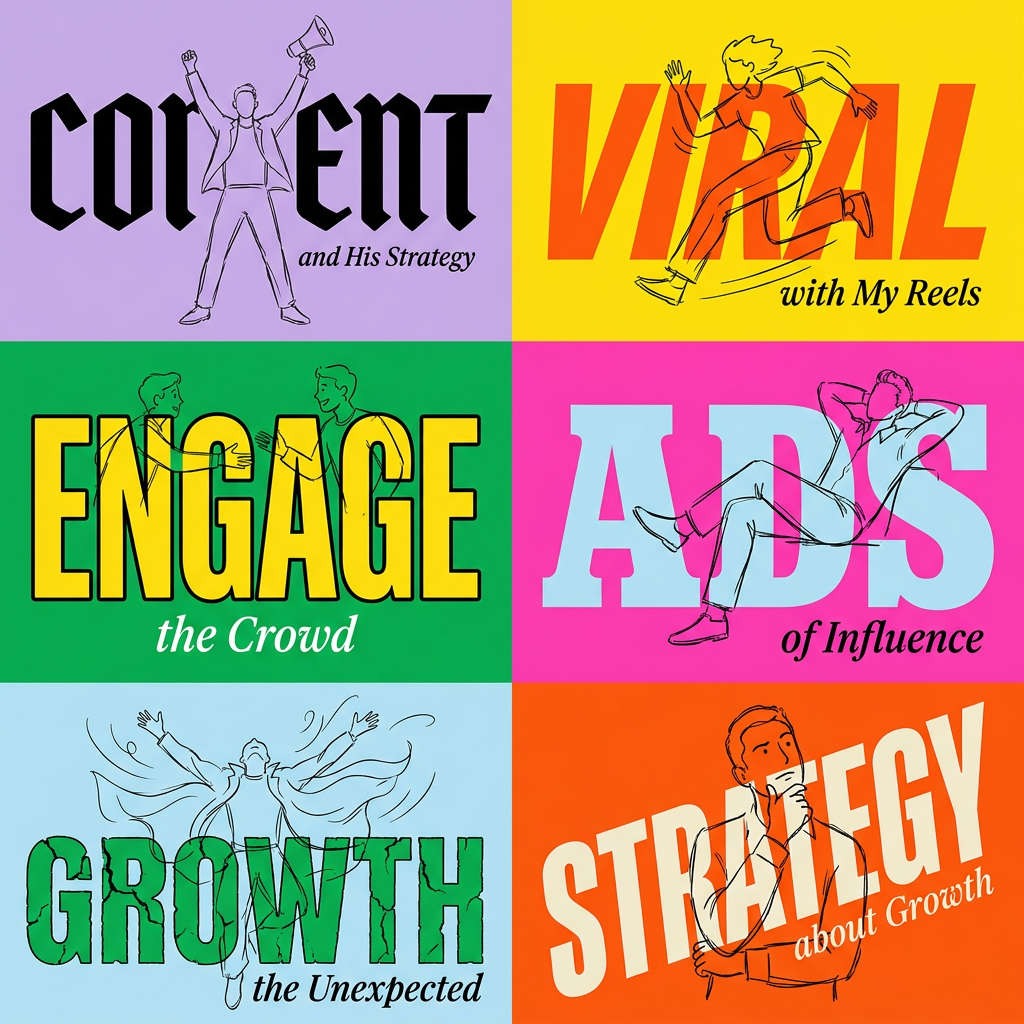
Create striking 2x3 editorial posters with six seamless, flat-color square cards in a perfect 4:5 grid. There are absolutely no gaps between the blocks, giving your content a bold, high-contrast magazine layout. It looks incredibly clean on any social feed.
Regenerate using your own assets.
Use AI as a stylist, not a statistician
The desire for a single prompt that can read a spreadsheet and output a perfect chart is understandable, but the technology isn't there yet. The frustration you're feeling comes from asking a tool to do a job it was never designed for. By shifting your workflow, you can stop fighting the limitations of AI and start leveraging its incredible strengths. Let AI be your tireless, on-brand designer, creating the visual systems you need. You remain in control, ensuring the final output is not only beautiful but also true.
