You typed “brutalist event poster, black and white, bold typography” into your favorite AI image generator. You were hoping for something stark, structured, and powerful. Instead, you got a muddy, over-textured sci-fi scene with crumbling dystopian buildings and, as always, garbled text that looks vaguely like letters but isn’t.
If this sounds familiar, you’re not alone. A quick look at Reddit threads from this month (August 2026) shows a wave of creators hitting the same wall. They ask for the raw, unapologetic order of brutalism and get chaotic, generic noise. The problem isn't your prompt. The problem is that you’re asking a pattern-matching tool to follow a system of rules.
Why prompts alone can't create brutalist design
Brutalism isn't just an aesthetic; it's a design philosophy built on principles: raw, unfinished materials (béton brut), modular grids, a strict typographic hierarchy, and a deliberate use of negative space. It’s about structure. AI image models, however, don’t understand structure. They understand patterns. When they hear “brutalism,” they associate it with millions of images tagged with “concrete,” “dystopian,” or “sci-fi,” and they deliver a blurry average of those concepts.
This isn't just a niche issue; it's the core problem the entire creative AI industry is trying to solve right now. Just this month, Adobe rolled out “Structure Reference” in Firefly to give users more compositional control, and Ideogram released a major update to improve its typography engine. These are direct responses to the fact that prompts are not enough for intentional design. To get a poster that feels designed, you need a tool that lets you enforce design rules, not just suggest them.
Step 1: Start with structure, not a blank canvas
The solution is to stop trying to describe a grid in your prompt and start with a tool that enforces one from the beginning. In brutalist design, the grid is non-negotiable. It dictates the placement and scale of every element. Instead of wrestling with a blank canvas in Midjourney, you can use a structured template in MyUP.ai that provides the rigid container for the AI to fill.
This approach puts you in the role of a designer, not a prompter. You define the system first. A template with a clean, modular layout provides the bones of your poster. The AI’s job is simply to generate content that fits within that predefined structure. For a classic, high-impact grid, this is the perfect starting point.
Workflow code: #myup-n0bi-2wzk
Bold Editorial Grid Poster
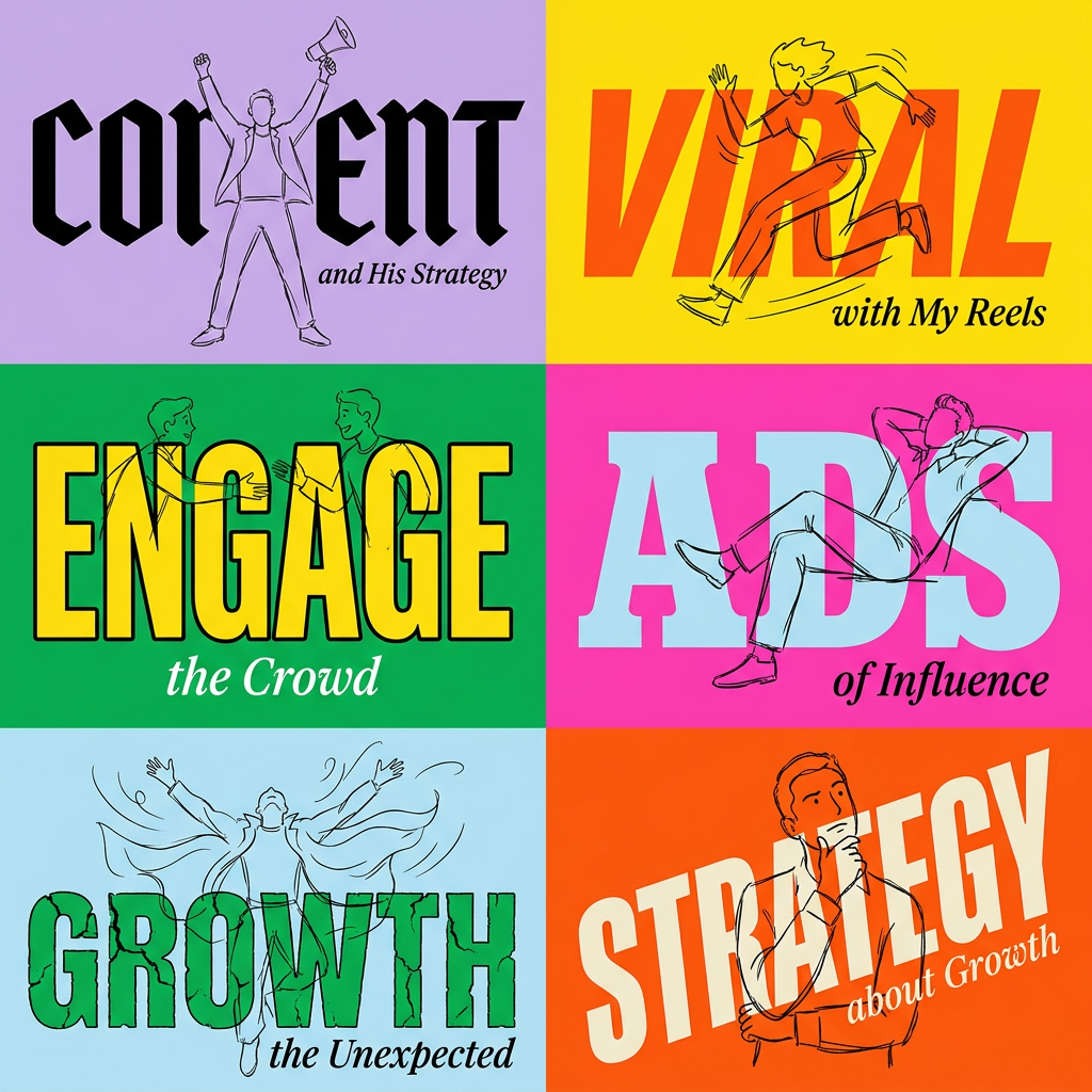
Create striking 2x3 editorial posters with six seamless, flat-color square cards in a perfect 4:5 grid. There are absolutely no gaps between the blocks, giving your content a bold, high-contrast magazine layout. It looks incredibly clean on any social feed.
Regenerate using your own assets.
Step 2: Lock in your typography and color with a Brandkit
The second place generic AI fails is with typography and color. You ask for Helvetica and get a distorted, unreadable mess. You ask for monochrome and get random splashes of sepia. Brutalism demands control over these elements.
On MyUP.ai, you solve this with a Brandkit. Before you even start generating, you can create a simple “Brutalist Brandkit” that locks in your rules:
- Colors: Set a strict palette. For example: Black (#000000), Off-White (#F5F5F5), and a single, optional accent color like a signal red.
- Fonts: Choose one or two specific sans-serif fonts. Think functional, legible typefaces like Akzidenz-Grotesk or a clean system font. Assign them to headings and body text.
Once your Brandkit is saved, every asset you create will automatically inherit these rules. The AI no longer has to guess at your font or color scheme; it’s required to follow the brand identity you’ve established. This simple step eliminates 90% of the randomness and ensures every poster feels like part of a coherent system.
Step 3: Generate content that follows the rules
With your grid enforced by a template and your brand elements locked in by a Brandkit, you can finally generate the visual content with confidence. Now, your prompts can be simpler and more focused on the subject matter—an architectural photo, a block of text, a simple graphic—because the stylistic heavy lifting is already done. You’re no longer fighting the AI; you're directing it within a system you control.
This method works for different sub-styles of brutalism, too. If you want a more textured, analog feel that evokes zines or photocopied flyers, you can start with a template that incorporates those elements while still maintaining a strong underlying structure. It's the same principle as getting a consistent risograph effect with AI; you start with a system that understands the medium's constraints.
Workflow code: #myup-msop-hlxf
Retro Zine Style Event Poster
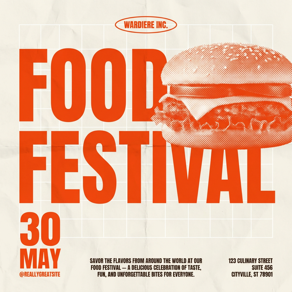
Give your social posts a gritty, analog zine aesthetic. It layers a crumpled paper texture and a subtle grid over a warm cream background to make any event graphic look like a tactile, photocopied flyer. Perfect for DIY gigs and bold promos.
Regenerate using your own assets.
Example workflow: A bold, color-blocked event poster
Brutalism doesn't have to be black and white. Its principles of bold forms and structured layouts work incredibly well with vibrant color. Let's create a poster for a summer music series using this workflow on MyUP.ai.
- Select the Brandkit: We’ll use a Brandkit with a bold, warm yellow as the primary accent color and a heavy sans-serif for the typography.
- Choose the Template: Start with a template designed for strong color blocking and a clean grid. The 'Bold Retro Yellow Event Poster' is perfect for this, as it combines a rigid structure with a vibrant, optimistic feel.
- Add Content: Input the event name, date, and lineup. The template will automatically apply the Brandkit's font and colors, arranging the text within the predefined grid.
- Generate and Validate: Let MyUP generate the poster. The output will respect the layout, typography, and color palette. Your role is simply to validate the result and make minor tweaks if needed.
The final product is a poster that is unmistakably brutalist in its principles but also visually exciting and on-brand for a modern event.
Workflow code: #myup-xbur-hzoi
Bold Retro Yellow Event Poster
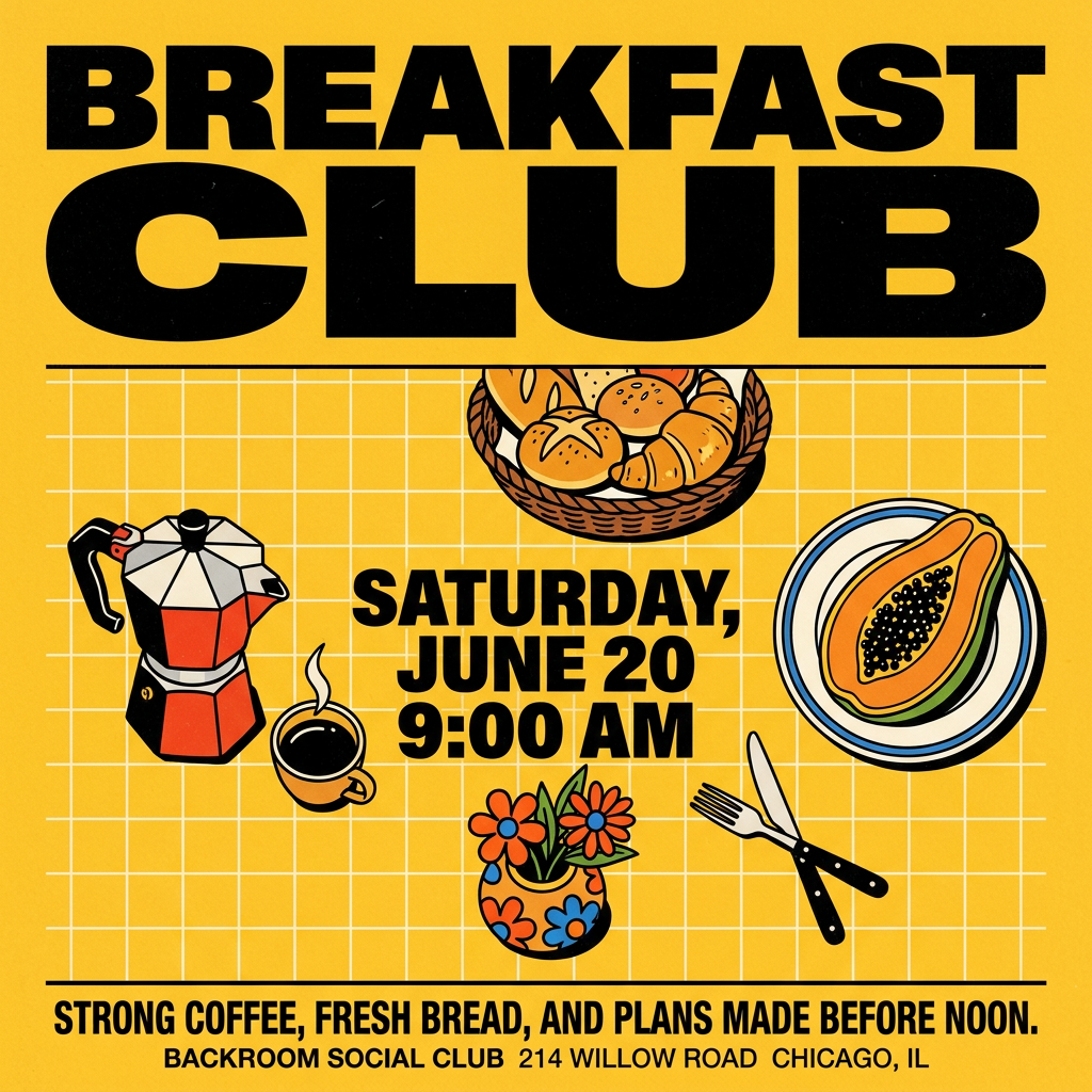
Turn your branding or event details into bold, nostalgic posters. It blends vibrant warm backdrops with a clean, retro square grid pattern to make any announcement look like a classic piece of mid-century graphic design.
Regenerate using your own assets.
Stop prompting for styles. Start building with systems.
The frustration of trying to create specific design styles with AI comes from a fundamental misunderstanding of the tools. Generic image generators are not design partners; they are pattern aggregators. To create work that feels intentional, you need a system that respects the rules of design.
Using a platform like MyUP.ai shifts your role from a frustrated prompter to a creative director. You establish the system—the grid, the typography, the color palette—and the AI executes within it. This is how you produce consistent, high-quality visual assets at scale, whether it's a brutalist poster, an on-brand product ad, or a series of high-quality GIFs. Stop prompting for styles and start building with systems that understand them.
