That stunning AI art for your book cover is useless without good typography
You’ve been there. After hours of prompting and refining in Midjourney or Stable Diffusion, you finally have it: the perfect, evocative image for your new book. It captures the mood, the genre, everything. Then you add the title and your author name to the prompt. The result is a mess. Warped letters, nonsensical words, disastrous spacing. The art is 90% of the way there, but the last 10%—the typography that actually sells the book—makes it look completely amateur.
This is the single biggest frustration for authors and self-publishers using AI. You're forced into a clumsy, multi-tool process: generate the art in one place, then export it to Canva or Photoshop to manually add text, hoping you can get the alignment and font pairing right. It's a workflow that kills momentum and often leads to a cover that feels disconnected. The image says one thing, and the text says another.
Why image generators can't 'design' text (and never will)
The problem isn't your prompt. It's fundamental to how AI image models work. When you ask a tool like Stable Diffusion to add a title, it isn't performing a design function like a layout program. It is not 'typesetting'. It is 'drawing' the shapes of letters as it understands them from its training data. It’s treating your title as just another part of the image, like a tree or a face.
This is why you get such poor results. The AI has no concept of kerning (the spacing between individual letters), leading (the space between lines of text), or typographic hierarchy (making the title more prominent than the author's name). It can't load and render a specific font file with precision. It just mimics the appearance of text, which results in the wobbly, often illegible output you've seen. Even with recent improvements like in SD3, the control required for professional design just isn't there. For a deeper dive on this, see our guide on the workflow that fixes AI-generated text.
The professional workflow: separate art from typography
Professional designers don't try to solve every problem with one tool. They use the right tool for each step. The same logic applies here. The solution isn't a better prompt; it's a better workflow that separates the two distinct creative tasks:
- Image Generation: Use AI for what it excels at—creating stunning, original artwork.
- Typography & Layout: Use a design-aware system to apply your title, author name, and other text elements with full control over fonts, colors, and placement.
This is precisely how MyUP is designed to work. Instead of trying to force an image model to be a graphic designer, you use a MyUP workflow that treats each step as a distinct, controllable part of the production process. You approve the art, and MyUP handles the design, ensuring a professional and cohesive final product.
Step 1: Generate cover art that leaves room for a title
The first step is to create your background art. When prompting, your goal is not just a beautiful image, but a beautiful image that functions as a book cover. This means thinking about composition from the start. Use prompts that encourage negative space or clear areas where text can live without competing with the art.
Good compositional prompts include phrases like:
- "Vast, empty sky above a lone figure"
- "Minimalist composition, subject off-center"
- "Negative space at the top third of the image"
- "Dark, moody background with a single point of light"
In MyUP, you can use a workflow to generate dozens of art variations until you find the perfect one. The user validates the creative direction; MyUP handles the production. Many poster templates are excellent starting points for generating cover art because they are already designed with text placement in mind.
This poster workflow, for example, is great for generating bold, graphic backgrounds that leave plenty of room for your title.
Workflow code: #myup-xbur-hzoi
Bold Retro Yellow Event Poster
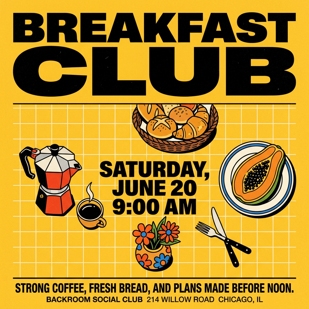
Turn your branding or event details into bold, nostalgic posters. It blends vibrant warm backdrops with a clean, retro square grid pattern to make any announcement look like a classic piece of mid-century graphic design.
Regenerate using your own assets.
Step 2: Apply perfect, on-brand typography with a Brandkit
This is where you take back control and ensure your cover looks professional. Instead of leaving fonts to chance, you define them explicitly in your MyUP Brandkit. A Brandkit is your central visual identity: it stores your specific fonts, color palettes, and logos. For a book series, this is non-negotiable for consistency.
Here’s how it works:
- Set up your Brandkit: Upload your specific title font (e.g., a bold serif like Trajan Pro) and your author font (e.g., a clean sans-serif like Gotham). Define your primary and secondary colors. This is a one-time setup.
- Choose a Workflow: Select a MyUP workflow designed for strong typography. The workflow will first generate the art you prompted in Step 1.
- Apply the Brandkit: In the next step, the workflow automatically pulls the fonts and colors from your Brandkit and composites them onto the generated image. You simply provide the text for the title and author name. The result is perfectly rendered, well-spaced typography, every time.
This workflow for a magazine cover is ideal for this task, as it's built around a powerful typographic hierarchy. Just input your book's details, and it will apply your Brandkit's fonts with professional polish.
Workflow code: #myup-yk1h-uqy8
High-End Editorial Fashion Magazine Cover
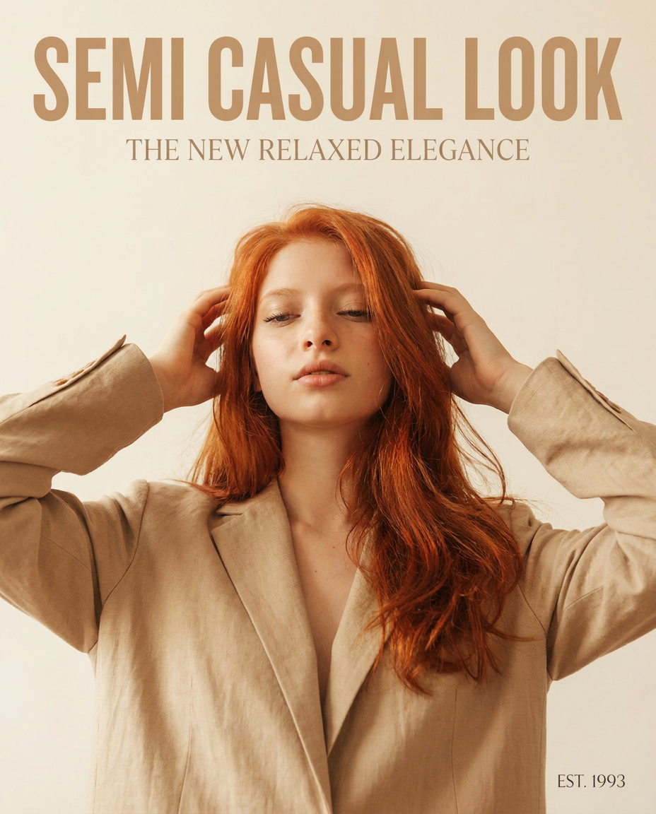
Drop in any portrait and turn it into a high-end editorial magazine cover. It frames your subject beautifully with relaxed, high-fashion posing and soft styling for a polished print aesthetic.
Regenerate using your own assets.
Putting it all together: cover examples by genre
This two-step workflow is versatile enough for any genre. The key is that the mood is set by the AI art, while the professionalism is guaranteed by the Brandkit-driven typography.
- For a Thriller: Generate a dark, high-contrast image of a shadowy figure. The workflow then applies a stark, condensed sans-serif font from your Brandkit for a tense, modern feel.
- For a Cookbook: Prompt for a bright, top-down shot of fresh ingredients on a rustic wooden table. The workflow can then overlay a friendly, handwritten-style script font for the title, pulled directly from your Brandkit.
- For a Business Book: Create a clean, abstract graphic with geometric shapes. The workflow will apply a classic, authoritative serif font for the title, ensuring it looks credible and serious.
This food-focused workflow is a perfect example. It generates beautiful, appetizing imagery and then layers clean, readable text on top—a great model for any cookbook or lifestyle brand.
Workflow code: #myup-aktp-7jq0
Food Magazine Mosaic Cover
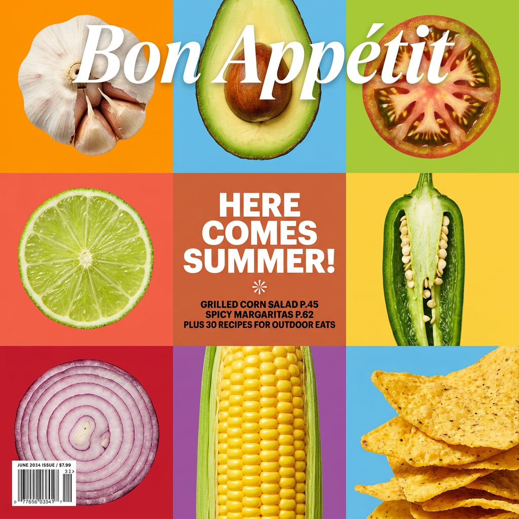
Turn your food shots into a bold, high-end editorial cover. It takes extreme close-ups of your dishes or ingredients and arranges them into a vibrant 3x3 grid that looks straight out of a premium food magazine.
Regenerate using your own assets.
Stop wrestling with prompts and start designing your cover
The promise of AI book cover generators is real, but only if you use them correctly. Stop trying to find the magic prompt that will solve typography. It doesn't exist. The professional, repeatable path to a high-quality cover is to separate the creation of art from the design of text. Use AI as a world-class illustrator, but use a system like MyUP as your expert typographer.
By building a simple Brandkit and using a two-step workflow, you can move from frustrating, unpredictable results to consistent, professional book covers that you control. This is how you turn a powerful new technology into a reliable tool for your author business.
