
You've seen it all over TikTok and Instagram. You type "Y2K aesthetic" into an AI generator, hoping for that perfect mix of cyber-optimism and glossy plastic, and what you get back looks... cheap. It’s a flat, generic filter that screams “AI-generated” and misses the entire point of the style. You're not alone in your frustration. The reason for these low-quality results isn't your prompt; it's that you're asking a tool for a one-off image when what you really need is a style system.
An authentic aesthetic isn't a single command. It's a collection of rules: a specific color palette, a set of typefaces, recurring textures, and compositional tendencies. To create Y2K visuals that feel genuine and work for a brand, you need to stop chasing the perfect prompt and start building a reusable visual identity. Here’s how to do it in MyUP by building the aesthetic's DNA directly into a Brandkit, giving you endless, on-brand Y2K assets instead of disposable, inconsistent images.
First, deconstruct the aesthetic: what actually makes a visual feel 'Y2K'?
Before you can build, you have to deconstruct. The Y2K look isn't one monolithic style; it's a blend of sub-genres born from the transition from analog to digital. To control the AI's output, you need to be specific about the components. Let's break them down into tangible elements you can feed into a system.
The Color Palette: Iridescence and Cyber-Pastels
Y2K colors are a mix of digital optimism and futuristic sheen. Forget basic color codes; think in terms of textures and effects.
- Iridescent & Pearlescent: Think of the shimmer on a CD-ROM or a flip-phone casing. Use terms like "holographic sheen," "pearlescent finish," and "prismatic colors."
- Cyber-Pastels: These aren't soft, muted pastels. They're bright, almost-neon shades of blue, pink, and lime green, often rendered with a digital glow. Think "electric lilac" or "acid green."
- Metallics: Polished, liquid chrome is a staple. Use "polished chrome," "liquid mercury," or "anodized aluminum" to get that futuristic, skeuomorphic hardware look.
Typography: Chunky, Gel-like, and Chromatic
The fonts of the era were experimental and often pushed the boundaries of legibility for the sake of style.
- Bloated & Rounded: Look for bold, chunky sans-serifs with inflated letterforms. Prompts can include "inflated typography" or "bubble letters."
- Gel & Plastic Effects: Translucency is key. Describe fonts as "translucent gel typography," "glossy plastic letters," or "aqua-style UI button."
- Chrometype: This refers to the hyper-polished, beveled, metallic text effects that were everywhere. "Liquid chrome text effect" or "beveled metallic logotype" are effective descriptors.
Textures and Motifs: The Digital Made Physical
The aesthetic was defined by the look and feel of new consumer technology and digital interfaces.
- Translucent Plastic: The iMac G3 is the quintessential example. Use "translucent colored plastic casing" or "see-through electronics."
- Digital Grunge & Glitch: Low-res pixelation, scan lines, and digital artifacts were embraced as part of the new digital reality. Think "pixelated graphics," "glitch art effect," and "early 2000s digital camera artifacting."
- Bubblegum Pop & Sci-Fi: Combine futuristic elements with playful, optimistic motifs like stars, hearts, and abstract blob shapes, often with a high-gloss finish.
The workflow: build your Y2K style guide in a MyUP Brandkit
Now that you have the raw ingredients, it's time to build your system. A MyUP Brandkit is designed to store these kinds of specific visual rules, ensuring every asset you generate adheres to them automatically. This is a one-time setup that saves you from rewriting complex prompts for every single image.
Here’s how to translate the Y2K components into your Brandkit:
- Define Your Color Palette: In the Brandkit color section, don't just add flat hex codes. Use the description fields to specify effects. For example, next to a silver color (#C0C0C0), add the instruction: "Always render as polished liquid chrome or with an iridescent sheen." For a pastel pink, add: "Render as glossy, translucent bubblegum pink plastic."
- Upload Your Fonts: Choose 2-3 Y2K-inspired fonts (you can find many free-for-commercial-use options online that mimic the era's style). Upload them to your Brandkit. In the style guide notes, specify how they should be used, e.g., "Main headline font should always have a beveled, gel-like effect."
- Codify the Style Descriptors: This is the most critical step. In the Brandkit's style guide or visual identity section, add the core textural and thematic prompts we deconstructed earlier. Create a list of keywords like: "Y2K cybercore aesthetic, glossy and translucent materials, iridescent surfaces, digital artifacts, low-res digital photography look, shot on a 2001 Sony Cybershot, bubblegum pop futurism."
By saving these rules, you've created a permanent reference point. Now, instead of starting from scratch, every workflow you run in MyUP will automatically pull from this Brandkit. The AI is no longer guessing; it's following your explicit creative direction. You validate the output, but MyUP handles the production, ensuring every single asset is perfectly on-brand.
Generate a full Y2K campaign, not just a single image
The real power of a system emerges when you need to create more than one asset. A single good image is an accident; a dozen consistent images is a brand campaign. With your Y2K Brandkit established in MyUP, you can now generate a wide variety of assets that all feel like they belong together.
Imagine you need a set of social media posts for a product launch. Instead of prompting each one individually and hoping for consistency, you can use a workflow designed for this purpose. The workflow will automatically apply your Brandkit's colors, fonts, and style rules to create a series of related visuals.
This is how you move from just making a picture to producing a campaign. For a classic Y2K scrapbook or zine look, the workflow below is the perfect starting point. It's designed to combine elements into a collage that feels authentic to the era, and it will automatically use your Brandkit to ensure the style is correct.
Workflow code: #myup-sacz-tjdn
Y2K Scrapbook Collage Creator
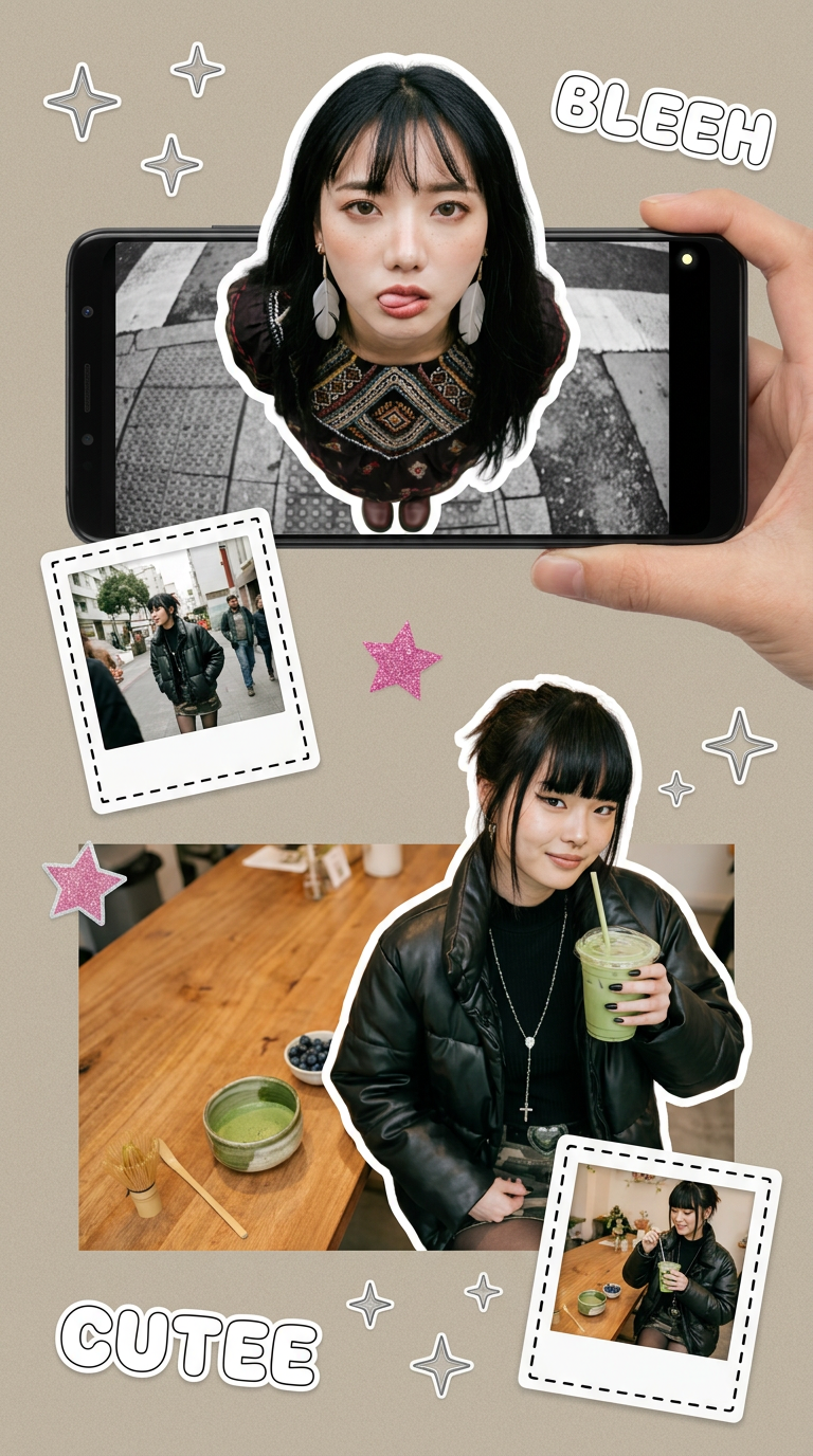
Put two different people into the same scene without losing their real-world features. Just upload two portraits and drop them together into any setting or style you need. It keeps both faces incredibly accurate.
Regenerate using your own assets.
Create posters and event assets that look authentic
The same principle applies to any other marketing asset. Need a poster for an event? Or a flyer for a promotion? Your Y2K Brandkit ensures the visual language remains consistent, whether the output is a square Instagram post or a vertical poster.
This solves one of the biggest frustrations for creators: getting the AI to replicate a style across different formats and compositions. Because the core style DNA is saved in your Brandkit, not in a one-time prompt, you can confidently generate new assets without losing the specific aesthetic you've defined.
To create a poster with a raw, photocopied zine feel that was common in Y2K subcultures, you can use a dedicated workflow. This template understands the compositional needs of a poster and will pull from your Brandkit to apply your unique Y2K style.
Workflow code: #myup-msop-hlxf
Retro Zine Style Event Poster
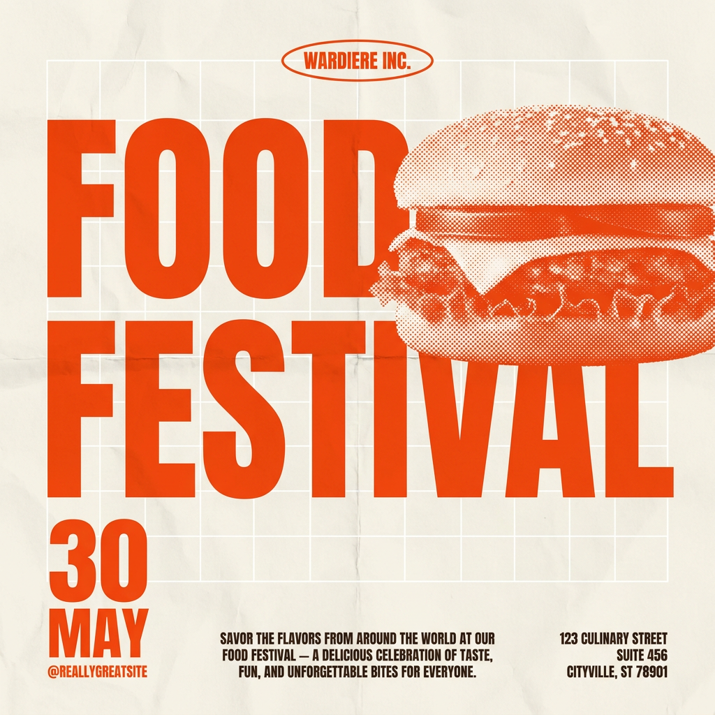
Give your social posts a gritty, analog zine aesthetic. It layers a crumpled paper texture and a subtle grid over a warm cream background to make any event graphic look like a tactile, photocopied flyer. Perfect for DIY gigs and bold promos.
Regenerate using your own assets.
What about different Y2K sub-styles?
The Y2K aesthetic is broad. What if you need to shift from the clean, optimistic 'bubblegum pop' look to something grittier, like digital grunge or a vintage risograph print? A system-based approach makes this easy without starting over. You have two main options in MyUP:
- Tweak Your Brandkit: You can temporarily add or modify style descriptors in your Brandkit. For example, add "distressed risograph print effect, halftone dots, grainy texture, misaligned color layers" to your style guide. All subsequent generations will adopt this grittier feel.
- Use a Specialized Workflow: Some workflows are built to achieve a very specific output. For a risograph look, you can use a template that is already optimized for that texture and printing style. It will still use your Brandkit's core colors and fonts but will apply them within the context of a riso print.
This gives you the creative control to explore different facets of the trend with precision. For an authentic, textured print look, the risograph poster workflow is the ideal tool.
Workflow code: #myup-3xus-3l9x
Vintage Risograph Event Poster
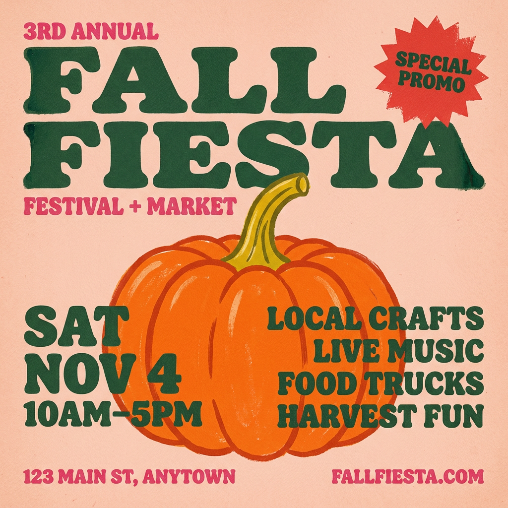
Turn any announcement into a gritty, tactile gig poster. It layers your text with an uneven letterpress ink texture over a dusty, warm pink risograph paper background. It’s perfect for giving social posts a real analog, screenprinted vibe.
Regenerate using your own assets.
The final step: stop chasing prompts, start building systems
Tapping into a visual trend like Y2K for your brand requires more than just knowing the right keywords. It requires consistency, control, and a way to scale production without sacrificing quality. One-off prompts will always deliver one-off results, often leading to the generic, 'cheap filter' look that fails to connect.
The professional approach is to treat the aesthetic like a design system. By deconstructing its core components and building them into a reusable MyUP Brandkit, you gain the power to generate an entire campaign of authentic, on-brand content. This is how you move from being a user of AI to being a creative director, guiding the tool to produce precisely what you need, every single time. The workflows in this article are your starting point to take back control.
