If you've been on X.com in the last day, you’ve probably seen the viral thread from a designer tearing apart the generic, nonsensical logos churned out by AI generators. Your frustration is real. You type “logo for a coffee shop” and get back a dozen variations of the same clichéd coffee bean icon. You feel like you're wasting your time.
Here’s the truth: the problem isn't that AI is bad at design. The problem is that a logo isn't the result of a single command. It's the outcome of a process. Treating a generator like a vending machine is why you're getting junk food results.
A professional designer uses a workflow of exploration, refinement, and strategic selection. You can use AI to accelerate that workflow, not skip it. This guide shows you how. We'll move from a bad result to a good one, and then from a good logo file to a fully operational brand system you can apply instantly to any design, like this poster. Workflow code: #myup-k4td-9k6z
Minimalist Poster
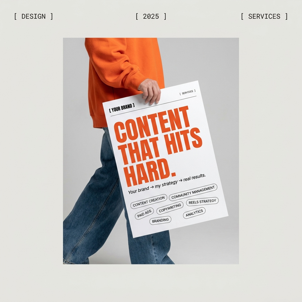
Give your social feed a clean, gallery-like aesthetic. This layout frames your images with structured mono typography and soft, neutral backgrounds for a high-end editorial look. It's perfect for minimal product launches or brand announcements.
Regenerate using your own assets.
Step 1: Brainstorm brand concepts, not logos
Professional designers don't start by drawing logos. They start with words: mood, feeling, value, promise. Your first step with AI should be the same. Instead of asking for a finished logo, use the AI as an infinite brainstorming partner to generate visual concepts.
Forget prompting for a “logo.” Prompt for a mood board. The goal here is discovery, not finality. You want to explore visual language that communicates your brand's essence.
For example:
- Instead of: “Logo for an eco-friendly skincare brand.”
- Try: “Visual concepts for serenity, nature, and science. Abstract shapes, muted color palettes of green and beige, clean lines, organic textures.”
- Instead of: “Logo for a tech startup.”
- Try: “Moodboard for a brand that feels innovative, accessible, and human. Geometric patterns, bright gradient colors, sense of motion and connection.”
This approach gives you a rich palette of ideas to work with, moving you away from predictable clichés and toward something genuinely unique.
Step 2: Iterate on a single concept to create a logomark
From the dozens of concepts in your mood board, one or two will stand out. Now, your job is to refine that raw idea into a functional logomark—a clean, memorable symbol that works at any size.
This is the iterative phase. Take the most compelling image from your brainstorming session and start a new conversation with the AI. Your prompts should now be focused on simplification and abstraction.
Effective refinement prompts look like this:
- “Take the abstract floral shape from the previous image and simplify it into a single-color, geometric icon.”
- “Isolate the main element and render it as a clean vector-style graphic on a white background.”
- “Explore variations of this mark, focusing on negative space and balance.”
- “Make the lines bolder and remove all internal details.”
With each prompt, you are guiding the AI closer to a strong, simple mark. You’re not just rolling the dice; you’re directing the creative process. The user validates the output at each step, ensuring the results stay on track.
Step 3: The human check: selection, vectorization, and typography
AI’s job is to generate options. Your job is to make strategic decisions. After the iteration phase, you should have a handful of strong logomark candidates. The final steps require human control and expertise that AI cannot replicate.
1. Strategic Selection: Which mark best communicates your brand's core message? Which one is most memorable and distinct from competitors? This is a business decision, not an aesthetic one.
2. Vectorization: AI image generators create raster images (pixels). A professional logo must be a vector file (mathematical paths) so it can be scaled to any size—from a tiny favicon to a giant billboard—without losing quality. You will need to use a tool like Adobe Illustrator or an online vectorizer to trace your chosen raster image into a clean SVG file.
3. Typography: Never let an AI choose your brand’s font. Most models are still terrible at rendering clean, well-spaced text (kerning). The wordmark or logotype should be created separately using a professional font that complements the logomark. This is a deliberate design choice, not a generated accident.
You have a logo. Now you have a bigger problem.
Congratulations. Through a smart workflow, you've guided an AI to help you create a unique, meaningful logomark. You have a crisp SVG file saved on your desktop. You’ve solved the creative challenge.
But you’ve just created a much larger, more practical business problem: how do you actually use it consistently?
A logo file is not a brand identity. A brand identity is a system. Without one, you’re now facing the daily, manual grind of applying that logo. You'll be constantly resizing it, guessing at color codes, and trying to make every social post, presentation, and ad look coherent. This is where most brands, especially new ones, fall apart. The inconsistency erodes trust and makes the brand look unprofessional, undoing all the hard work you put into the logo itself.
Turn your new logo into a one-click brand system
This is where you stop being a manual content producer and start directing a brand system. In MyUP, you can build a Brandkit—a living, intelligent version of your brand guidelines that automates consistency.
The process is simple. You upload your final logo file. MyUP instantly analyzes its form and color, generating a complete, harmonious color palette based on your design. It then suggests professional font pairings that complement your logomark's style. You have full control to approve or adjust these suggestions. In minutes, your brand identity is no longer just a file; it’s codified into a reusable, one-click system. This is how you scale your brand without scaling your workload.
Instantly apply your brand to any design
A Brandkit isn't just a static style guide; it's an active engine for content creation. The moment it's saved, you can apply your entire visual identity—logo, colors, fonts—to any template with a single click.
Let's say you need a quick announcement for social media. Instead of opening a blank canvas and fumbling with hex codes and font files, you just open a template like the Minimalist Poster and apply your Brandkit. The colors, fonts, and logo instantly populate the design, perfectly on-brand and ready to go. The time spent on manual setup drops to zero.
This is the real value of a branding workflow. It doesn't end with a logo; it begins there. You can try this final step yourself. Workflow code: #myup-k4td-9k6z
AI is your co-founder, not your designer
The viral threads complaining about bad AI logos miss the point. They're criticizing a tool for failing at a job it was never meant to do alone. AI isn't your designer, hired to deliver a final, strategic asset on the first try. It's your tireless co-founder, ready to brainstorm 1,000 ideas at 3 AM.
Your role is to provide the vision, make the critical selections, and build the system that turns a great idea into a functional brand. A successful logo comes from a smart workflow where AI assists a human's strategic decisions. Stop prompting for a logo. Start building a brand system. Create your MyUP Brandkit today.
