You've experienced the magic. You describe a brilliant idea for a poster to an AI like Claude, and in seconds, a visual appears. But then you look closer. The brand name is misspelled, the layout is awkward, and it has a generic quality you can't quite put your finger on. This is the 'almost good' problem, and it's the barrier between a fun experiment and a professional asset you can actually use for your business.
The 'almost good' problem: why your Claude designs fall short
You've seen the potential. You type a detailed description into a powerful AI like Claude—'a retro-style poster for our new coffee brand'—and in seconds, an image appears. But then you look closer. The brand name is misspelled, the layout is awkward, and it has a generic quality you can't quite put your finger on. This is the 'almost good' problem, and it’s the difference between a fun experiment and a professional asset you can actually publish.
As businesses and marketers integrate AI into their creative process, this frustration is becoming universal. You're not alone. The issue isn't your prompt; it's the tool's fundamental limitation. Let's diagnose the specific visual artifacts that make these designs fall short.
1. Garbled Typography and Mangled Text
Even the most advanced models like Claude 3 struggle with text. You'll see misspelled words, letters that blend into each other, or nonsensical characters. For any marketing material, from a social media post to an ad banner, unreadable text makes the design instantly unusable.
2. Weak Composition and Layout
An AI generator might place all the elements you asked for on the canvas, but it rarely understands the principles of visual hierarchy, balance, and flow. The result is often a flat, cluttered, or awkwardly spaced design that lacks the intentionality and impact of a professionally composed piece.
3. Inconsistent Branding
You ask for your brand's specific shade of green, and you get a generic lime. You try to include your logo, and it comes out warped and distorted. Language models don't have a persistent memory of your visual identity, leading to creations that feel off-brand and disconnected from your other marketing efforts.
4. The Generic 'AI' Look
Without a strong directorial hand, raw AI generations often default to a polished but soulless aesthetic. They lack a unique point of view, a specific mood, or the subtle imperfections that make a creative asset feel authentic and memorable. Your startup's 'unique' poster ends up looking like hundreds of others generated that day.
Why endless prompt tweaking is the wrong fix
When faced with these flaws, the most common instinct is to go back and endlessly tweak the prompt. You might try adding terms like 'perfect spelling,' 'minimalist Swiss design,' or 'using the font Helvetica.' This can feel productive, but it's a fundamental misunderstanding of the tool.
Claude is a large language model, not a graphic designer. It excels at understanding and generating text, but it doesn't possess an innate knowledge of typography, color theory, or compositional balance. Prompting for these things is like trying to teach a novelist to be an architect by giving them more descriptive words—you might get a more detailed description of a building, but you won't get a usable blueprint.
Advanced users are now attempting a workaround called 'design system prompting,' where they feed massive blocks of text detailing their brand guidelines (HEX codes, font names, spacing rules) into the AI for every single generation. This is a tedious, error-prone, and manual hack that highlights a core need: a structured, repeatable way to apply a brand identity. It proves that the solution isn't a better prompt; it's a better production method.
The solution: move from raw generation to creative production
The solution is to shift your mindset from 'fixing' raw generations to 'producing' finished creations. There's a critical difference between a tool that gives you raw material (a generator) and a platform that delivers a final product (a creative production platform).
MyUP is the Creative Production Platform that turns your intention directly into a publish-ready result. We believe you shouldn't have to become a design expert or a prompt engineer to create studio-quality visuals. You provide the vision—'I want a high-converting ad for my product'—and MyUP handles the technical production from A to Z.
This is achieved by building on two core principles: starting with a professional foundation and automating brand consistency. Instead of hoping the AI guesses correctly, you use a system built on proven design expertise.
Practical guide: creating a professional poster with MyUP
Step 1: Set your brand identity once with a Brandkit
Instead of manually typing your brand guidelines into a prompt every time, you set them up once in MyUP's Brandkit. Just enter your website URL, and MyUP automatically builds a complete visual identity with your logo, colors, and fonts. This Brandkit is then automatically applied to every creation, ensuring perfect consistency without any extra effort. It's the automated, professional solution to the tedious 'design system prompting' problem. This solves brand consistency from the very start, forming the foundation for all your visual assets. For a deeper dive on this, see our guide to building an AI brand identity.
Step 2: Choose a professional template for a solid foundation
With your brand's DNA locked in, you can bypass the composition and typography lottery. Instead of starting from a blank slate, you start with a professional template created by a top designer. These templates have strong visual hierarchy, balanced layouts, and expert typography baked in.
For our coffee poster example, you could select the 'Retro Style Food Advertising Poster'. This template already has a strong composition and a classic typographic style that guarantees a professional look. It's designed to make a product the hero, with a layout that guides the viewer's eye. Simply tell MyUP to use it for your project.
Template: #myup-1hgd-9oz5
Retro Style Food Advertising Poster
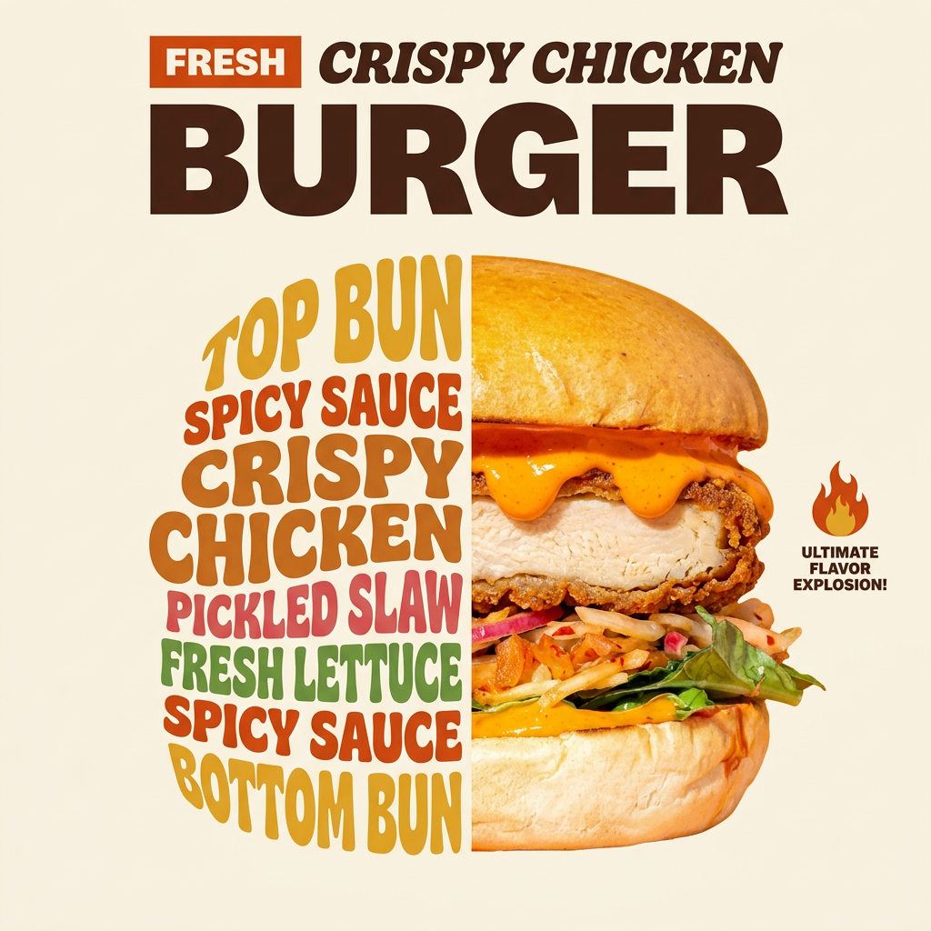
Turn any food product shot into a bold, nostalgic retro advertisement. It drops your item onto a warm cream background and automatically frames it with a color-matched header badge for that classic mid-century print ad look.
Regenerate using your own assets.
Step 3: Generate and validate your finished creation
With your Brandkit active and your template chosen, the final step is simple. You provide your specific inputs—like a photo of your coffee bag and the headline 'Morning Ritual, Perfected'—and let MyUP produce the final asset. The platform intelligently combines your brand identity, the template's professional structure, and your content to deliver a finished poster.
The result is not a random generation that needs fixing; it's a polished, on-brand creation ready to publish. This reliable, quality-first method applies to any creative intention:
- For a high-fashion social post: Use the 'High-End Editorial Fashion Magazine Cover' to instantly frame a portrait with a polished print aesthetic. Template: #myup-yk1h-uqy8
- For an event announcement: The 'Bold Retro Yellow Event Poster' provides instant visual impact with its vibrant, nostalgic grid design. Template: #myup-xbur-hzoi
- For a lifestyle ad: Create an authentic, engaging scene with the 'Bold Portrait Food Advertising Photo' to show customers enjoying your product. Template: #myup-xjsb-hirr
In every case, you move directly from your idea to a high-quality, finished result, skipping the entire frustrating cycle of fixing artifacts.
Stop fixing, start creating
The goal for your business isn't to become an expert at debugging AI artifacts. It's to produce high-quality, on-brand creative that drives results. Raw generators like Claude are powerful for ideation, but for professional production, you need a system designed for the job.
MyUP is that system. It's the Creative Production Platform that empowers you to turn any creative intention into a finished, publishable creation. Stop fixing, and start creating what you imagined. Make Your Unimaginable Possible.
