
So you've tried the new Artifacts feature in Claude 3.5 Sonnet to make a chart. You fed it your data, asked for a bar graph, and it generated a neat little window with some SVG code. It works. But it looks nothing like your brand. The colors are default, the font is generic, and the style is completely disconnected from your visual identity. You're not alone. This is the exact wall thousands of creators hit within days of the model's June 20, 2026 release.
The promise of generating visuals directly in a chat interface is powerful, but the reality is that language models are not graphic designers. They don't know your brand's specific hex codes, your approved typeface, or the subtle illustrative style that makes your content recognizable. Trying to force it through prompting is a slow, frustrating process of trial and error. There's a better way.
Claude 3.5 Sonnet can give you chart code, but not a finished design
The Artifacts feature in Claude 3.5 Sonnet is a genuine step forward for interactive AI. It's brilliant for generating code snippets, writing and previewing text, or creating basic wireframes. For data visualization, it can instantly render SVG code for standard charts. The problem is that this raw output is just a starting point—a technically correct but creatively empty shell.
Getting from that generic SVG to a finished, on-brand graphic that you can actually publish requires manual work:
- Editing the code to change colors and fonts.
- Importing the SVG into a design tool like Figma or Illustrator.
- Manually applying your brand styles and layout.
- Adding logos, headlines, and other branded elements.
This multi-step, manual process completely defeats the purpose of using AI for speed and efficiency. The core issue is a misunderstanding of the tool's purpose. We're asking a brilliant data analyst to do a brand designer's job.
Part 1: Use Claude as your data strategist, not your designer
The most effective workflow reframes Claude's role. Instead of asking it to be a pixel-perfect designer, use it as a creative partner for data. Its strength is in reasoning and language, which makes it exceptional at finding the story within the numbers and suggesting compelling ways to tell it.
Forget asking for SVG code. Ask for concepts. Feed Claude your raw data and prompt it for ideas:
Prompt Example 1: Finding a Metaphor"I need to visualize a 45% increase in user engagement for our app over the last quarter. The audience is marketers on LinkedIn. Give me three creative visual metaphors to represent this growth, moving beyond a simple bar chart. For each, describe the core visual and the key takeaway."
Prompt Example 2: Structuring a Narrative"Here's our customer feedback data: 60% praise ease of use, 25% mention customer support, 15% request new features. I need to create a simple infographic for our website. Suggest a title, a brief summary, and a visual concept that presents this data in a positive, customer-centric way."
Claude's output will be a set of text-based concepts—a data narrative, a visual metaphor, a structural idea. This is the high-value strategic input. Now, you just need a production tool to execute it.
Part 2: Use a brand-aware AI for production
This is where the handoff happens. A brand-aware visual AI platform like MyUP is built for the second half of this workflow. Instead of being a generalist model, it operates using your specific Brandkit—a visual identity built once from your URL that contains your exact colors, fonts, logo, and approved image styles. It's designed for production, not just ideation.
When you give a MyUP workflow a concept (like the one you just got from Claude), it doesn't have to guess your brand. It automatically applies your visual identity to every output. This means you get the conceptual creativity of a powerful LLM combined with the brand precision of a dedicated design system. The human creator—you—simply validates the final output, making minor adjustments if needed, while the AI handles the repetitive production work.
The workflow: From a data point to an on-brand visual in two steps
Let's make this practical. Here’s the full workflow, from a single data point to a finished, shareable graphic.
Step 1: Get the concept from Claude
Let's use our user engagement data. We prompt Claude: "Visualize a 45% user engagement increase. I need a minimalist and abstract concept for a social media graphic."
Claude might reply with an idea like: "Concept: Ascending Shapes. A series of clean, overlapping geometric shapes (circles or triangles) growing in size and moving upwards from bottom-left to top-right. The color palette shifts from a muted tone to a vibrant one, representing the growth. The number '45%' is the main focal point."
Step 2: Produce the visual in MyUP
This text concept is your creative direction. You don't need code or a design tool. You simply launch a MyUP workflow and feed it the core elements of Claude's idea. For a clean, data-driven visual, the Minimalist Poster workflow is a perfect fit. It's designed to create stylish, typography-led graphics that can easily incorporate abstract data concepts.
You provide the key text ('45% User Engagement Growth') and a short visual prompt based on Claude's idea ('Abstract ascending geometric shapes, minimalist, vibrant color gradient'). MyUP takes that input, automatically applies your Brandkit's fonts and colors, and generates a polished visual ready to go.
Workflow code: #myup-k4td-9k6z
Minimalist Poster
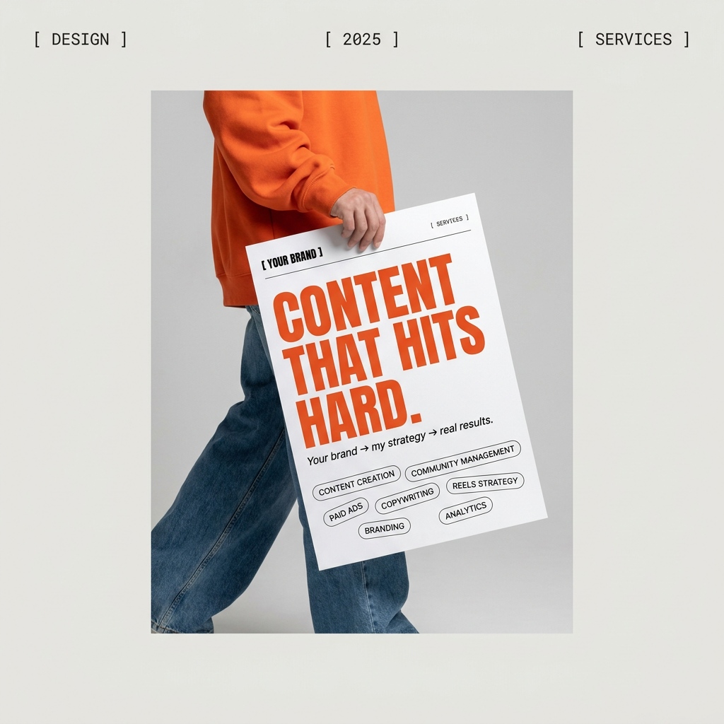
Give your social feed a clean, gallery-like aesthetic. This layout frames your images with structured mono typography and soft, neutral backgrounds for a high-end editorial look. It's perfect for minimal product launches or brand announcements.
Regenerate using your own assets.
Scaling up: From a single chart to a full report
This workflow isn't just for one-off social posts. It's about building a system for creating any data-driven visual content consistently. Imagine you need to create five different charts for a quarterly report or a client presentation. Using the Claude-to-MyUP workflow ensures every single graphic shares the same visual DNA without you manually adjusting styles on each one.
For more complex layouts that combine multiple data points, text, and images—like a full-page infographic for a blog post—you can use a workflow designed for more structured content. The Bold Editorial Grid Poster, for example, allows you to create magazine-style layouts that feel professional and are, most importantly, automatically on-brand.
Workflow code: #myup-n0bi-2wzk
Bold Editorial Grid Poster
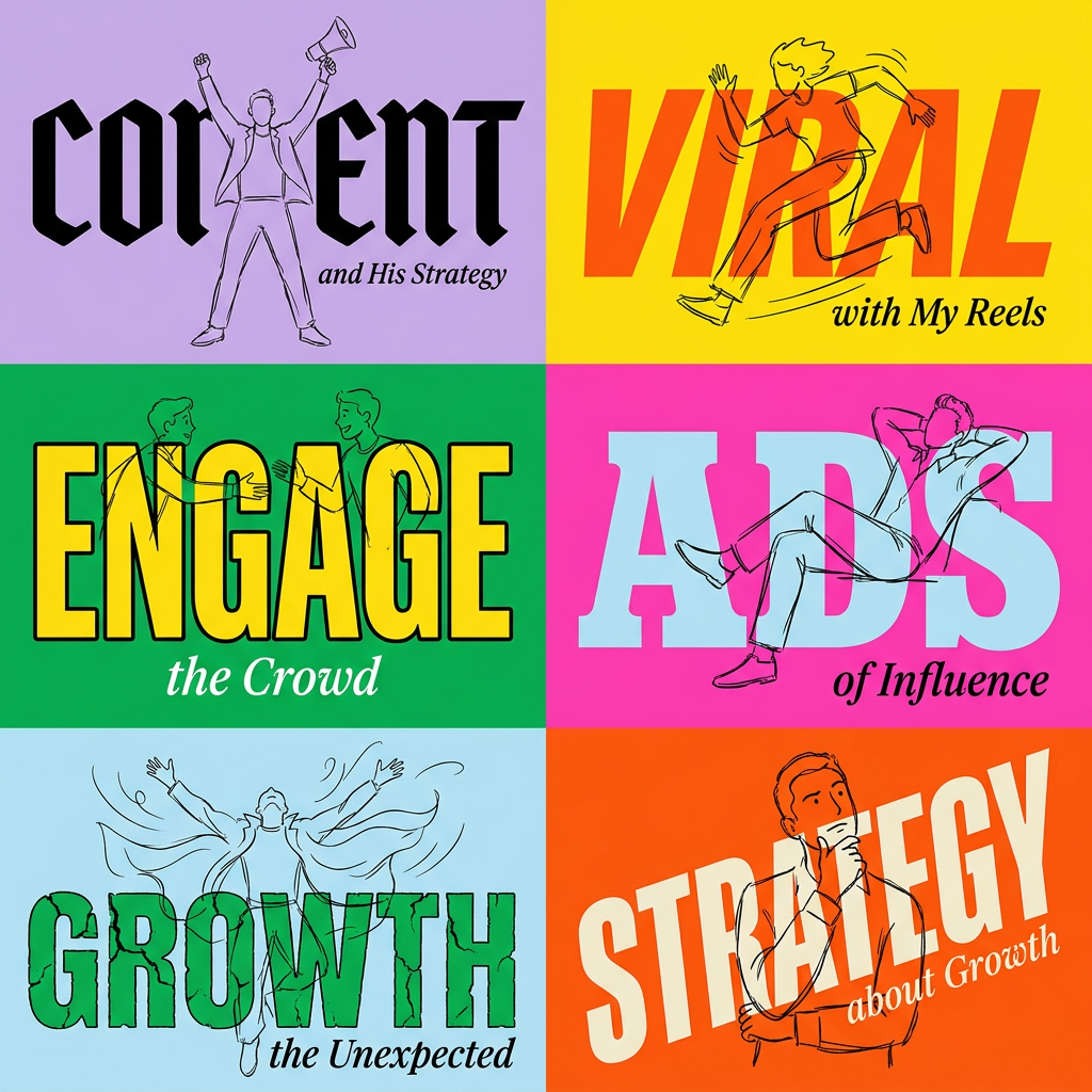
Create striking 2x3 editorial posters with six seamless, flat-color square cards in a perfect 4:5 grid. There are absolutely no gaps between the blocks, giving your content a bold, high-contrast magazine layout. It looks incredibly clean on any social feed.
Regenerate using your own assets.
By separating the conceptual stage (Claude) from the production stage (MyUP), you create a scalable engine for visual content. It's faster than manual design and more brand-consistent than trying to force a generic AI model to understand your style guide. You can learn more about building entire on-brand presentations in our guide to creating slide decks with AI.
The right tool for the job
Claude 3.5 Sonnet is a brilliant tool for thinking. Use it to analyze data, brainstorm ideas, and find creative narratives. But for making things that look and feel like your brand, you need a production tool. The most effective AI workflows don't rely on a single, do-it-all model. They combine the strengths of different specialized systems.
Let Claude be your data strategist. Let MyUP be your automated brand designer. By pairing them, you get the best of both: world-class reasoning to find the story in your data, and a brand-aware production engine to tell that story beautifully and consistently every single time.
