
You’ve seen them taking over your LinkedIn feed: slick, multi-slide carousels explaining a complex topic, all seemingly generated by AI. The recent viral trend proved the format's power, and now you want to know how it's actually done. The problem is, most AI image generators will give you a set of disconnected, off-brand visuals that look cheap and erode trust.
An effective LinkedIn carousel isn't a slide deck; it's a visual story. It needs a narrative hook, a logical flow, and consistent branding. This is the complete workflow to create carousels that don't just get views, but build your authority—all within a single, brand-aware system.
Step 1: Start with the story, not the slides
The biggest mistake creators make is jumping straight into visual generation. An engaging carousel, the kind that makes people stop scrolling and actually increases dwell time, starts with a strong narrative arc. Before you think about colors or images, you need to structure your message.
On LinkedIn, a proven structure follows this path:
- Slide 1: The Hook. A bold title that grabs attention and states the core topic.
- Slide 2: The Problem. Agitate a pain point your audience experiences.
- Slides 3-5: The Solution. Present your unique insight or solution in three to five clear, digestible points.
- Slide 6: The Key Takeaway. Summarize the most important message in a single sentence.
- Slide 7: The Call to Action (CTA). Tell the reader exactly what to do next.
Instead of brainstorming this from scratch, you can use MyUP's AI to build the foundation. Simply provide a core topic, and MyUP will generate a structured text outline for your entire carousel. The AI handles the initial draft; you refine and approve the narrative. This ensures your visual story has a strong backbone before a single pixel is generated.
Step 2: Generate on-brand visuals with a single click
Once your narrative is set, it's time to create the visuals. This is where most AI workflows fall apart, producing slides with clashing fonts, incorrect logos, and random color palettes. The key to professional-looking content is brand consistency, and the key to consistency at scale is a MyUP Brandkit.
A Brandkit is your visual identity, saved and automated. You set it up once by providing a URL or uploading your assets: logo, brand colors, and fonts. From that moment on, every asset you create in MyUP automatically inherits your brand's DNA. No more manually adjusting hex codes or finding the right font file for every single slide.
Let's create the title slide for our carousel. We need something clean, bold, and perfectly aligned with our brand. A simple text-based slide is often the most effective way to start. The workflow below is designed for exactly that.
Workflow code: #myup-k4td-9k6z
Minimalist Poster
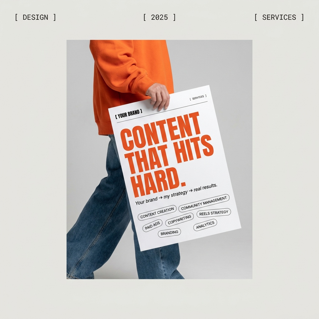
Give your social feed a clean, gallery-like aesthetic. This layout frames your images with structured mono typography and soft, neutral backgrounds for a high-end editorial look. It's perfect for minimal product launches or brand announcements.
Regenerate using your own assets.
Step 3: Design for 'the swipe' by keeping visual interest high
A carousel fails if the reader gets bored and swipes away. To keep them engaged, you need to vary the visual rhythm. If your title slide was minimalist and text-focused, the next few slides should introduce more complexity to illustrate your points. This doesn't mean abandoning your brand; it means using different layouts that all adhere to the same visual system defined by your Brandkit.
Within MyUP, you can generate different types of slides for your carousel's body:
- Bulleted lists: Break down complex ideas into simple points.
- Quote slides: Highlight a key statement or testimonial.
- Simple data visualizations: Use charts or graphs to make your point more impactful.
- Image-and-text combos: Pair a concept with a compelling, on-brand visual.
For slides that need to present multiple ideas at once, like the '3-Point Solution' part of your narrative, a grid layout works perfectly. It organizes information cleanly and looks professional. The workflow below provides a template for creating a slide with a multi-point editorial grid, ensuring your brand fonts and colors are applied automatically.
Workflow code: #myup-n0bi-2wzk
Bold Editorial Grid Poster
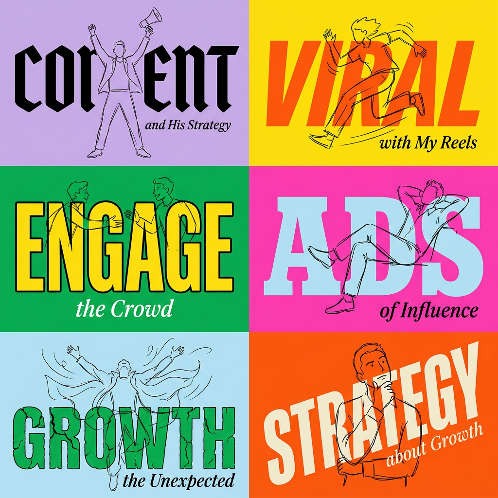
Create striking 2x3 editorial posters with six seamless, flat-color square cards in a perfect 4:5 grid. There are absolutely no gaps between the blocks, giving your content a bold, high-contrast magazine layout. It looks incredibly clean on any social feed.
Regenerate using your own assets.
Step 4: The final slide—your call to action
The last slide is your opportunity to convert a reader into a follower, a commenter, or a website visitor. Don't waste it with a generic 'Thanks for reading'. Your call to action needs to be clear, direct, and visually distinct. It should tell the audience precisely what you want them to do next.
Examples of strong CTAs include:
- "What's your take? Share it in the comments."
- "Follow me for more insights on [Your Topic]."
- "Get the full guide at the link in my bio."
- "DM me the word 'Workflow' to learn more."
In MyUP, you can design a CTA slide that stands out while remaining on-brand. Use a contrasting background color from your Brandkit palette or a layout that clearly separates the CTA text from the rest of the content. This workflow for a modern poster can be easily adapted to create a powerful and clear final slide for your carousel.
Workflow code: #myup-eiob-7tbc
Modern Hiring Poster
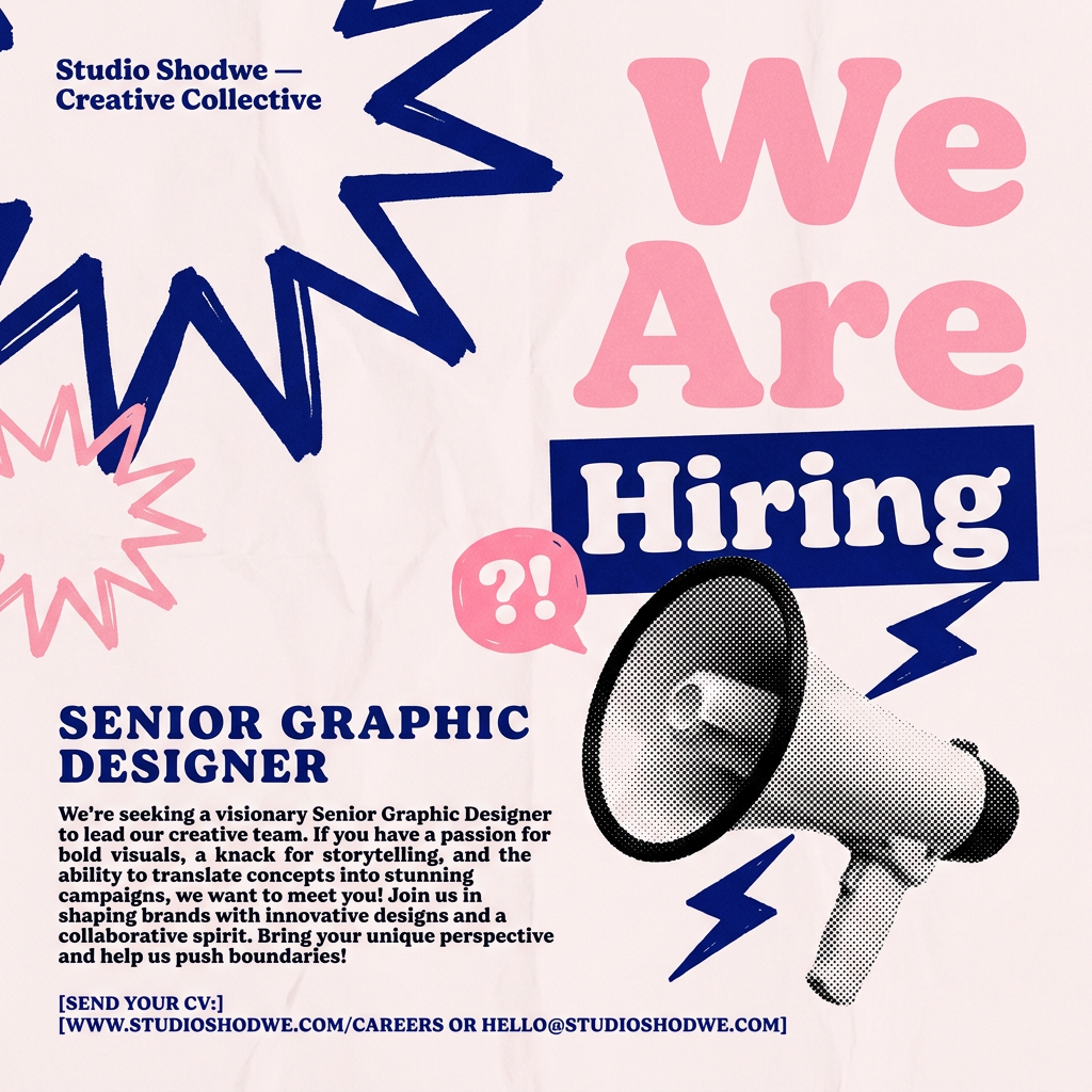
Turn your open roles into stylish social announcements. It sets your hiring details against a soft, textured paper background with clean, editorial typography. Perfect for giving your brand a polished, modern look when you're looking to hire.
Regenerate using your own assets.
From slides to a system: your new content engine
By following this workflow, you haven't just learned how to make one AI-powered carousel. You've built a repeatable system for creating high-quality, on-brand LinkedIn content at scale. With your Brandkit established in MyUP, the most time-consuming part of content creation—maintaining visual consistency—is now automated.
You can save your carousel generation process as a custom workflow, allowing you or your team to produce a new, perfectly branded visual story in minutes, not hours. This is how you move from manually creating posts to running a true content engine that consistently builds your authority and drives engagement.
