The news cycle in late June 2026 has been dominated by a single, exciting promise: AI is finally fixing its text problem. Adobe announced advanced 'Typography Control' for Firefly. Krea.ai rolled out custom font uploads. Midjourney is testing new layout parameters. After years of generating images with garbled, nonsensical lettering, it feels like we can finally create posters, ads, and social posts in a single step.
But if you've tried these new features for professional brand work, you've likely hit the same wall of frustration. The font is close, but not quite your brand's typeface. The kerning is slightly off. The text is baked into the image as pixels, so you can't edit a typo without regenerating everything. The output is almost there, but 'almost' doesn't work for a client deadline.
The truth is, the search for a single, perfect AI model that excels at both image generation and brand-perfect typography is a trap. The professional solution isn't a better model—it's a better workflow.
Why is text still so hard for image AI?
Despite incredible progress, diffusion models—the technology behind most AI image generators—don't 'understand' text the way a graphic designer does. They think in pixels, not in vectors. A letter 'A' isn't a defined shape with mathematical curves; it's a pattern of light and dark pixels the model has seen thousands of times. This fundamental difference is why you see common errors:
- Spelling and Logic: The model might know the general shape of letters in a word like 'SUMMER' but can easily get the sequence wrong, resulting in 'SUMEMR'.
- Typographic Nuance: Concepts like kerning (the space between characters) and leading (the space between lines) are precise design principles. A diffusion model is just approximating a visual pattern, often leading to awkward spacing.
- Brand Specificity: The model might be able to generate 'text in a serif font,' but it can't reliably reproduce your brand's specific typeface, like 'Poppins Bold,' with the correct weight and style. It's guessing, not typesetting.
Trying to force one tool to do two fundamentally different jobs—painting a scene and setting type—will always be a compromise. That’s why separating the tasks is the key to control.
The professional workflow: separate generation from design
Instead of trying to get a perfect, finished asset from a single prompt, the reliable workflow splits the process into two distinct steps. This lets you use the best tool for each job, giving you total control over the final output. MyUP is built for this exact workflow.
Step 1: Use an AI image generator for what it's good at—creating a stunning visual background.
Step 2: Use a brand-aware design platform for what it's good at—layering crisp, editable, perfectly on-brand text.
This isn't a workaround; it's a professional production process. It moves you from hoping for a lucky result to directing a predictable outcome. MyUP executes the production; you validate the creative choices.
Step 1: Prompt a beautiful image with space for your message
Your goal in this step is not to generate text, but to create a perfect canvas for it. The key is prompting for negative space. Instead of fighting with the AI to place text correctly, instruct it to leave a clean area where you can add it later. This gives you a beautiful, bespoke background image that's ready for your message.
Here are a few prompting tactics:
- Specify composition: Use phrases like "with a blank area at the top for a headline," "clean wall in the background," or "minimalist composition with copy space on the right."
- Use negative prompts: Add `--no text`, `--no words`, or `--no writing` to your prompt to discourage the model from attempting to generate any letters at all.
For example, a prompt could be: "A vibrant, detailed photo of a new coffee blend on a modern cafe table, soft morning light, with a clean, out-of-focus wall in the background leaving ample negative space at the top. --no text"
To get started right away, you can use a MyUP template designed specifically for this. The 'Minimalist Poster' workflow generates a clean background, ready for your text overlay.
Workflow code: #myup-k4td-9k6z
Minimalist Poster
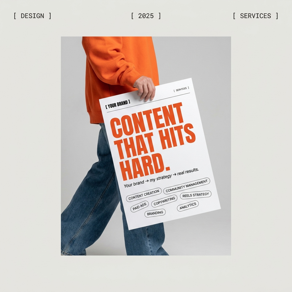
Give your social feed a clean, gallery-like aesthetic. This layout frames your images with structured mono typography and soft, neutral backgrounds for a high-end editorial look. It's perfect for minimal product launches or brand announcements.
Regenerate using your own assets.
Step 2: Add crisp, on-brand text with MyUP's Brandkit
Once you have your background image, the rest of the process takes seconds in MyUP. This is where you reclaim full control over your brand's visual identity. You upload your generated image, and MyUP's editor lets you add text as a clean, editable layer.
The real power, however, comes from MyUP's Brandkit. Instead of manually selecting your font, size, and color every single time, your Brandkit stores your visual identity. When you add a headline, MyUP automatically applies your brand's primary font and color. When you add body text, it applies the correct secondary font and color. You don't have to remember hex codes or font weights; the system already knows.
This solves the core problem that in-generator text features can't. While Adobe Firefly might give you a list of fonts, MyUP ensures you use *your* font, every time. This is the difference between generic design and true brand consistency. Your text is now a vector layer—sharp at any size, easily editable, and perfectly aligned with your brand guidelines.
In practice: creating branded posters in minutes
Let's see how this works for common tasks. Need a poster for an upcoming event, a new product launch, or a hiring announcement? The workflow is the same.
- Generate the background: Create a compelling visual that leaves space for your message.
- Choose a MyUP workflow: Pick a template that fits your layout needs.
- Add your image and text: Upload your AI-generated background. Type in your headline and details. MyUP's Brandkit instantly formats it with your brand's fonts and colors. You just approve the result.
These workflows are built to do exactly that. They provide the structure, and your Brandkit provides the identity.
- For a music festival or a party: Bold Retro Yellow Event PosterWorkflow code: #myup-xbur-hzoi
- For a new menu item or CPG product: Food Brand PosterWorkflow code: #myup-tbky-nciq
- For a corporate announcement or job opening: Modern Hiring PosterWorkflow code: #myup-eiob-7tbc
The final test: this workflow also fixes wobbly text in AI video
The benefit of this two-step workflow extends beyond static images. You've likely seen the 'Living Posters' trend on social media, where static images are animated using new image-to-video AI tools. A major complaint is that any text baked into the original image becomes a wobbly, unreadable mess during animation.
By separating the text layer in MyUP, you completely solve this problem. You can take your AI-generated background, animate it using an AI video tool to create a subtle, eye-catching motion effect, and then bring that video clip back into MyUP. By placing your crisp, on-brand text layer on top, the background moves while your message remains perfectly stable and legible. This is a professional-level effect that's impossible to achieve when the text is part of the pixel-based generation.
Stop re-rolling. Start designing.
The endless cycle of re-rolling prompts, hoping for usable typography, is a waste of creative energy. The latest features from major AI platforms are impressive steps forward, but they don't solve the fundamental need for brand control and consistency that professionals require.
The smarter path is to embrace a workflow that gives you predictable, high-quality results every time. Let AI image generators handle the visuals. Let MyUP handle your brand identity. By separating the tasks, you gain control, save time, and can finally create production-ready assets that are not just beautiful, but unmistakably yours.
