If you’ve spent any time trying to generate a set of UI icons with AI, you know the frustration. You get a perfect 'user' icon, but the 'settings' icon has a different line weight. The 'cart' icon has a weird shadow the others don't. You get nine out of ten right, and the tenth rogue output ruins the entire set.
As of today, July 5, 2026, the entire AI industry is scrambling to fix this. Krea AI just launched 'Style Palette' and Adobe is pushing 'Structure Reference' in Firefly. On X and Reddit, designers are sharing complex Midjourney `--sref` hacks and training custom LoRAs just to get a matching visual language. These are all symptoms of a fundamental problem. But features and hacks are not the answer. You don't need a better button; you need a better system.
The AI icon problem is so bad, the entire industry is racing to fix it
The search for 'consistent AI icons' is spiking for a reason. Generating a single, beautiful image is a solved problem. Generating a *system* of images—like an icon set where every element feels like it belongs to the same family—is where most tools fail. This failure forces designers into time-consuming workarounds: generating dozens of variations, manually editing vectors in Illustrator, or stitching together complex prompts that break easily. These aren't professional workflows; they're acts of desperation.
The new features from Krea and Adobe are a direct admission of this widespread pain. They are partial fixes that address style or structure, but not both, and they still operate within the limits of a single session. The real solution isn't a feature you use once. It's an asset you build once and run forever.
Why your AI icons don't match: The 'memoryless' prompt box
The root of the problem is simple: a standard AI image generator has no memory. Every time you hit 'generate,' it's a new, isolated task. The AI doesn't remember the beautiful, glossy 3D icon with a 3-pixel line weight it just made for you. Your next prompt for a 'shopping cart' icon starts from scratch, reinterpreting your style words in a slightly different way. The result is a collection of close-but-not-quite images, not a production-ready system.
An icon set is a visual language. It needs rules. A simple prompt box is memoryless; it can't enforce rules. To build a system, you need a tool that remembers your rules. This is the difference between prompting and building a workflow.
The workflow: Build your icon generation system once, run it forever
In MyUP, you don't just write prompts; you build workflows that connect to your brand's permanent memory. Instead of hoping for consistency, you engineer it. You define your visual system—colors, style, perspective, lighting—one time. Then, you can feed any list of subjects into that system to produce a perfectly matched set on demand. Here’s how to build that system.
Step 1: Define your icon style with a MyUP Brandkit
Before you generate anything, you need to teach the AI your brand's rules. This is the job of the MyUP Brandkit. By simply providing a URL, MyUP automatically extracts your brand's core visual identity: your exact color palette, logo, and typography. This becomes the foundation for every asset you create.
This step ensures that when your workflow generates an icon, it's not just guessing at 'your brand's blue.' It's using the specific hex code from your Brandkit. This is the first layer of unbreakable consistency. It moves your brand identity from a loose idea in a prompt to a concrete rule in a system.
Step 2: Create your master style prompt in a workflow
Next, you'll create a new workflow in MyUP and build your 'Master Style Prompt'. This is a detailed prompt that defines the unchanging aesthetic of your entire icon set. It doesn't describe the icon's *subject* (like 'user' or 'cart'), only its *style*.
A strong master prompt specifies details like:
- Style & Texture: '3D icon, claymorphism style, glossy finish, soft diffused lighting'
- Perspective & Framing: 'isometric perspective, centered on a plain background, slight drop shadow'
- Line Weight & Detail: 'clean edges, minimalist, no fine details, bold and readable at small sizes'
- Color Palette: Here, you reference your Brandkit to enforce your brand colors automatically.
Here is a template you can adapt inside a MyUP workflow:
3D icon of [SUBJECT], claymorphism style, glossy finish, soft studio lighting, isometric perspective, centered composition. The primary color should be [BRANDKIT COLOR 1] with accents of [BRANDKIT COLOR 2]. The background is a solid, neutral color. The icon must be simple, bold, and easily recognizable at 64x64 pixels.
To get started even faster, you can use a pre-built workflow as your foundation. For example, the 'Product Stickers' workflow already contains the logic for creating clean, isolated objects with a specific style. You can load it and simply adjust the style description to match your needs.
Workflow code: #myup-swqt-4zo3
Product Stickers
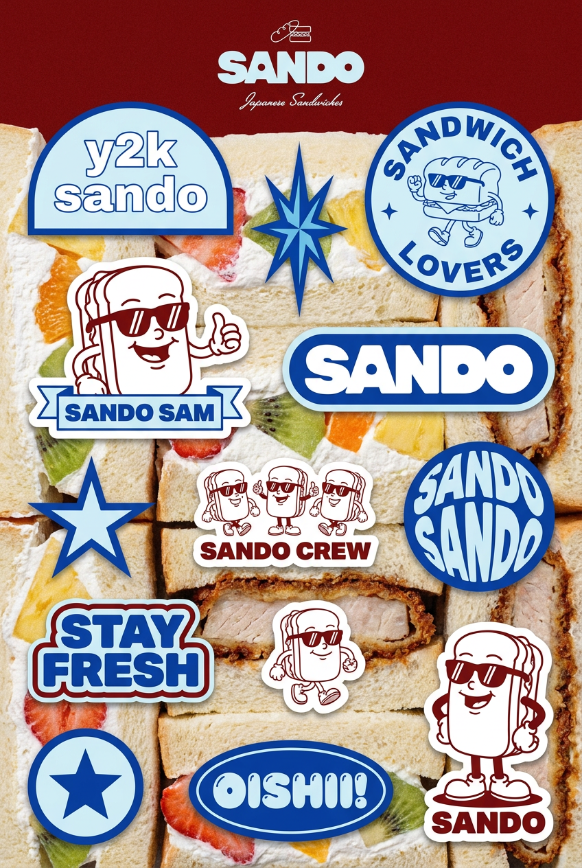
Turn your logo into a nostalgic, vibrant Y2K-style vertical ad. It automatically pulls your brand colors to create matching sweet treats like custom donuts or cupcakes in the background, giving you a super playful retro-pop aesthetic.
Regenerate using your own assets.
Step 3: Batch-generate your entire set from a simple list
This is where the system pays off. Once your master style prompt is saved in the workflow, you don't need to touch it again. The workflow is designed to take a list of inputs for the `[SUBJECT]` variable. All you have to do is provide a simple, comma-separated list:
user profile, shopping cart, settings gear, home, search magnifying glass, notification bell, checkmark, trash can, calendar, file folder
MyUP will then execute the workflow for each item on the list, running each subject through your identical master style prompt. The result is ten icons that are perfectly consistent in style, color, lighting, and perspective. MyUP handles the repetitive production; you simply validate the final output. There are no rogue outputs, no variations in line weight, no manual cleanup. Just a complete, production-ready set.
Going further: Creating icon states and other branded assets
A true asset system goes beyond a single set. Your app or website needs icon states, like 'active' and 'inactive'. With your MyUP workflow, this is trivial. Simply duplicate your workflow and make a minor tweak to the master prompt, such as 'use a muted version of [BRANDKIT COLOR 1]' for the inactive state. Now you have two workflows that can generate perfectly matching sets for any state.
This system-based approach can extend to all your brand visuals. The same principles in your master icon prompt can inform the creation of spot illustrations, social media graphics, or even posters, ensuring a cohesive visual identity everywhere. You could, for instance, apply a similar claymorphism style to a larger composition using a different workflow.
Workflow code: #myup-k4td-9k6z
Minimalist Poster
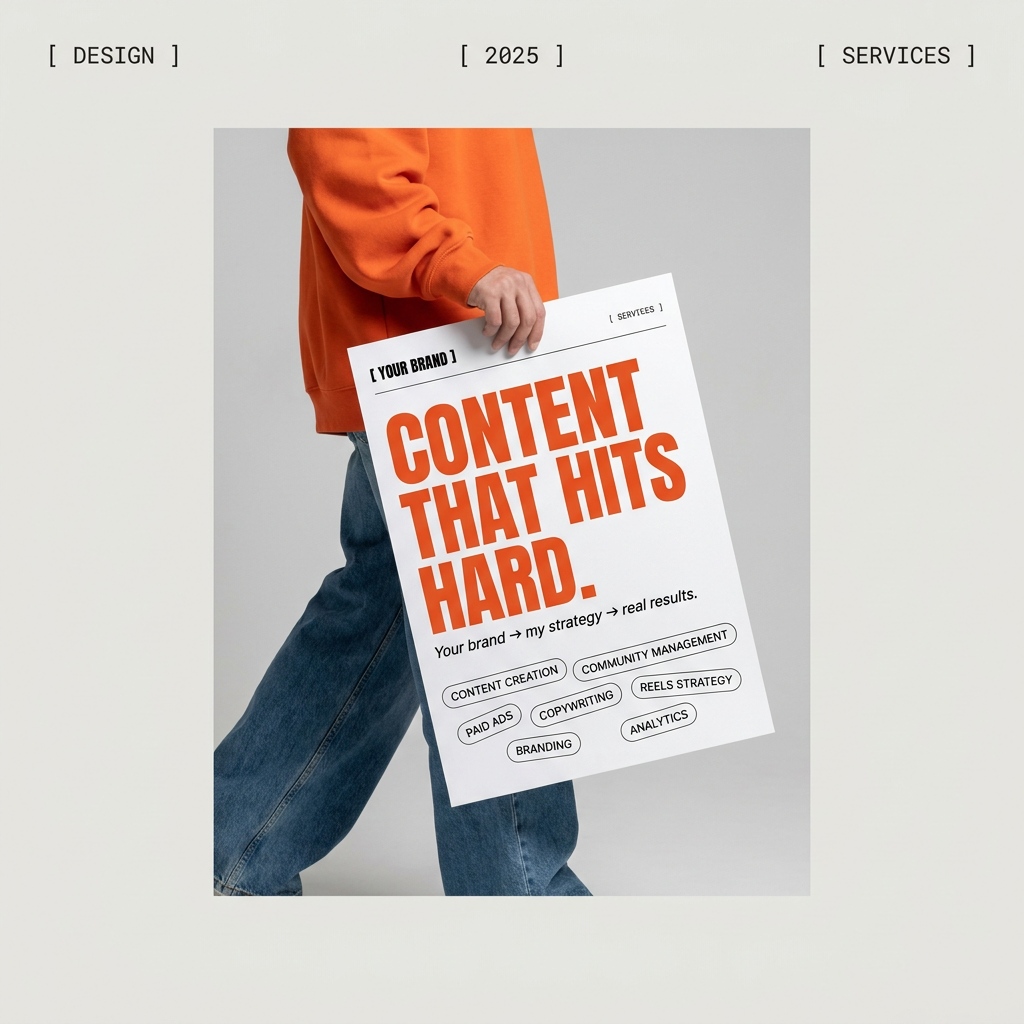
Give your social feed a clean, gallery-like aesthetic. This layout frames your images with structured mono typography and soft, neutral backgrounds for a high-end editorial look. It's perfect for minimal product launches or brand announcements.
Regenerate using your own assets.
Stop chasing features, start building systems
The explosion of AI 'consistency' features proves that designers and brand builders are tired of fighting for control. But a feature is a temporary fix. A workflow is a permanent asset. While other tools offer buttons that help you in the moment, MyUP helps you build a system that becomes your brand's permanent memory, ensuring every icon, illustration, and visual you create is part of the same coherent family. Stop generating one-off images and start building your brand's visual engine.
