You generated the perfect icon. Clean lines, on-brand colors, exactly the right feel. Then you tried to create a matching one for 'settings' or 'profile', and the results were completely different. A different line weight, a conflicting perspective, a style that looks like it came from another planet. You're not alone. This is the single biggest failure point of using AI for professional design assets.
The market knows it, too. The release of Midjourney's V7 'Style Tuner' in June 2026 is a direct admission that consistency is the problem everyone is trying to solve. But manually curating a style from a random grid is still a workaround, not a workflow. A single good icon is a lucky guess. An entire set of consistent icons is a system. This guide will show you how to build that system.
The consistency gap: why your AI icons never match
Standard AI image models treat every prompt as an independent event. The AI has no memory of the beautiful 'home' icon it just made when you ask for a 'shopping cart' icon five seconds later. It rolls the dice on style every single time. This is why you get a mix of 3D renderings, flat designs, and sketchy illustrations when all you wanted was a simple, unified set.
This randomness is fine for creative exploration, but it's a deal-breaker for brand identity. A brand's visual language relies on repetition and consistency. Icons on a website or in an app must look like they belong to the same family, designed with the same rules. When they don't, the user experience feels cheap and disjointed. Stock icon libraries solved this with massive, pre-made sets, but they're generic. The promise of AI is custom assets, but until you solve the consistency problem, they're just unusable novelties.
Stop prompting, start building a system: your icon style recipe
The professional solution isn't a better prompt; it's a better system. Instead of hoping for a lucky match, you need to define your icon style as a set of rules that the AI can follow every time. Your brand isn't a single prompt; it's a set of rules. AI should use your rules to create your assets.
In MyUP, this system is called a Brandkit. It's where you store your visual identity—colors, fonts, logo, and crucial style descriptors. For an icon set, you'd build a 'style recipe' with specific, enforceable attributes:
- Style & Perspective: Is it a 'flat vector icon', 'isometric icon', or 'line art icon'? Defining this is the first step.
- Line Weight: Use terms like 'thin delicate lines', 'uniform thick line art', or 'monoline'. This is critical for a unified look.
- Color Palette: Are the icons 'duotone using brand colors', 'monochromatic', or 'full color'? Your Brandkit can store your exact hex codes.
- Fill & Shading: Are they 'solid fill', 'no fill', or 'subtle gradient shading'?
- Corner Style: Specify 'sharp corners' or 'soft rounded corners' to ensure every shape feels consistent.
By storing this recipe in a Brandkit, you turn a guess into a command. The system appends these rules to every generation automatically, forcing the AI to adhere to your brand's visual DNA.
The workflow: generate a complete icon set in 3 steps
Once your style recipe is defined in your MyUP Brandkit, the production process becomes radically simple and predictable. You move from being a prompt guesser to a creative director who validates the output.
Here is the exact workflow:
- Load Your Style: Create or select the Brandkit containing your icon style recipe. This automatically loads your colors, logo, and the crucial style descriptors ('flat vector icon, duotone, thick line art...') that will govern the entire set.
- Create a Batch List: Instead of prompting one by one, you create a simple list of all the icons you need. For example: 'User profile icon', 'Settings gear icon', 'Shopping cart icon', 'Analytics chart icon', 'Message bubble icon', 'Home icon', 'Search magnifying glass icon'.
- Run the Workflow: MyUP iterates through your list, applying the Brandkit's style recipe to each item. It generates all the icons in a single batch. The AI handles the repetitive execution; you provide the final approval.
The result is a complete grid of icons that are perfectly matched in style, color, and line weight—as if they were created by a single human designer in a single session. This is the difference between a tool and a production system.
From generation to application: putting your new icons to work
An icon set is only useful once it's integrated into your other brand assets. The power of a Brandkit-driven workflow is that the same system used to create the icons can also be used to place them into finished designs, ensuring consistency from the asset level all the way to the final campaign.
For example, you can immediately use one of your new icons in a social media graphic. Instead of exporting the icon and importing it into another tool, you can simply run another workflow that pulls from your Brandkit to create a post that's already on-brand.
This workflow creates a clean, professional social media post using your brand's visual identity, ready for you to drop in your new icon and a marketing message. The user validates the concept; MyUP handles the production.
Workflow code: #myup-kbgo-tlle
Product Brand Post
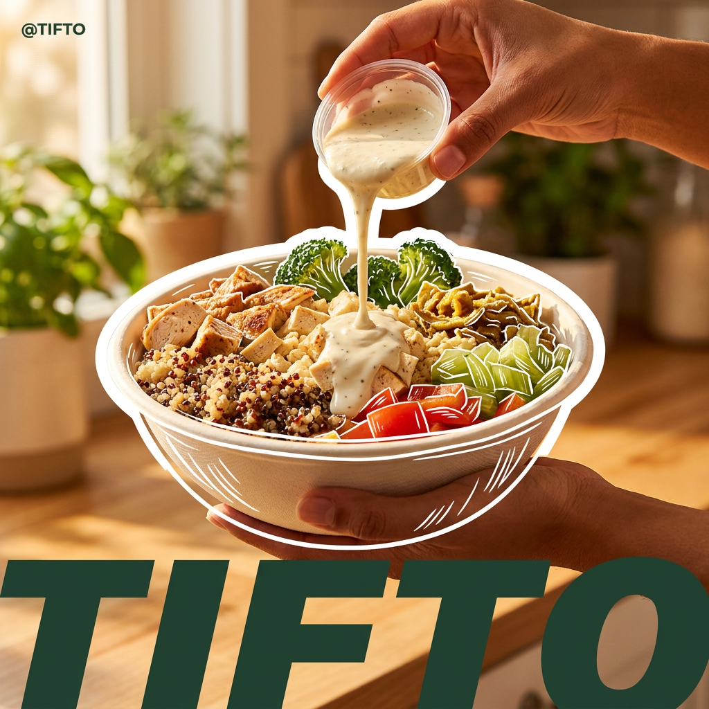
Drop in your product to generate a cohesive nine-post Instagram grid. It blends warm lifestyle photography and flat-lay packaging with bold hand-drawn doodles, collages, and urban billboard mockups. Everything automatically styles itself to your brand's colors.
Regenerate using your own assets.
Scaling your visual identity beyond icons
Your visual system is more than just icons. The same Brandkit—the same single source of truth for your brand's style—can be applied to generate an entire universe of on-brand content. The style recipe you created for icons can inform illustrations, patterns, and larger campaign visuals.
Want to turn an icon into a die-cut sticker for packaging or a promotional event? The 'Product Stickers' workflow uses your Brandkit to generate high-quality, print-ready sticker designs.
Workflow code: #myup-swqt-4zo3
Product Stickers
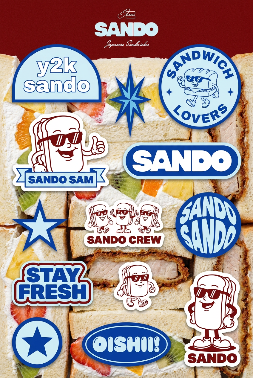
Turn your logo into a nostalgic, vibrant Y2K-style vertical ad. It automatically pulls your brand colors to create matching sweet treats like custom donuts or cupcakes in the background, giving you a super playful retro-pop aesthetic.
Regenerate using your own assets.
Need to feature an icon in a larger piece of key art, like a poster for a new feature launch? The 'Minimalist Poster' workflow can generate a complete, type-and-image composition that adheres to your brand's aesthetic.
Workflow code: #myup-k4td-9k6z
Minimalist Poster
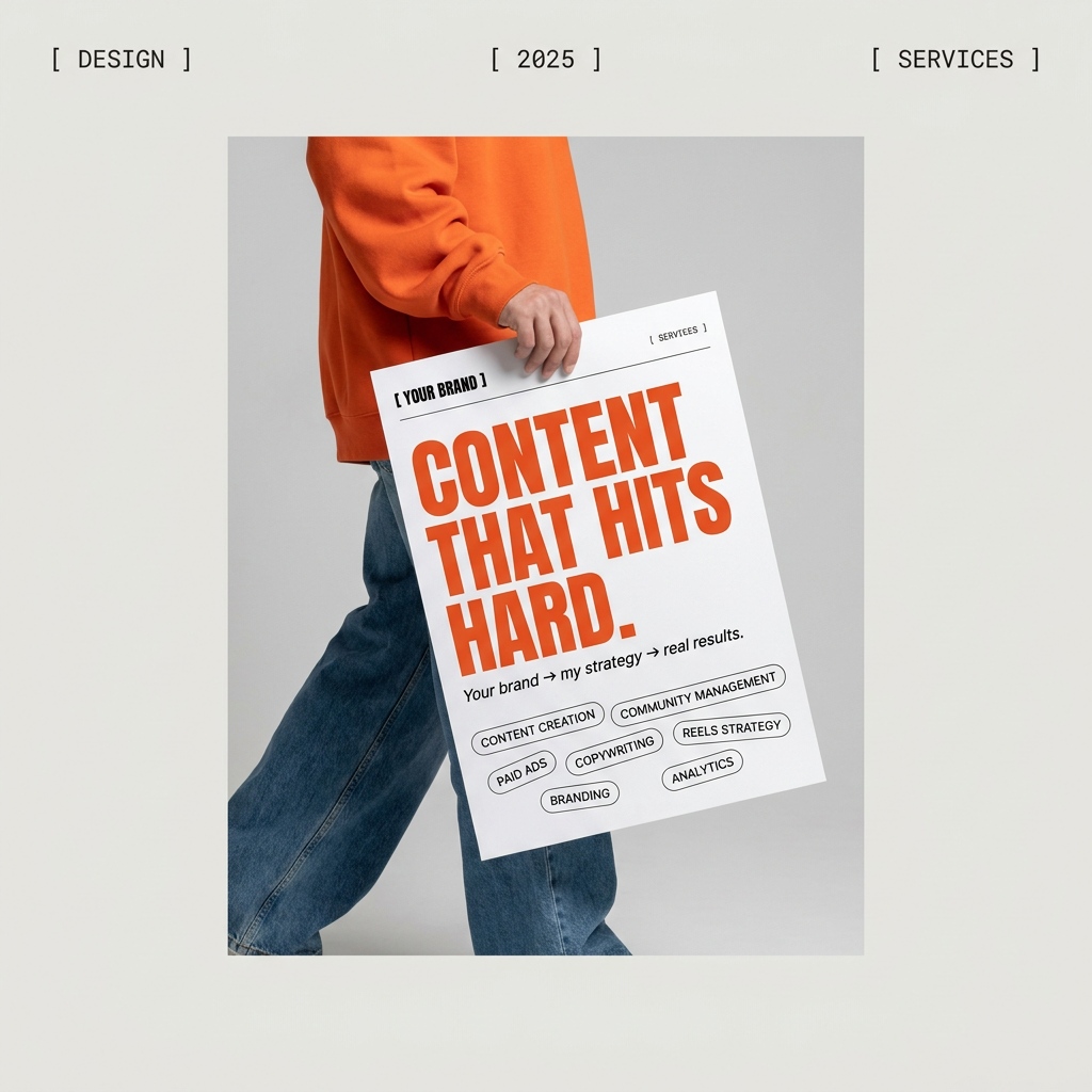
Give your social feed a clean, gallery-like aesthetic. This layout frames your images with structured mono typography and soft, neutral backgrounds for a high-end editorial look. It's perfect for minimal product launches or brand announcements.
Regenerate using your own assets.
This is how you scale a brand identity with AI. You don't just make one thing; you build a system that can make anything, and it all stays perfectly consistent.
Your brand is a system, not a lottery
Relying on one-off prompts to build a brand's visual identity is like playing the lottery. You might get lucky once, but you'll never build anything repeatable or scalable. The frustration with mismatched icons is the first sign that you need to move from prompting to production.
A Brandkit-driven workflow provides the system for predictable, on-brand creation. It turns AI from an unpredictable toy into a reliable production partner for professional design work. Stop chasing consistency and start enforcing it.
