You’re right, your AI-generated menu looks unappetizing. Here’s why.
If you’ve tried using Claude to design a menu for your restaurant, you’ve probably felt a familiar sense of disappointment. The text descriptions might be a good start, but the images? They often look plasticky, generic, and frankly, unappetizing. You’re not imagining it, and it’s not a failure of your prompting skills. As recent discussions on Reddit’s r/Restaurateur and a September 3rd, 2026, TechCrunch article highlight, business owners are widely reporting “disastrous” and “unappetizing” results from general-purpose AI tools for this exact task. The problem is simple: Claude is a text model that generates image concepts, not a food stylist or a graphic designer. It can get you 90% of the way to an idea, but it fails at the final, crucial 10% that turns a concept into a creation that makes customers hungry.
The diagnosis: Why AI struggles with 'appetite appeal'
The core issue is a lack of what professionals call “appetite appeal.” A great food photograph isn’t just a picture of a dish; it’s a carefully constructed scene designed to trigger a sensory response. This is where general AI models like Claude stumble. They struggle to replicate the subtle, imperfect details that make food look delicious:
- Texture and Moisture: AI often produces images with a smooth, uniform surface that looks more like plastic than food. It misses the glisten of olive oil, the subtle char on a grilled steak, the condensation on a cold glass, or the delicate crumbs of a pastry.
- Lighting and Shadows: Professional food photography uses specific lighting to create depth, highlight textures, and evoke a mood. Claude’s lighting is often flat and diffuse, eliminating the soft shadows that make a dish look three-dimensional and real.
- Steam and Sizzle: The visual cues of heat—like a wisp of steam rising from a hot bowl of soup—are incredibly difficult for AI to generate realistically. Most attempts look like a clumsy Photoshop effect rather than a natural part of the scene.
Without these elements, you get a technically correct image of a burger that no one actually wants to eat. It lacks the story and the sensory detail that drives sales.
Beyond the image: Why AI fails at layout and typography
Even if you could generate the perfect food photo, the challenge isn’t over. A menu is a complex design document that combines images, text, and branding into a cohesive, easy-to-read layout. This is another area where a prompt-based approach falls apart. Trying to instruct Claude to create a professional menu layout is an exercise in frustration. You can't easily prompt for:
- Professional Typography: Good design requires careful selection of fonts, proper kerning, and a clear visual hierarchy. AI-generated text is often poorly integrated, using generic fonts with awkward spacing that looks amateurish.
- On-Brand Layout: Your menu needs to reflect your restaurant's visual identity. Getting an AI to consistently apply your logo, brand colors, and specific layout rules through text prompts alone is nearly impossible.
- Visual Hierarchy: A well-designed menu guides the customer's eye to high-margin items. This requires a deliberate layout structure that AI generators, focused on filling space, simply don't understand.
The result is often a chaotic jumble of images and text that looks unprofessional and fails as a sales tool.
The fix: Shift from generating ideas to producing finished creations
The solution is to stop thinking about generating individual, raw assets and start thinking about producing a finished creation. Instead of wrestling with prompts to fix a bad image, you need a system designed to deliver a studio-quality result from the start. This is the core principle of MyUP.ai, the Creative Production Platform that turns your intention—like “I want an appetizing menu”—into a complete, publish-ready asset.
MyUP achieves this by using creative templates built by top designers and AI creators. These aren't just prompts; they are complete production methods that have professional lighting, composition, and styling already built-in. You provide your vision and your specific dish, and MyUP handles the complex technical production to deliver a finished result that looks like it came from a professional photo shoot.
Step 1: Create a mouth-watering hero shot for your star dish
Let's start with the most important part of your menu: the hero shot of your signature dish. This image needs to be impactful, mouth-watering, and perfectly styled. Instead of trying to describe “delicious” in a prompt, you can use a production template designed specifically for high-impact food visuals. For example, you can use a template that creates a lifestyle shot of someone enjoying your food, making it instantly more relatable and desirable.
Simply state your intention, provide an image of your dish, and the platform executes the entire creative process. MyUP handles the lighting, the human element, and the composition to produce a shot that feels authentic and compelling. This is how you get a photo that sells, not just a picture that illustrates. For an authentic lifestyle shot, a production template is the direct route. Template: #myup-xjsb-hirr
Bold Portrait Food Advertising Photo
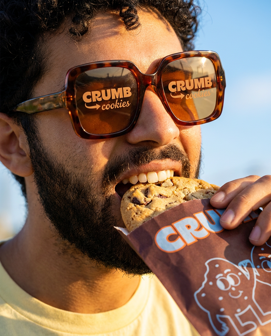
Get those high-impact, tight action shots of people actually enjoying your food brand. It drops your product right into a messy, realistic close-up bite shot that feels like a premium lifestyle campaign instead of a boring studio packshot.
Regenerate using your own assets.
Step 2: Build a set of on-brand visuals with consistent style
A great menu needs more than one hero shot. You need a series of visuals for different dishes, drinks, and sides that all feel like they belong to the same brand. Visual consistency is key to a professional look. This is where MyUP's Brandkit comes in. You can set up your restaurant's visual identity—logo, colors, fonts, and overall style—once. MyUP then automatically applies these elements to ensure every creation is perfectly on-brand.
You can then use different creative templates to generate a variety of shots while maintaining that consistent feel. For example, after creating your main hero shot, you might need a dynamic, vertical image of your fries for a social media promotion or a side panel on your menu. A specialized template can create this in seconds, ensuring the styling matches your brand. For a dynamic, vertical ad shot, try the Vertical Gourmet French Fry Ad. Template: #myup-fts6-4ihp
Vertical Gourmet French Fry Ad
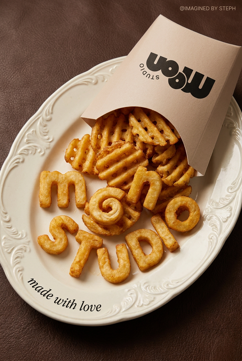
Transform your products into high-fashion editorial ads. This setup uses a dynamic diagonal layout and a slightly tilted overhead angle to give food and packaging incredible depth and texture. It's perfect for giving any brand a chic, premium look.
Regenerate using your own assets.
Step 3: Assemble a complete, ready-to-print menu design
With your set of stunning, on-brand food photos ready, the final step is to assemble the complete menu. This is where you combine your images with your menu text (item names, descriptions, prices) into a finished design that's ready to print or publish online. Again, instead of struggling with prompts to get the layout right, you can use a design-focused production template. These templates are built by graphic designers and handle the typography, spacing, and hierarchy for you.
For instance, if your restaurant has a vintage or retro vibe, you can use a template that automatically arranges your content into a classic poster style. It will integrate your images, apply your Brandkit, and format your text into a beautiful, effective layout. You simply provide the content, and MyUP delivers the finished, professionally designed menu. To create a menu with a classic print ad feel, a specialized template is the most direct method. Template: #myup-1hgd-9oz5
Retro Style Food Advertising Poster
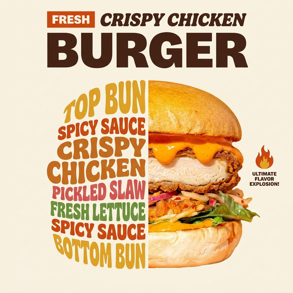
Turn any food product shot into a bold, nostalgic retro advertisement. It drops your item onto a warm cream background and automatically frames it with a color-matched header badge for that classic mid-century print ad look.
Regenerate using your own assets.
Your menu is a sales tool, not an AI experiment
Your menu is one of the most important sales tools your restaurant has. It's the first point of contact many customers have with your food, and its job is to make them hungry and excited to order. Using generic, unappetizing AI images is a missed opportunity that can actively hurt your business. Stop treating your menu like an AI experiment and start treating it like the professional creative asset it is.
With MyUP.ai, you don't need to become a food photographer or a graphic designer to get studio-quality results. By focusing on your intention and letting the platform handle the technical production, you can turn a simple idea into a finished, irresistible menu that drives sales and builds your brand. It’s time to make your food look as good as it tastes.
