
Scroll through your LinkedIn feed. You'll see the same blue and grey stock photos of abstract network nodes and smiling professionals in sterile offices. Now, a new kind of generic has arrived: the glossy, hyper-detailed but soulless AI image. Using AI to generate visuals isn't the problem. The problem is that most AI tools just add to the noise, creating a new sea of sameness.
Standing out on LinkedIn isn't about having the flashiest image; it's about being recognizable. It's about building a visual language that communicates your brand's authority and professionalism at a glance. This guide isn't about prompting tricks. It's a playbook for a brand-first workflow that turns AI into a scalable engine for creating a professional, cohesive, and memorable brand presence on LinkedIn.
The LinkedIn visual code: what actually builds a brand?
Unlike Instagram's lifestyle focus or X's text-driven immediacy, LinkedIn has a specific visual code. The images that perform best aren't just decorative; they are functional. They communicate an idea, share a piece of data, or announce something important. To build a brand, you need to master three core visual formats:
- Abstract Concept Graphics: These are visuals that represent intangible ideas like 'synergy,' 'growth,' or 'innovation.' They are perfect for illustrating quotes, thought leadership posts, or company values. The goal is to be clean and professional, not photorealistic.
- Data-Driven Visuals: Simple charts, key statistics, or infographic-style highlights. The trend of creating data visualizations is growing because they stop the scroll and provide immediate value. Here, accuracy and clarity are paramount.
- Branded Announcements: Posts for hiring, events, product launches, or company news. These require a consistent layout, typography, and logo placement to create brand recall and a polished, official feel.
Creating these one at a time is slow. Using generic templates makes you look like everyone else. The key is a system that produces all three formats, perfectly on-brand, every single time.
The foundation: lock in your brand with a MyUP Brandkit
Before you generate a single image, you need to establish your brand's visual identity. This is the single biggest failure point of using generic AI tools for professional content. You waste countless hours trying to manually edit colors or paste logos onto inconsistent outputs. The solution is to build your brand identity into the creation process from the start.
In MyUP.ai, you do this once by creating a Brandkit. You simply provide your website URL, and MyUP automatically extracts your brand's core components: your logo, primary and secondary colors, and typography. This isn't just a palette you can choose from; it's a set of rules that MyUP's workflows automatically apply to every single asset you create. It's the difference between manually painting a car and having a professional assembly line that applies the correct color every time. This simple setup is the foundation for scaling up your content production while maintaining perfect consistency. You can learn more about this in our guide to baking your brand guidelines into every AI visual.
Workflow 1: on-brand abstract graphics for quotes and concepts
This is your bread-and-butter post. You have a powerful quote or a key business concept to share. You don't need a complex photo; you need a clean, professional background that makes your text pop and reinforces your brand identity.
The old way is to search for a stock photo, drop it in a design tool, and manually add text. The MyUP workflow is faster and guarantees brand cohesion.
- Generate the Base: Start with a simple prompt for an abstract background. Think in terms of texture and mood, not objects. For example: "minimalist light gray textured background with a single soft blue gradient wave, professional, clean."
- Apply the Brand: In MyUP, you don't need to tell the AI your brand colors. When you apply your text, your Brandkit automatically ensures it uses your designated brand font and color palette.
- Validate and Post: The AI handles the production; you handle the validation. You approve the final layout, ensuring the message is clear. The result is a crisp, professional graphic that feels custom-made, not pulled from a stock library.
To create a simple, elegant post for a quote or a key message, this workflow is the place to start.
Workflow code: #myup-k4td-9k6z
Minimalist Poster
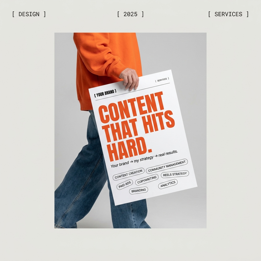
Give your social feed a clean, gallery-like aesthetic. This layout frames your images with structured mono typography and soft, neutral backgrounds for a high-end editorial look. It's perfect for minimal product launches or brand announcements.
Regenerate using your own assets.
Workflow 2: the right way to create AI-powered data visuals
Image generators are notoriously bad at rendering accurate text and data. This is where most people give up on using AI for serious business graphics like charts or stat callouts. The secret isn't a better prompt; it's a hybrid workflow that uses AI for what it's good at (visuals) and a structured system for what it's bad at (data).
While tools like Adobe Firefly are adding features like "Structure Reference" to help with layout consistency, a brand-first platform like MyUP solves the more critical problem: ensuring the information itself is accurate and the branding is automatic.
- Generate the Visual Shell: Use AI to create the graphic elements. Prompt for "a clean infographic layout with three distinct sections, using geometric shapes and lines, minimalist corporate style." Ignore any garbled text the AI produces.
- Add Data with the Brandkit: This is the crucial step. In a MyUP workflow, you use structured text fields to input your actual data points and headlines. Your Brandkit automatically applies the correct fonts and colors, ensuring readability and brand consistency.
- Control the Narrative: MyUP executes the design, but you validate the information. This human-in-the-loop approach is essential for any content where accuracy matters. You get the speed of AI without sacrificing the credibility of your data.
This workflow is perfect for creating compelling visuals from survey data, business metrics, or key takeaways from a report.
Workflow code: #myup-n0bi-2wzk
Bold Editorial Grid Poster
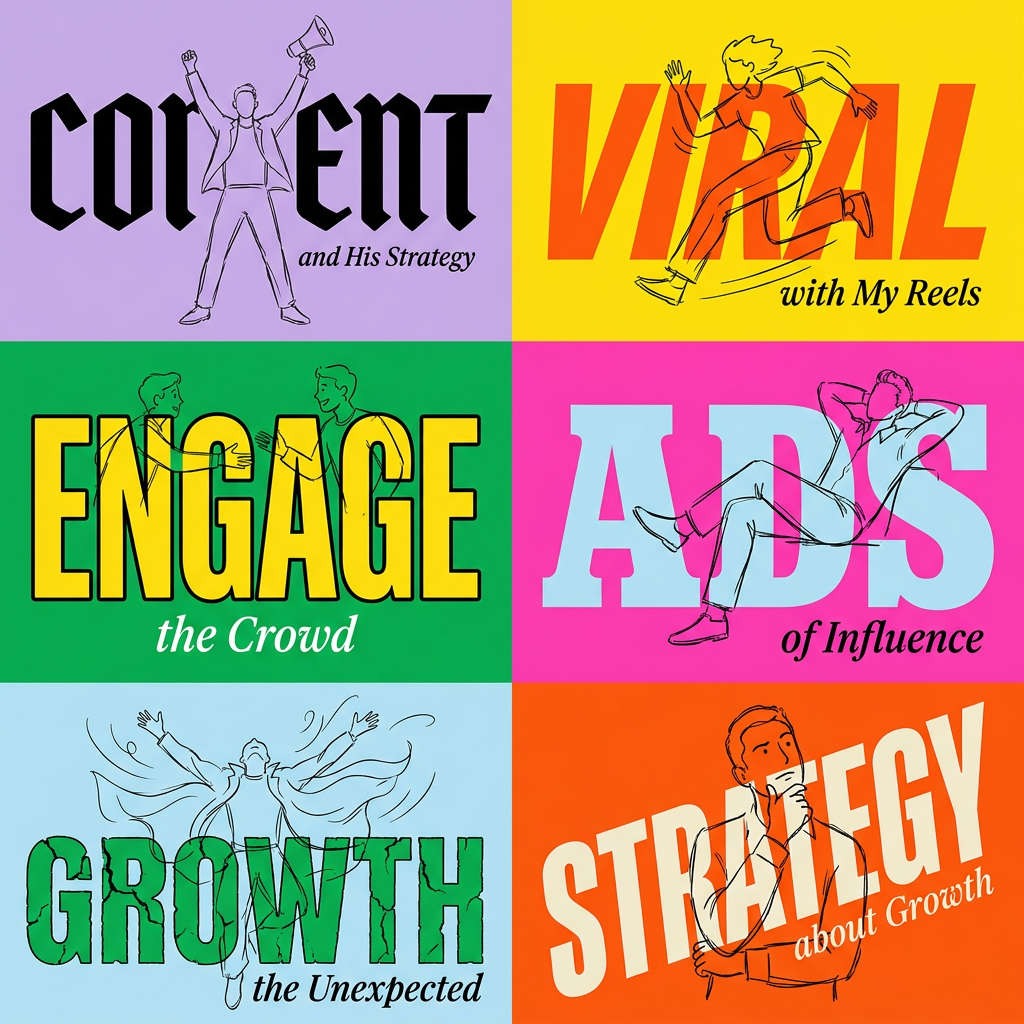
Create striking 2x3 editorial posters with six seamless, flat-color square cards in a perfect 4:5 grid. There are absolutely no gaps between the blocks, giving your content a bold, high-contrast magazine layout. It looks incredibly clean on any social feed.
Regenerate using your own assets.
Workflow 3: professional announcements that stand out
When you're announcing a new hire, a webinar, or a company milestone, the visual needs to look official and polished. A random AI image won't cut it. You need a structured template that communicates professionalism and is instantly recognizable as coming from your company.
MyUP's workflows act as intelligent templates. They provide a consistent structure while allowing for creative variation in the background imagery.
- Choose a Structured Workflow: Select a workflow designed for announcements, like a hiring poster. This defines the non-negotiable elements: where the logo goes, the layout of the headline and body text, and the call-to-action.
- Generate a Thematic Background: Within the workflow, you can generate a new AI background for each post. For a hiring post, you might prompt for "a bright, modern office interior, out of focus." For an event, "an abstract pattern of interconnected nodes." The image changes, but the branded structure remains the same.
- Populate and Publish: Add your specific text. The Brandkit ensures all typography and color usage is correct. The result is a series of announcements that are visually distinct yet part of a cohesive brand family.
Use this workflow to build a professional and consistent presence for all your company's important updates.
Workflow code: #myup-eiob-7tbc
Modern Hiring Poster
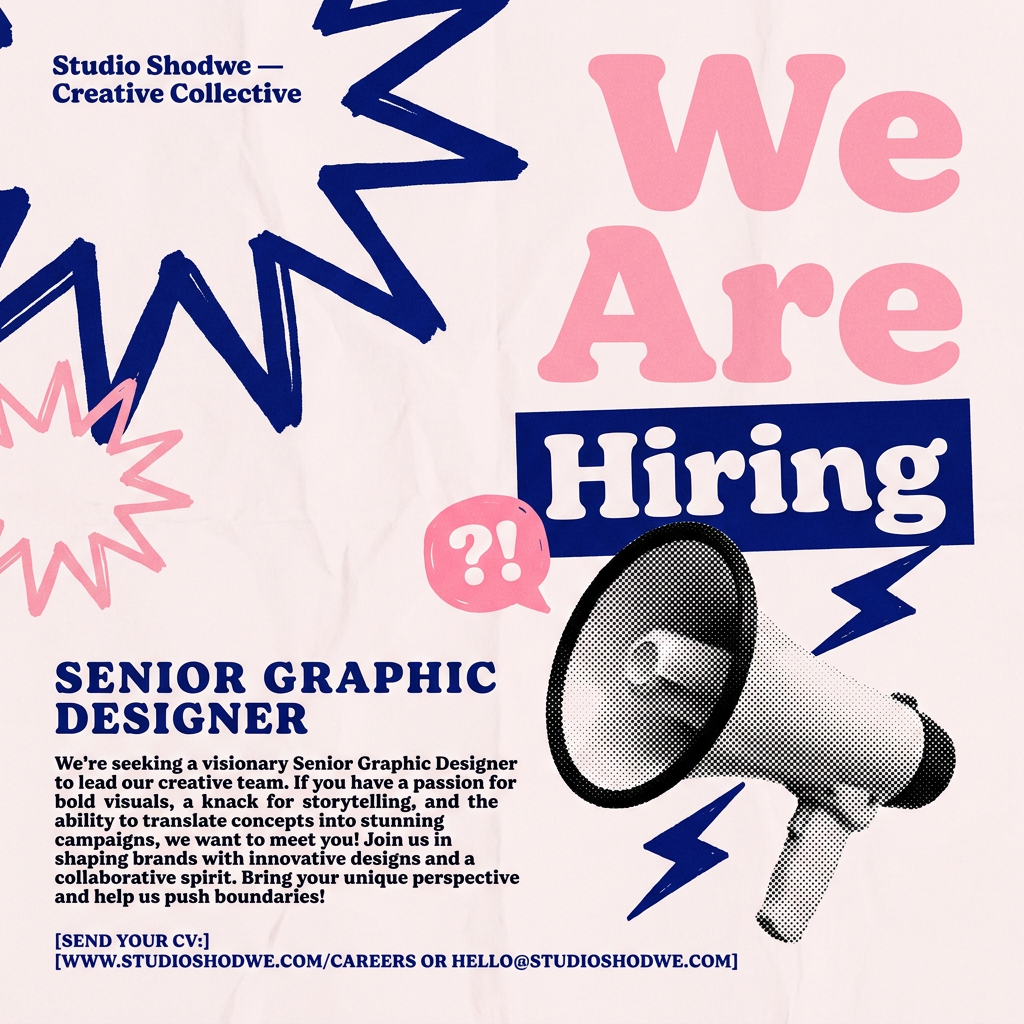
Turn your open roles into stylish social announcements. It sets your hiring details against a soft, textured paper background with clean, editorial typography. Perfect for giving your brand a polished, modern look when you're looking to hire.
Regenerate using your own assets.
From one-off images to a cohesive brand feed
The goal on LinkedIn isn't to make one good AI image. It's to build a system that produces a consistently professional and recognizable brand feed at scale. Random prompting in different tools will only ever produce random results. A chaotic feed undermines your authority and makes your brand look amateurish.
By starting with a MyUP Brandkit and using repeatable workflows, you're not just creating images; you're manufacturing brand assets. You're building a visual library that anyone on your team can use to create content that is always on-brand and always professional. This is how you move beyond the sea of sameness and build a brand that people remember.
