
You’ve generated the perfect AI image, but the text is a garbled mess. It’s a common frustration for marketers and creators who need professional results, not just interesting experiments. Even the latest AI models struggle to render clear, accurate typography, forcing a clunky process of exporting to another tool just to add a simple headline. This guide provides a practical production method to solve this problem once and for all, showing you how to create thumbnails with perfectly readable, on-brand text in a single, integrated platform.
The persistent challenge of readable text on AI thumbnails
You’ve done it. After several attempts, you’ve generated a stunning image for your next YouTube video or product ad. The colors are perfect, the composition is dynamic, and the style is spot-on. There’s just one problem: the text you asked for looks like a nonsensical jumble of letters. “SALE NOW” has become “SLEA NVO.” Sound familiar? You’re not alone.
Even with the latest models like Stable Diffusion 3 and DALL-E 3, getting AI to generate clear, readable text directly on an image remains a significant challenge. As of September 2026, user forums are filled with creators expressing frustration over the “lottery” of AI typography. These models think in pixels, not characters, leading to distorted, misspelled, or completely broken text that instantly undermines the professionalism of your visual.
A thumbnail with garbled text isn't just an aesthetic issue; it's a business problem. It confuses your message, erodes brand trust, and hurts your click-through rate. The goal isn't just a pretty picture; it's a finished, publish-ready creation that communicates effectively.
Why the multi-tool 'hack' is not a professional production process
To get around this, many creators have adopted a clumsy, multi-tool process. It usually looks something like this:
- Generate a background image in a tool like Midjourney, carefully prompting for “negative space.”
- Export the image.
- Use a separate tool to upscale it.
- Import the upscaled image into a design program like Canva or Photoshop.
- Finally, add the text layers on top.
- Export the final version.
This 'hack' might seem clever, but it's not a professional production method. It’s slow, inefficient, and creates endless friction. What happens when a client asks for a small text change? You have to repeat multiple steps, juggling files between platforms. This process is also a recipe for brand inconsistency, as it relies on manually matching fonts and colors, opening the door for human error. For any serious creator, marketer, or agency, this fragmented approach is simply not scalable.
The foundation: your Brandkit for consistent typography control
The solution to typographic chaos is to establish a single source of truth for your brand's visual identity. This is the foundation for professional and scalable creative production. On MyUP, this is achieved with the Brandkit.
Instead of hoping an AI model can guess your font, a Brandkit allows you to define your typography once: your exact brand fonts, sizes, weights, and colors. You can even upload your logo. Once your Brandkit is saved, MyUP applies these rules automatically to any creation, ensuring every thumbnail, ad, or social post is perfectly on-brand without any manual work. This moves the process from random generation to intentional production, giving you the control that raw AI tools lack. This is how you create on-brand AI thumbnails that stand out every time.
You can see this principle in action with templates designed to automatically adapt to your brand. For instance, a product ad template can pull your brand's visual identity to create a cohesive and striking visual in seconds. Template: #myup-zpby-tzie
Minimal Vibrant Product Advertising Poster
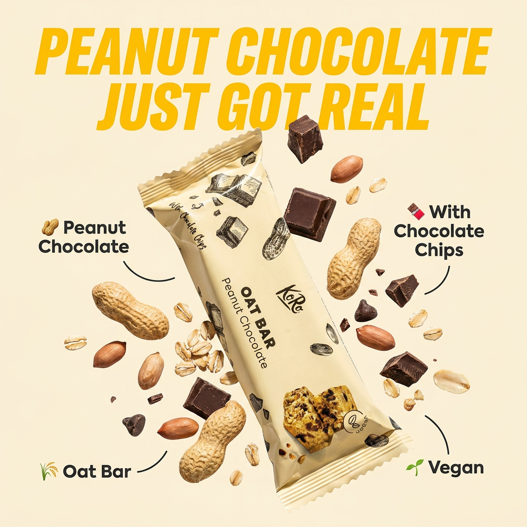
Drop in any product shot and watch it turn into a bold, high-energy square ad. It automatically reads your packaging to pull out the dominant colors and text, then builds a vibrant poster styled perfectly around your brand.
Regenerate using your own assets.
Designing for impact: principles for legible text on thumbnails
Before you even write your headline, a good thumbnail design guides the viewer's eye. Legible text isn't just about the font itself, but its relationship with the entire image. Here are key principles to follow:
- High Contrast is Non-Negotiable: Text must stand out from the background. This means using light text on a dark background or vice versa. Avoid placing text over a 'busy' part of the image with many competing colors and shapes.
- Embrace Negative Space: The most readable text is often surrounded by 'empty' space. This gives the words room to breathe and draws the viewer's attention directly to your message.
- Establish a Clear Hierarchy: Not all text is equally important. Use size, weight (bold, regular), and color to create a visual hierarchy. Your main headline should be the largest and most prominent element.
- Strategic Placement: The 'rule of thirds' is a useful guide. Placing your main text along these lines or at their intersections often creates a more balanced and visually appealing composition.
The best part is you don't need to be a professional designer to apply these rules. MyUP's creative production platform uses templates built by top creators that already incorporate these design principles, giving you a head start on a professional-looking result. For example, a template can provide a pre-designed layout with a textured background and designated areas for text, ensuring a balanced composition from the start. Template: #myup-msop-hlxf
Retro Zine Style Event Poster
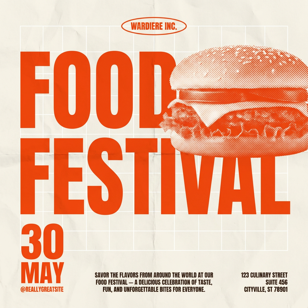
Give your social posts a gritty, analog zine aesthetic. It layers a crumpled paper texture and a subtle grid over a warm cream background to make any event graphic look like a tactile, photocopied flyer. Perfect for DIY gigs and bold promos.
Regenerate using your own assets.
The production process: creating thumbnails with integrated, readable text
With the foundations of a Brandkit and good design principles in mind, let's walk through the actual creation process on MyUP. Here, the goal isn't to generate a raw image and fix it later; it's to produce a finished asset in one integrated environment.
- State Your Intention: You don't start with a prompt for an image; you start by describing the finished creation you want. For example: “Create a YouTube thumbnail for a video about a new coffee blend launch.”
- Select a Creative Template: MyUP offers templates designed specifically for thumbnails with text. These templates are pre-configured to generate a compelling background image while reserving clear, well-composed space for your typography.
- Generate and Refine the Visual: MyUP produces the visual based on your intention and the template's structure. The key difference is that the text is not 'baked in' and broken. It's a separate, editable layer.
- Add and Style Your Text: Now, you simply type your headline. Your Brandkit automatically applies the correct font and color. You have full control to edit the words, adjust the size, or tweak the color—all directly on the canvas.
This method transforms the process from a game of chance to a predictable, controllable production line for high-quality visuals.
Refining text placement and style for maximum clarity
A great thumbnail is often a matter of inches—or pixels. Getting the text placement just right can be the difference between a good visual and a great one. Unlike the frustrating experience of re-generating an entire image just to move a word, MyUP provides the tools for fine-tuning within the platform.
Once your text is on the image, you can easily:
- Reposition: Drag and drop the text box to the perfect spot. Nudge it pixel by pixel for precise alignment.
- Resize: Scale the text up or down to achieve the ideal visual hierarchy without losing quality.
- Adjust Layering: Bring text in front of or behind certain visual elements to create a sense of depth.
This iterative process allows you to perfect the composition without ever leaving the platform or restarting your creative process. It treats the image and text as integrated but distinct elements of a single finished creation. For visuals that are heavily text-driven, like announcements or calendars, this level of control is essential. Template: #myup-hcix-fsva
Textured Paper Calendar Close-Up
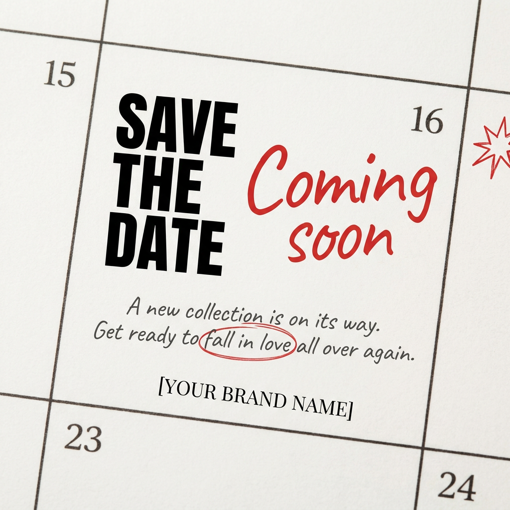
Turn your upcoming dates or launch schedule into a beautiful, tactile physical calendar. It renders crisp minimalist grids on heavy textured paper with realistic macro focus. Perfect for sharing events on social media without looking like a generic graphic.
Regenerate using your own assets.
Beyond thumbnails: applying the method to all your visual assets
The principles for creating thumbnails with clear text are universal. Once you master this method on MyUP, you can apply it to produce an entire suite of on-brand visual assets.
The same integrated process of using a Brandkit for consistency and templates for structure works for:
- Social Media Posts: Create Instagram carousels or Facebook posts with consistent, readable text.
- Digital Ads: Generate ad variations for A/B testing, where only the headline text changes while the visual remains consistent.
- Website Banners: Design hero images and promotional banners with crisp, clear calls-to-action.
- Posters and Flyers: Produce print-ready or digital posters where typography is a key design element.
By using a single platform, you ensure that your brand's typography and visual style remain coherent across all marketing channels, reinforcing your identity and saving countless hours of repetitive work. A template designed for a landscape poster can easily become the foundation for a suite of related assets. Template: #myup-ysc9-ekcs
Professional Product Poster
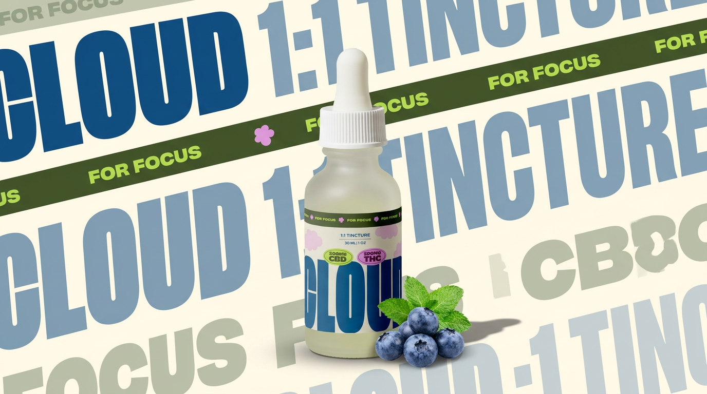
Turn any product shot into a clean, graphic landscape poster. It automatically pulls the text from your packaging to create a massive, semi-transparent repeated background pattern behind your item. Great for modern, typography-heavy brand showcases.
Regenerate using your own assets.
From frustrating artifacts to finished creations
The era of accepting broken text as a necessary evil of AI image generation is over. Fighting with prompts and juggling multiple software tools is not a sustainable way to create professional content. The goal is a finished creation, ready to publish, that effectively communicates your message and strengthens your brand.
MyUP is the Creative Production Platform built to deliver just that. By combining the power of a Brandkit for consistency, smart templates for structure, and an integrated editor for control, you can finally move from generating raw images to producing finished visual assets. It's time to make your unimaginable ideas possible, with every word perfectly in place.
