
Tired of fixing AI's 'almost on-brand' slides? There's a better way.
You've seen the viral posts. A marketer shares a side-by-side: their slick brand guide next to a slide deck from a popular AI presentation maker. The caption reads: “The last 10% of brand details takes 90% of the time to fix.” It’s the pain of modern content creation. The AI gets you close, but the endless manual tweaks—correcting hex codes, swapping fonts, replacing generic icons—kill your productivity.
Tools like Deckify AI are trying to solve this with new 'Brand Lock' features, but they often just slap a logo and primary color onto a generic template. That isn't a brand strategy; it's a brand filter. It doesn't solve the core problem: ensuring every single visual asset, from a spot illustration to a data chart, speaks the same visual language.
A truly on-brand presentation comes from a different approach. Instead of generating and then fixing, you use a workflow where every visual is created directly from your central Brandkit. This guide provides that professional workflow. Let’s start with the most important slide: the title card. This workflow generates a clean, minimalist visual that automatically uses your brand’s fonts and colors, getting it right from the first step.
Workflow code: #myup-k4td-9k6z
Minimalist Poster
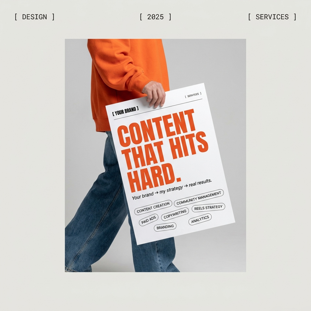
Give your social feed a clean, gallery-like aesthetic. This layout frames your images with structured mono typography and soft, neutral backgrounds for a high-end editorial look. It's perfect for minimal product launches or brand announcements.
Regenerate using your own assets.
First, map your visuals: from raw text to a presentation structure
The new 'Document-to-Deck' features from tools like Gamma are a smart evolution, turning raw text from a memo or Google Doc into a structured presentation. But text is only half the battle. A great presentation is a visual story, and before you generate a single image, you need a production plan.
Instead of just prompting “make a presentation about Q3 growth,” start by breaking your narrative down into a list of required visual assets. This is your deck’s shot list.
- 1x Title Slide: Your main visual hook.
- 1x Agenda Slide: Clean, typographic layout.
- 4x Content Slides: Each needs a unique spot illustration (e.g., a growing plant for 'growth,' a handshake for 'partnership').
- 2x Data Slides: One bar chart showing revenue, one pie chart for market share.
- 1x Team Slide: Placeholder for headshots.
- 1x Closing Slide: A simple thank you or call to action.
This simple list transforms an abstract idea into a concrete production queue. Now you're not just making a deck; you're producing a set of specific, on-brand assets.
Step 1: Generate the core visual identity for your deck
With your visual map ready, the first production step is generating the foundational slides: the title card, section dividers, and main content backgrounds. This is where a Brandkit-driven workflow demonstrates its value immediately.
In a standard AI tool, you’d get a generic design and then spend time adjusting it. In MyUP, the workflow already has access to your Brandkit—your approved logos, color palettes, typography, and stylistic DNA. When you run the workflow for a 'Title Slide', it doesn’t guess. It applies your primary brand font for the heading and pulls from your approved color palette for the background. The user's role shifts from tedious manual correction to simple validation. You approve the output, confident that the core brand rules have already been met.
Step 2: Create a complete, stylistically consistent illustration set
Nothing screams 'disjointed AI deck' like a collection of illustrations in ten different styles. One slide has a 3D character, the next a flat icon, and the third a photorealistic scene. It's visual chaos. Achieving consistency across multiple, unique images is one of the hardest tasks for any AI image generator.
Manually trying to force consistency in tools like Midjourney with complex style and character references is unreliable and time-consuming. A better method is a workflow designed for consistency. By defining the artistic style once in your Brandkit (e.g., 'flat vector illustrations with bold outlines, using a muted color palette'), a MyUP workflow can generate your entire set of assets to match. Your 'growth' plant, 'partnership' handshake, and 'teamwork' icons will all look like they were created by the same illustrator for the same project. This is how you move beyond single, random images to a cohesive visual system. For a deeper dive into this technique, see our guide for creating truly consistent brand visuals.
Step 3: The new frontier — generating on-brand charts and data visuals
Until very recently, this step was impossible. Asking an AI image model for a bar chart would produce garbled text and nonsensical shapes. But thanks to advancements in models like Stable Diffusion 3 in mid-2026, generating clean, simple data visualizations from a text prompt is now a reality.
This unlocks the final, most critical piece of the on-brand presentation. A generic AI tool might create a chart with random colors, forcing you to rebuild it manually. A Brandkit-driven workflow, however, can be instructed to use your specific brand colors for the data series.
For example, your prompt within the workflow wouldn't just be 'a bar chart showing 50% and 80% growth.' It would be:
Create a clean, minimalist bar chart showing two series. The first series, 'Q1', is at 50%. The second, 'Q2', is at 80%. Use the primary brand color for the Q1 bar and the secondary brand color for the Q2 bar. Use the primary brand font for all labels.
The result is a chart that is not only accurate but instantly recognizable as part of your brand's visual identity, no manual color-picking required.
From assets to presentation: assembling your on-brand deck
Once your workflow has generated the complete set of assets—title cards, illustrations, and data charts—the final step is assembly. MyUP's role is to deliver a folder of perfectly on-brand ingredients, ready for you to use in your presentation tool of choice, whether it's PowerPoint, Google Slides, or Keynote.
This workflow fundamentally changes the job. Instead of wrestling with a design tool to fix colors and fonts on 20 different slides, you get to focus entirely on the narrative. You can arrange your visuals, write your speaker notes, and perfect your story, confident that the visual foundation is solid, consistent, and 100% on-brand.
