If you’ve spent any time trying to create a logo or social post with an AI image generator, you know the frustration. You nail the perfect visual, but the text looks like a bizarre, melted alphabet. You're not alone. In the last 48 hours, the AI world has been buzzing about this exact problem, with Midjourney testing a new “Style T-Rex” feature on July 21st and a new startup called Glyph AI launching on the same day, both dedicated to fixing AI’s typography problem.
These developments prove one thing: generating coherent text is the biggest failure point for even the most advanced AI models. But while they chase a better model, the professional solution isn't about finding a magic prompt. It's about using a smarter workflow.
The AI world is trying to fix text. Here’s why it’s still not enough.
The sudden scramble to fix AI text generation isn't a coincidence. It’s a reaction to a universal user pain point. For years, creators have been forced into a clunky, multi-tool process: generate a beautiful image in one platform, export it, then manually add text in another, struggling to match fonts and styles. Features like Midjourney's are an attempt to solve this, but they still treat the symptom, not the cause.
The fundamental issue is that these models are guessing at letter shapes. They don't understand typography as a system of rules, kerning, and brand identity. You’re still gambling with a prompt, hoping the AI gets your brand name right. A professional brand can’t be built on a gamble.
Why your brand name becomes pixel soup in an AI generator
To understand why AI mangles text, you need to know how diffusion models “see.” They don’t see letters, words, or fonts. They see a vast library of pixels and the statistical relationships between them. When you ask for the word “AURA,” the AI isn’t retrieving a font file for ‘A-U-R-A’. It’s trying to assemble a pattern of pixels that, based on its training data, looks something like what people have labeled “AURA” in the past. The result is often an approximation—a visual echo of a word, not the word itself. This is why you get warped letters, extra limbs on a “K”, or nonsensical character strings. It’s pixel soup.
For a brand, this is unusable. Your logo’s typography isn’t just text; it’s a core part of your visual identity, defined by a specific font, weight, and color. An approximation is a failure.
The professional workflow: separate the icon from the type
Stop trying to force AI to be a typographer. It’s the wrong tool for that job. The reliable, professional workflow treats a logo or branded visual as a system with two distinct parts: the visual element and the typographic element. You use AI for what it excels at—generating unique, compelling visuals—and a brand-aware system for what AI fails at: applying precise, editable typography.
On MyUP.ai, this is a simple, two-step process built for brand consistency:
- Generate the visual: Use MyUP’s image generator to create a clean, text-free logomark, icon, or background image.
- Apply the brand: Use MyUP’s editor and your saved Brandkit to layer your exact brand fonts and colors over the AI-generated visual. The text remains editable, and the result is perfectly on-brand, every time.
Step 1: Generate a clean, text-free logomark with AI
The first step is to focus the AI on its core strength. Instead of prompting for “a logo for ‘Aura Coffee’ with a minimalist sun icon,” you remove the text from the equation. Your goal is to get a powerful visual asset, not a finished lockup.
In MyUP.ai, you would prompt something like:
“Minimalist, single-line icon of a rising sun over a coffee bean, vector style, on a clean white background, no text.”
The key is the “no text” instruction. This frees the model from trying to create pixel soup and allows it to concentrate all its power on the visual mark. You can iterate on this until you have an icon you love. The user validates the creative direction; MyUP handles the production.
Step 2: Apply perfect, editable text from your Brandkit
Once you have your AI-generated visual, the rest of the process is about control, not chance. This is where the MyUP Brandkit is essential. A Brandkit is your brand’s visual identity, stored in one place. You upload your specific brand fonts (e.g., Montserrat Bold), define your exact brand colors (e.g., #4A2C2A), and save your logo. It’s built once and reused automatically.
With your visual on the canvas in MyUP, you simply add a text layer. The platform automatically suggests your Brandkit fonts and colors. You type your brand name, and it renders perfectly—crisp, clean, and in the exact typeface you chose. The text is an editable layer, meaning you can change the wording, adjust the size, or tweak the position without having to regenerate the entire image. This is the typographic control that standalone image generators lack.
You can try this workflow right now with a pre-built template. This poster template uses the same logic: a strong visual base with a crisp, editable text layer on top.
Workflow code: #myup-6hp6-zwh2
Minimalist Hand-Lettered Food Brand Poster
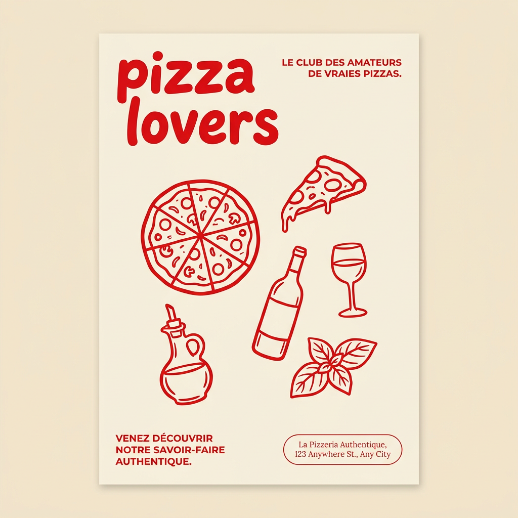
Generate clean, minimal posters for your food brand or cafe. It sets up a soft cream background with tons of breathing room, contrasted by a bold, chunky handwritten title in vivid red. It's a gorgeous editorial layout that makes your brand look instantly high-end.
Regenerate using your own assets.
Putting it all together: from a prompt to an on-brand poster
This workflow isn't just for simple logo lockups. It’s how you build any complex, on-brand asset. Imagine you need a poster for a summer music festival. Trying to generate the entire poster in one prompt—with the event title, date, and artist names—is a recipe for disaster.
Using the MyUP workflow:
- Generate the background: Prompt for “vibrant, retro-style abstract graphic of soundwaves and sunshine, grainy texture, no text.”
- Apply the typography: Open the image in a MyUP template. Use your Brandkit to add the event title in your headline font and the details in your body font. You maintain complete control over the information hierarchy and layout.
This is how you move from being a prompt operator to a creative director. The AI provides the raw visual material, and you apply the brand system with precision. This event poster template is a perfect example of this workflow in action.
Workflow code: #myup-xbur-hzoi
Bold Retro Yellow Event Poster
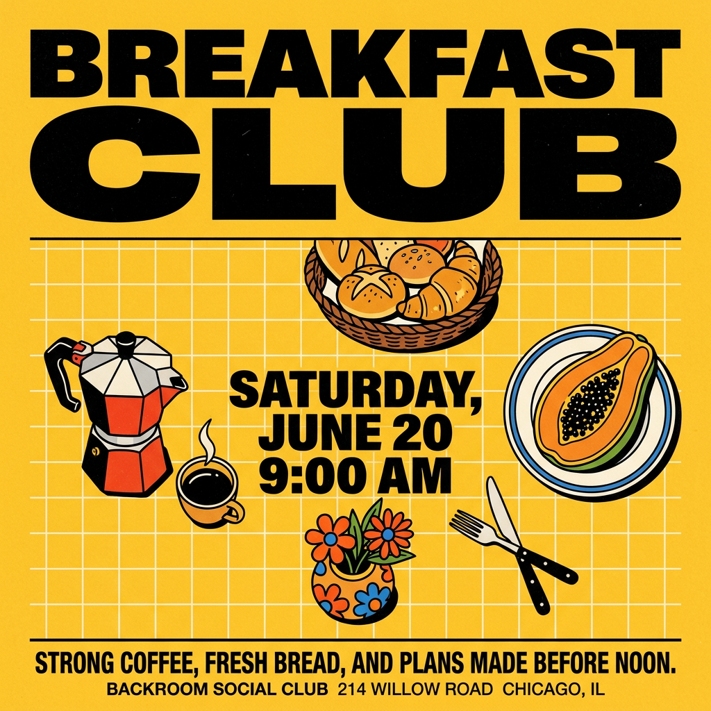
Turn your branding or event details into bold, nostalgic posters. It blends vibrant warm backdrops with a clean, retro square grid pattern to make any announcement look like a classic piece of mid-century graphic design.
Regenerate using your own assets.
This isn't just for logos. It's for your entire brand.
The real cost of mangled AI text isn't just a bad logo; it's the erosion of your entire brand's consistency. Every social media post, ad banner, and presentation slide is an opportunity to reinforce your visual identity. If your text is inconsistent, your brand looks unprofessional.
The hybrid workflow—AI visuals plus Brandkit typography—is the standard for all brand content production on MyUP. Whether you're creating a quote graphic for Instagram, a product announcement, or an animated video, the principle is the same. Generate the core visual, then apply your brand's typographic system for a perfect finish. This is how you scale content creation without sacrificing brand integrity, a challenge many teams face when trying to produce on-brand memes or other fast-moving content.
This template shows how the same logic applies to a different aesthetic, combining a generated visual texture with strong, controlled typography.
Workflow code: #myup-msop-hlxf
Retro Zine Style Event Poster
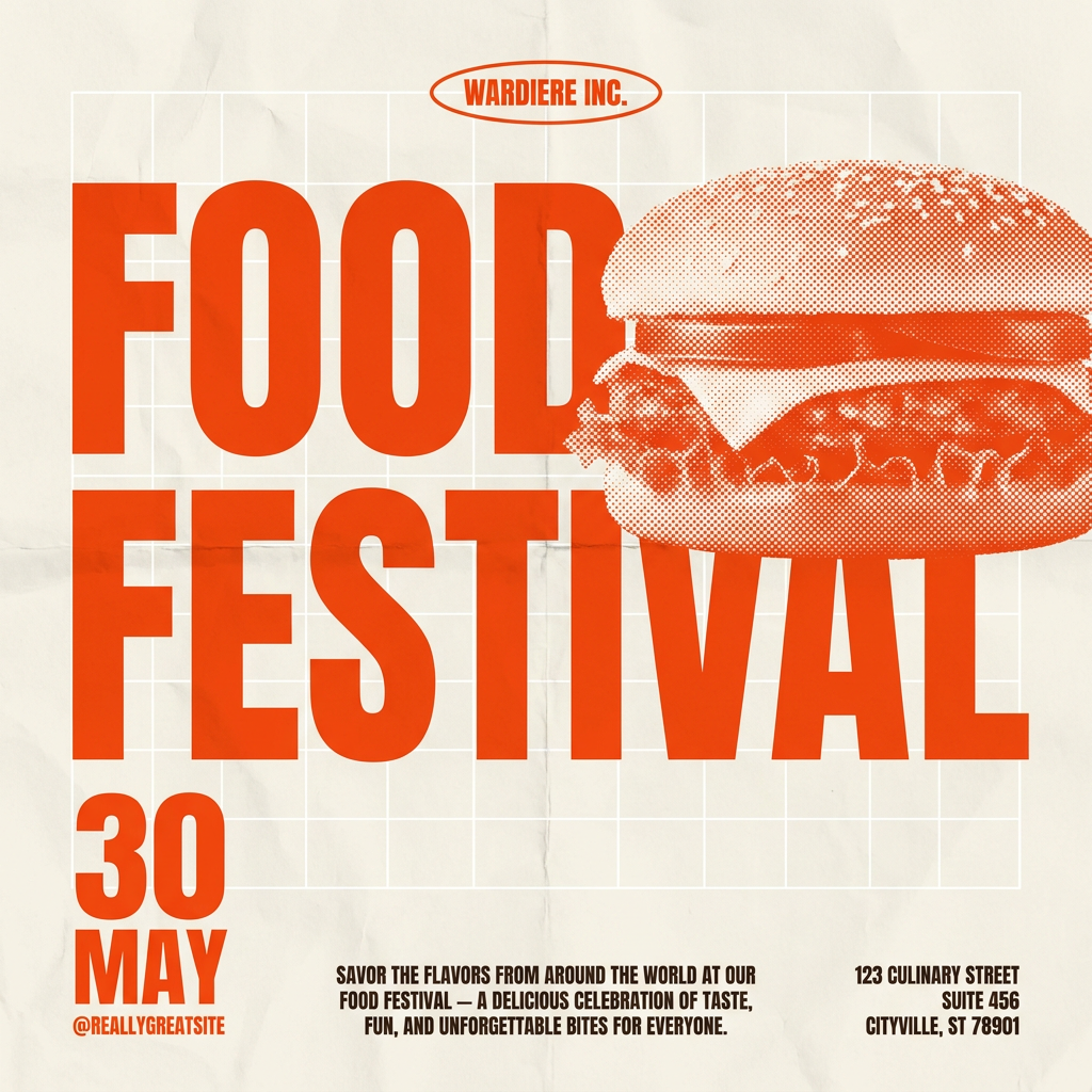
Give your social posts a gritty, analog zine aesthetic. It layers a crumpled paper texture and a subtle grid over a warm cream background to make any event graphic look like a tactile, photocopied flyer. Perfect for DIY gigs and bold promos.
Regenerate using your own assets.
Stop gambling on text. Start controlling your brand.
AI models will continue to get slightly better at text, but they will likely never be true typographers. They are tools of probability, not precision. Your brand, however, requires precision. The right font, the right color, the right placement—these are not details to be left to a model’s best guess.
The professional, sustainable solution is a workflow that gives you control. By separating visual generation from typographic application, you get the best of both worlds: the creative power of AI and the absolute brand consistency of a design system. Stop wrestling with prompts to fix bad text. Create a MyUP account, build your Brandkit in minutes, and start creating content with confidence.
