
You type “create an infographic about Q3 sales data” into an AI tool. You wait, hopeful. And you get back… a glorified PowerPoint presentation. A series of disconnected, off-brand slides with generic icons and gibberish text. If this sounds familiar, you’ve hit the fundamental flaw of nearly every tool calling itself an “AI infographic generator.”
They aren’t built for infographics. They’re built for slides. But an infographic is a single, flowing visual story, not a deck. For years, this has been a frustrating limitation. Until now.
In July 2026, the game changed. The release of features like Midjourney’s ‘Region Prompts’ and Adobe’s ‘Structure Reference’ finally gives creators the granular, spatial control needed to build complex, intentional layouts. The solution isn’t finding a better one-click generator. It’s adopting a professional, component-based workflow. This guide will walk you through it, step-by-step.
You asked for an infographic. AI gave you a slide deck. Here's why.
The core problem is architectural. Most AI design tools are built on a slide-based paradigm. Their logic is: one idea, one slide. This works for a basic presentation but completely fails for an infographic, which requires a cohesive visual hierarchy, a narrative flow, and a consistent design system across a single, long-form canvas. When you ask a slide-based tool for a complex, unified visual, it breaks the task down into the only unit it understands: a slide. The result is a disjointed collection of images that feels more like a clumsy report than a piece of persuasive design.
These tools prioritize speed over control, and templates over custom layouts. They can’t handle the specific demands of data visualization, brand consistency, and storytelling that a real infographic requires. Trying to force them to create one is like asking a car factory to build a bicycle; you might get something with wheels, but it won’t be right.
The professional workflow: assemble components, don't just generate a file
Stop thinking about generating an “infographic.” Instead, think like a designer: you are going to create the components of an infographic and then assemble them. This is the central philosophy behind building high-quality brand content with AI. An infographic is a visual system made of distinct parts:
- A hero image or headline graphic: The visual hook that grabs attention.
- Key data points: Stylized numbers or short stats.
- Custom icons: Simple, on-brand graphics that represent concepts.
- Charts and graphs: Visual representations of data.
- Body copy and headers: The text that provides context and narrative.
- A call to action (CTA): The concluding element that tells the reader what to do next.
The professional workflow uses AI to generate these ingredients individually, ensuring each one is perfect and on-brand. Then, you use a flexible platform to assemble them into the final piece. This gives you total control over the layout and the story. AI executes the repetitive tasks; you provide the creative direction and validation.
Step 1: Define your structure and lock in your brand
Before generating a single pixel, you need two things: a plan for your layout and a system for your brand. Start by sketching a simple wireframe. It doesn’t have to be perfect; a rough drawing on a notepad will do. Map out where your headline, key stats, and charts will go. This gives you a blueprint for assembly later.
Next, and most critically, lock in your brand identity. This is where you set up your Brandkit in MyUP.ai. You do it once: upload your logo, define your exact brand colors by their hex codes, and set your brand fonts. From this point on, every asset you create in MyUP—from text blocks to AI-generated visuals—will automatically inherit this visual DNA. This isn't just a shortcut to brand consistency; it's the foundation for producing any on-brand content at scale, whether it's an infographic or a full presentation design system.
Step 2: Generate your visual ingredients with AI
With your Brandkit active in MyUP.ai, you can now start creating your components. The key is to be specific and to reference your brand style in your prompts. Instead of a generic prompt like “an icon of a gear,” use a detailed one:
“A set of 5 minimalist line art icons for business services: a gear, a bar chart, a lightbulb, a handshake, and a target. Use only brand colors #1A2B4C and #FFFFFF, on a transparent background, vector style.”
Do this for each component. Generate a hero image that matches your brand’s photographic style. Create stylized numbers for your key stats. Because your Brandkit is loaded, MyUP’s AI will automatically ground its creations in your visual identity, but specific prompts give you even finer control.
Once you have your core visual elements, you need a canvas to build on. A vertical poster format provides an excellent structure for a standard infographic. This template gives you a clean, well-proportioned starting point.
Workflow code: #myup-sygb-rhnt
Minimalist Vertical Product Advertising Poster
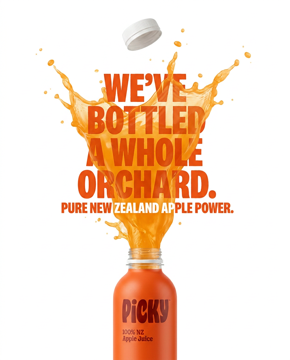
Drop the clutter and put your product in the spotlight. This setup places your item against a pure, seamless white background with a striking vertical flow that draws the eye straight up. It's perfect for creating clean, high-end studio posters.
Regenerate using your own assets.
Step 3: Assemble, edit, and finalize on the canvas
This is where you transition from generator to designer. Drag your AI-generated components—the hero image, icons, and chart elements—onto the MyUP canvas. Now, arrange them according to your wireframe. This is the human control that one-click generators completely remove from the process.
Add your headlines and body copy. MyUP automatically applies your correct Brandkit fonts and colors, so you don't have to waste time formatting. Adjust the spacing, resize elements, and ensure the visual flow guides the reader’s eye from top to bottom. AI created the parts, but you are crafting the final story with full layout control. You approve, you adjust, and MyUP handles the production.
If your content is more product-focused, a different layout might serve the story better. This template offers an alternative structure that can be easily adapted for an infographic format.
Workflow code: #myup-fts6-4ihp
Vertical Gourmet French Fry Ad
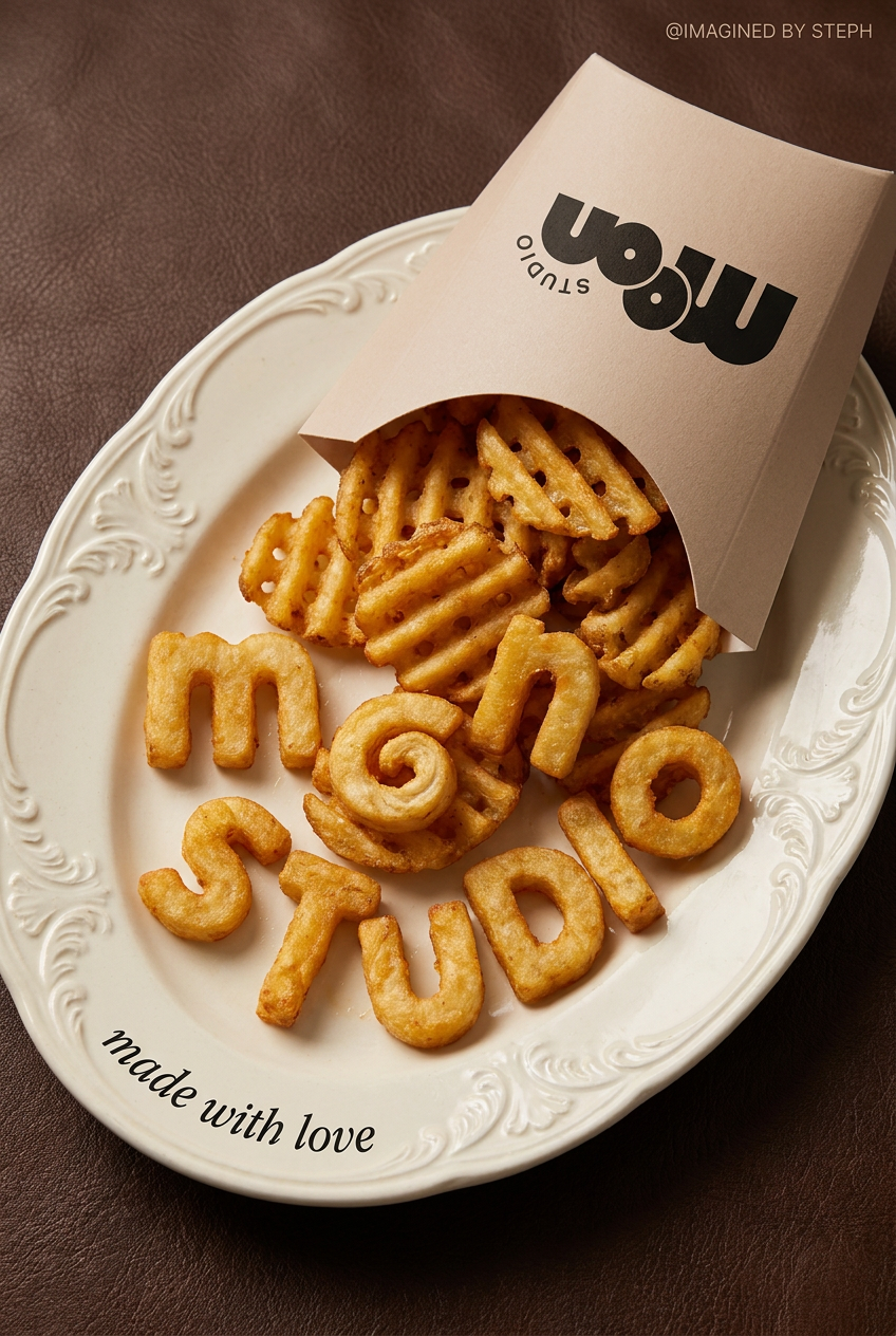
Transform your products into high-fashion editorial ads. This setup uses a dynamic diagonal layout and a slightly tilted overhead angle to give food and packaging incredible depth and texture. It's perfect for giving any brand a chic, premium look.
Regenerate using your own assets.
Step 4: Turn your infographic into a full social campaign
Your finished infographic isn't an endpoint; it's a master asset. Because you built it from components on a flexible canvas, you can now repurpose it effortlessly. In MyUP, you can simply select and export specific sections of your design.
That compelling chart in the middle? That’s a perfect standalone visual for a LinkedIn post. The top three icons with their corresponding stats? That’s an ideal Instagram carousel. You can break your single infographic down into a week's worth of social content in minutes, all perfectly on-brand. The component-based workflow makes your content infinitely more valuable.
For creating a series of related social posts from your infographic, a grid-based template can help you organize the repurposed content into a cohesive campaign.
Workflow code: #myup-n0bi-2wzk
Bold Editorial Grid Poster
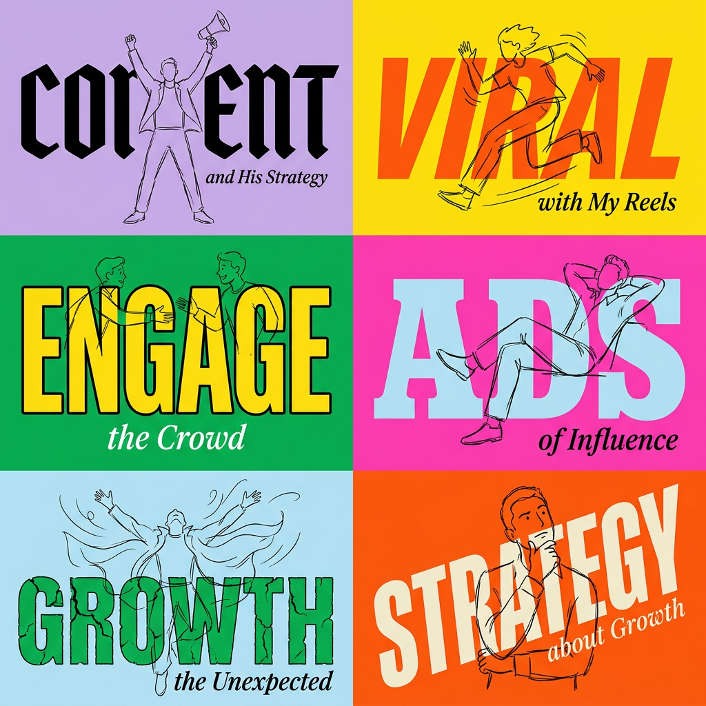
Create striking 2x3 editorial posters with six seamless, flat-color square cards in a perfect 4:5 grid. There are absolutely no gaps between the blocks, giving your content a bold, high-contrast magazine layout. It looks incredibly clean on any social feed.
Regenerate using your own assets.
Stop looking for a generator. Start building a workflow.
The search for a perfect, one-click “AI infographic generator” is a distraction. These tools will always be limited by their slide-based architecture. True quality, brand consistency, and creative control don’t come from a magic button; they come from a professional workflow that leverages AI for what it’s good at—execution—while keeping you in the director’s chair.
By defining your brand, generating individual components, and assembling them with full control, you can create infographics that not only look better but perform better. This is the modern way to build brand content, and MyUP.ai is the platform designed to run this exact playbook.
