You prompted the perfect image for your event poster, an amazing visual that captures the exact vibe you wanted. But the text looks like a melted nightmare of warped letters and alien script. You're not alone.
The recent buzz on Reddit and social media, with creators sharing complex workarounds just to get legible words from AI, is a clear sign that the process is broken. Trying to force an image generator to be a typographer is like asking a painter to write legal copy. It's the wrong tool for a critical part of the job. A great poster isn't just a picture; it's communication. It's time to stop fixing broken outputs and start using a workflow built for design.
Why your AI poster has nightmare text
The core problem isn't your prompt. It's how generative image models work. Tools like Midjourney, Stable Diffusion, and Firefly think in terms of pixels, patterns, and visual relationships, not language. When you ask them to write 'Summer Music Festival', they aren't typing letters. They are trying to paint a picture of what they think those words look like, based on millions of images they've seen. The result is often a garbled mess that resembles text but is fundamentally unreadable.
This is a structural limitation. These models are masters of aesthetics but have no concept of typography, kerning, or even basic spelling. That's why even when you get the image 90% right, the last 10%—the crucial information—forces you into a frustrating cycle of re-rolls or a clumsy editing job in another app.
The right workflow: separate the art from the information
A professional poster does two jobs: it attracts attention (the art) and it delivers information (the text). The most effective creation process treats these as two distinct layers, and this is the philosophy behind MyUP.ai's poster workflows.
Instead of trying to do everything in a single, flawed prompt, you separate the tasks:
- Generate the Art: Use AI for what it excels at—creating a unique, compelling background visual that sets the tone for your event.
- Apply the Information: Use a brand-aware system to apply your text, logo, and other details. This layer needs to be precise, legible, and consistent.
This is where MyUP's Brandkit is essential. You set up your brand once by providing a URL. MyUP automatically extracts your logo, fonts, and color palette. From then on, any poster workflow you run will apply your event details using your exact brand typography and colors. The AI handles the creative visuals, while your brand controls the critical communication. You approve the final composition; MyUP handles the production.
How to create a custom event poster in 3 steps on MyUP
Executing this professional workflow on MyUP.ai is straightforward because the template itself is the workflow. You're not just editing a static design; you're running a process that builds a custom poster for you.
- Launch a Poster Workflow: Start with a workflow that matches your general design goal. You'll be prompted for the basic inputs.
- Describe Your Visual: Instead of a complex prompt that includes text, simply describe the background image you want. 'A vibrant, abstract explosion of color for a music festival' or 'A moody, atmospheric photo of a forest for a writer's retreat.' MyUP generates a unique image based on your description.
- Input Your Event Details: In simple text fields, enter your event title, date, location, and any other text. MyUP automatically lays out this information on top of your generated image, using the fonts and colors from your saved Brandkit.
The result is a poster with a completely bespoke AI-generated image and perfectly crisp, on-brand, and legible text. No more melted letters or design compromises.
Workflow: a clean, minimalist event poster
To put this into practice, here's a versatile workflow perfect for corporate events, webinars, or any occasion that calls for a clean, modern design. It focuses on generating a strong central image and applying typography with a clear visual hierarchy. You provide the event details, and the workflow does the rest.
Workflow code: #myup-k4td-9k6z
Minimalist Poster
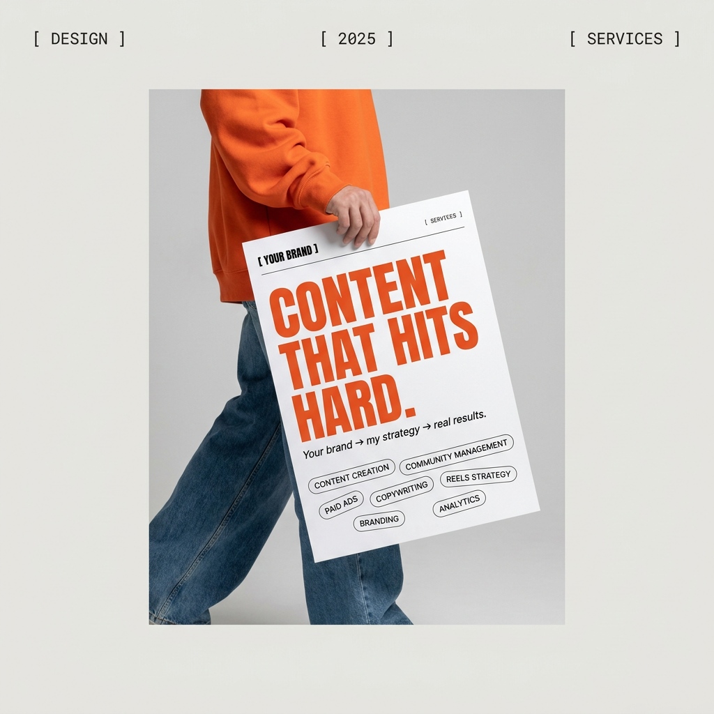
Give your social feed a clean, gallery-like aesthetic. This layout frames your images with structured mono typography and soft, neutral backgrounds for a high-end editorial look. It's perfect for minimal product launches or brand announcements.
Regenerate using your own assets.
Need a specific vibe? start with a style-aware workflow
The recent spike in searches for 'AI concert poster' and 'AI festival poster' proves that creators need more than generic templates. A minimalist corporate design won't work for an indie rock show or a craft market. The aesthetic is part of the message.
Instead of trying to craft a complex prompt to capture a subculture's vibe, you can use a MyUP workflow that already has a strong visual style baked in. These workflows guide the AI to generate a background that fits a specific genre—retro, grunge, futuristic, etc.—and then apply your Brandkit information in a layout that complements that style.
This approach gives you unique, non-template results that feel authentic to your event without requiring you to be a design expert or a master prompter. For a deeper dive on this, see our guide on the one-step AI poster workflow.
Workflows for posters that don't look like AI
The ultimate goal is to create promotional material that is unique and effective. The viral trend of creating 'AI Riso prints' highlights a strong desire among creators for visuals with more texture, character, and a non-digital feel. MyUP workflows let you achieve these specific, popular aesthetics in a single step, without the complex multi-tool processes shared on social media.
Here are three distinct, style-aware workflows to generate event posters that stand out:
- For a tactile, layered, and printed look: Vintage Risograph Event PosterWorkflow code: #myup-3xus-3l9x
- For a DIY, cut-and-paste zine aesthetic: Retro Zine Style Event PosterWorkflow code: #myup-msop-hlxf
- For high-energy, graphic impact with a vintage feel: Bold Retro Yellow Event PosterWorkflow code: #myup-xbur-hzoi
By choosing the right workflow, you're not just making a poster; you're directing a production process that combines the creative power of AI with the communication discipline of your brand.
