
Your data is boring because you're still making charts
This past week in July 2026, the content creation world officially declared the static chart dead. Adobe integrated Firefly-powered 'Animated Infographics' into Express. Runway launched 'Data-Driven Motion' for its Gen-3 model. The message from the industry's biggest players is clear: if your data isn't moving, it's invisible.
This is a welcome shift. For years, marketers and founders have been stuck trying to make quarterly reports or growth metrics feel exciting in presentations and on social media. But these new tools, while technically impressive, are still just a solution for making prettier spreadsheets. They animate the bars and lines but fail to address the real problem: a chart shows data, but a story makes that data memorable.
The goal isn't to create a technically perfect, animated version of an Excel export. It's to communicate the meaning behind the number—the growth, the savings, the impact. That requires a creative workflow, not just a data-in, chart-out utility.
The two traps of AI data visualization
If you've tried to solve this problem, you've likely fallen into one of two traps. Each one forces you to compromise on either creative quality or brand integrity.
Trap 1: The Technical Chart Generator. These tools are precise. They take your CSV file and generate a clean, animated bar chart or pie graph. But the output is generic, sterile, and completely disconnected from your brand's visual identity. It’s technically correct but creatively bankrupt, looking like a stock template that does nothing to build brand recognition.
Trap 2: The General-Purpose Video AI. These models are creative and can produce stunning visuals. But they have no concept of data accuracy. Ask one to visualize '25% growth' and you might get a beautiful video of a growing plant, but the visual has no connection to your brand, your style, or the specific context of your data. You get a vibe, not a message.
Professionals need a third path: a workflow that combines creative storytelling with brand control. You need a way to translate a data point into a compelling visual concept, and then ensure that visual is executed perfectly within your brand's system of colors, fonts, and logos.
The workflow: from a single number to an on-brand video story
Instead of trying to animate a chart, we're going to create a short, symbolic video that tells the story of the data. This is a repeatable, four-step process you can execute entirely within MyUP.ai, ensuring every asset is unique, engaging, and perfectly on-brand.
Let's use a simple data point as our example: 'Q3 user engagement increased by 35%.'
Step 1: Define the story
What is the core message? It's not 'thirty-five percent.' It's 'strong, upward momentum' or 'accelerated connection.' This is the creative brief for your AI.
Step 2: Generate a visual metaphor
Now, translate that story into a visual concept. Instead of a bar chart, we'll prompt an image that represents 'momentum'. We're not showing the number; we're showing the feeling of the number. In MyUP, you can use a simple poster template to generate this core visual.
A prompt could be: 'A minimalist graphic illustration of a single, elegant arrow moving upward dynamically on a clean background, in shades of deep blue and energetic teal.'
This step is about creative direction. The user defines the concept, and MyUP handles the visual production. You can iterate quickly until you have an image that captures the story perfectly. The Minimalist Poster workflow is an excellent starting point for this.
Workflow code: #myup-k4td-9k6z
Minimalist Poster
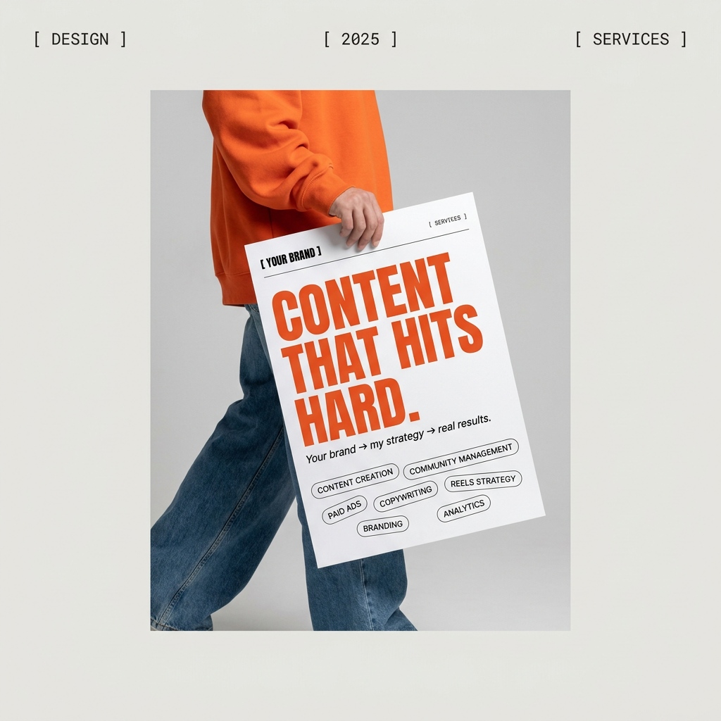
Give your social feed a clean, gallery-like aesthetic. This layout frames your images with structured mono typography and soft, neutral backgrounds for a high-end editorial look. It's perfect for minimal product launches or brand announcements.
Regenerate using your own assets.
Step 3: Animate the visual
With your static visual ready, the next step is to bring it to life. Using MyUP's image-to-video AI, you can add subtle, dynamic motion. For our arrow visual, we could add a gentle upward drift and a subtle shimmer, turning the static poster into a 3-4 second looping video clip. The key is controlled, minimal animation that enhances the story without being distracting.
Step 4: Apply your brand identity
This is the step where most other tools fail. Once your video clip is generated, your MyUP Brandkit automatically applies the finishing touches. Your logo is placed in a designated corner, the data point ('+35% User Engagement') is overlaid in your brand's primary font and color, and the entire asset is ready to be exported. You've gone from a single number to a finished, on-brand video asset without ever leaving the platform.
Prompts for telling data stories (not just showing data points)
The key to this workflow is translating business metrics into visual metaphors. Your prompt is the bridge between the data and the story. Here are some copy-pasteable starting points for common data concepts:
- For Growth (+X%): 'An abstract visualization of upward momentum, with clean lines reaching towards the top right corner. Minimalist, corporate, and optimistic.'
- For Savings/Efficiency (Y% reduction in costs): 'A soothing, minimalist visual representing simplicity and clarity. A complex, tangled shape on the left smoothly resolves into a single, clean line on the right.'
- For Market Share (Now Z% of the market): 'A graphic design showing a single colored circle elegantly expanding to occupy a larger portion of a contained space, pushing other, muted circles aside.'
- For Before-and-After Comparison: 'A split-screen design. On the left, a dull, monochromatic scene. On the right, the same scene is now vibrant, colorful, and full of energy.'
Using a template like the Bold Editorial Grid Poster in MyUP can make these comparison visuals incredibly easy to generate. You define the two concepts, and the workflow creates a structured, high-impact layout for you to then animate.
Workflow code: #myup-n0bi-2wzk
Bold Editorial Grid Poster
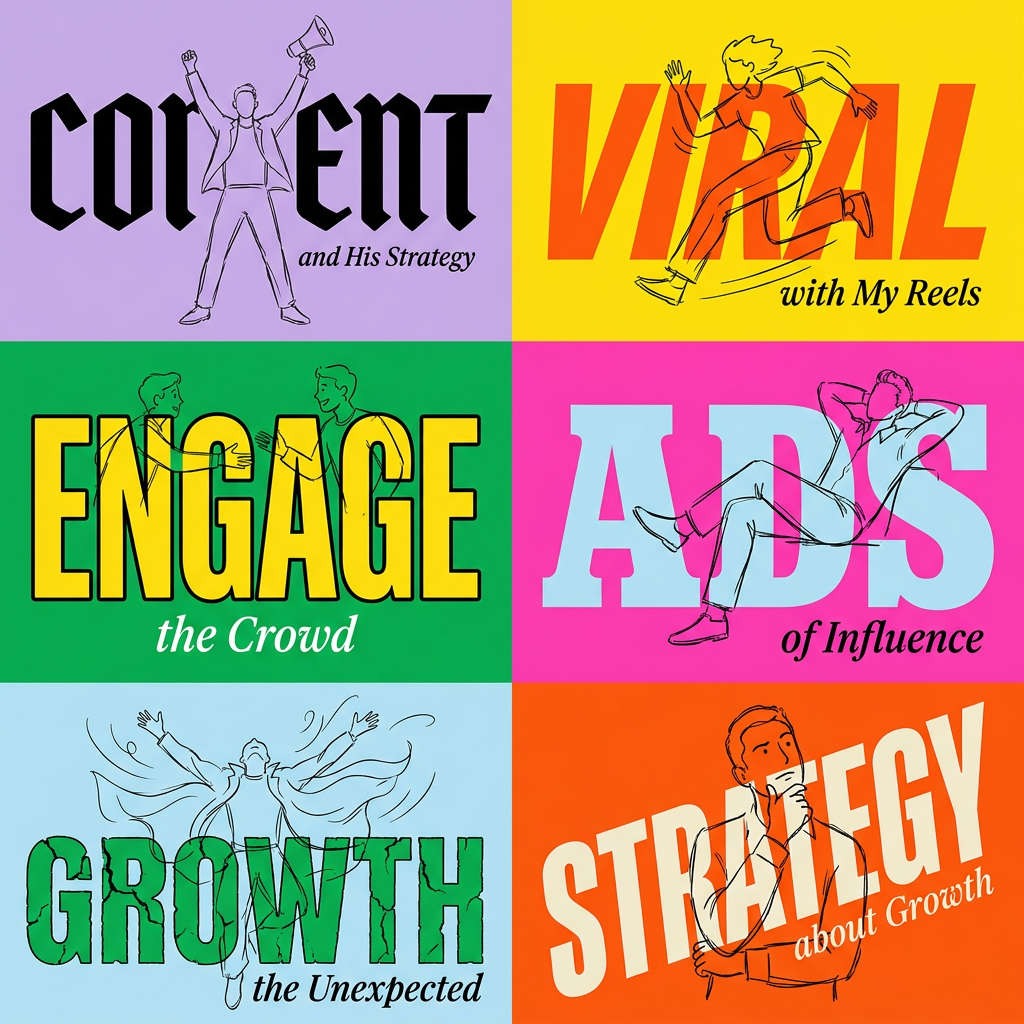
Create striking 2x3 editorial posters with six seamless, flat-color square cards in a perfect 4:5 grid. There are absolutely no gaps between the blocks, giving your content a bold, high-contrast magazine layout. It looks incredibly clean on any social feed.
Regenerate using your own assets.
Going beyond the numbers: animating concepts and feedback
This storytelling workflow isn't limited to hard numbers. It's even more powerful for visualizing qualitative data or abstract business concepts that are impossible to chart.
How do you show 'increased customer satisfaction' or 'streamlined internal processes'? You can't put those in a bar graph. But you can tell their story with a visual metaphor.
- 'Increased customer satisfaction': Prompt a visual of interlocking, harmonious shapes coming together, or a series of abstract, neutral faces turning into smiling ones.
- 'Successful team expansion': Visualize a simple shape duplicating and arranging itself into a larger, stronger structure.
- 'New Market Entry': A visual of a key unlocking a new area, or a single colored line finding a path into an unexplored white space.
For something like a hiring announcement or a new partnership, a workflow like the Modern Hiring Poster can generate a sophisticated, abstract visual that communicates the concept of 'joining' or 'building together'. This becomes the perfect foundation for a short, animated video for LinkedIn or internal presentations.
Workflow code: #myup-eiob-7tbc
Modern Hiring Poster
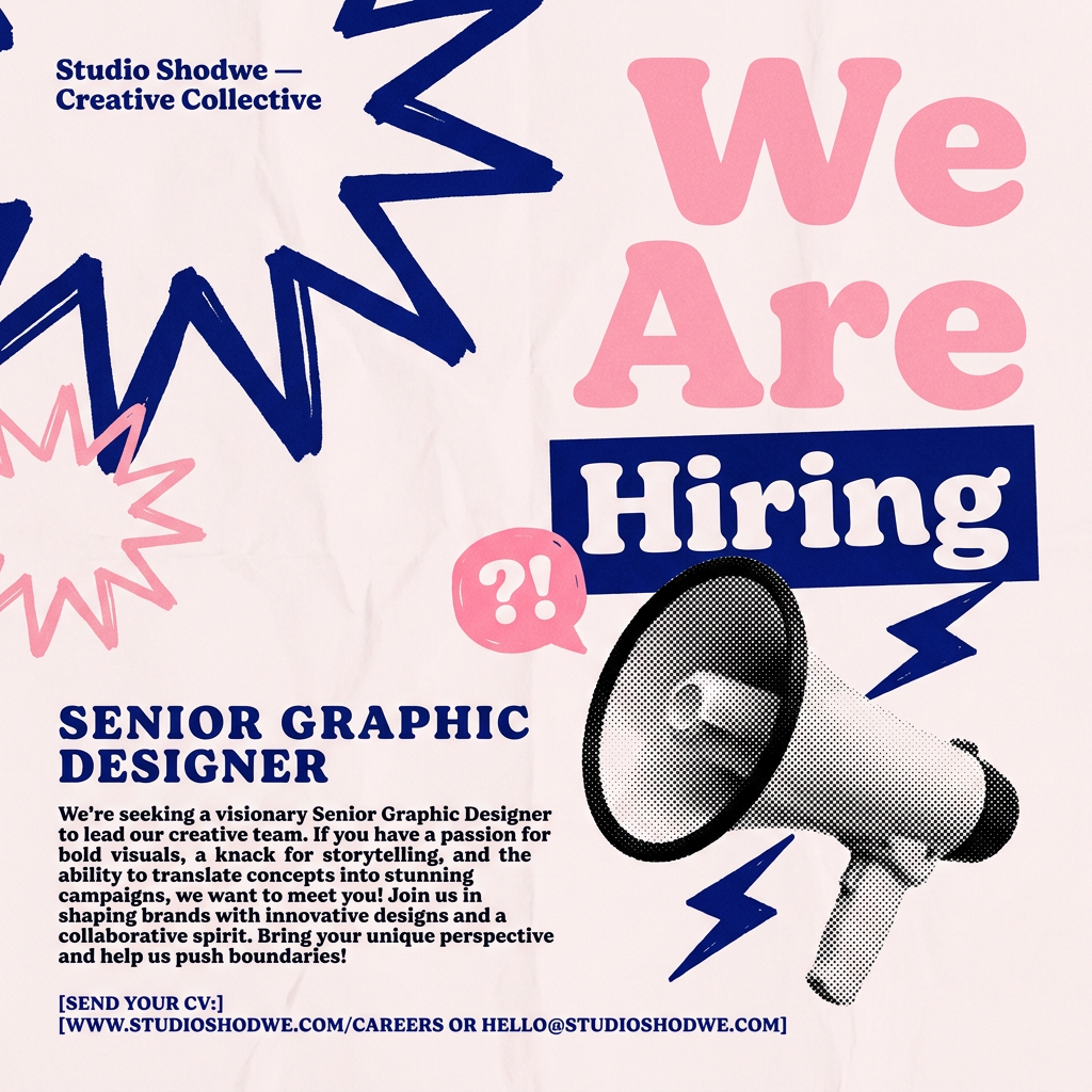
Turn your open roles into stylish social announcements. It sets your hiring details against a soft, textured paper background with clean, editorial typography. Perfect for giving your brand a polished, modern look when you're looking to hire.
Regenerate using your own assets.
Why a creative workflow beats a single-purpose generator
The new wave of AI data animators proves the market needs more dynamic visual content. But they treat the problem as a technical one, asking 'How can we animate this chart?' The better question is, 'How can we tell the story this data represents?'
A single-purpose generator will always produce a generic, predictable output. A flexible, brand-aware workflow in MyUP gives you creative control. It puts you in the role of the creative director, where you make the key strategic decision—the story—and MyUP executes the production. This approach ensures your data doesn't just get seen; it gets remembered.
Ultimately, making your data compelling isn't about choosing between technical precision and creative expression. It's about having a system that delivers both. By focusing on the story first and using a Brandkit to ensure consistency, you can create a library of unique, high-impact data visuals that build your brand with every share. It's a more strategic way to work, and it's the difference between showing a number and making a point.
