The promise and failure of AI 'style lock' features
You’ve seen the exciting updates in 2026. Features like 'Style Reference' and 'Character Lock' promised to solve the biggest headache in AI creative production: consistency. You tried it immediately, feeding it your brand’s beautiful moodboard, hoping to generate a dozen social media posts. The initial results looked promising — the aesthetic was close. Then you looked closer. Your logo was a warped, unreadable smudge. Your brand’s signature Pantone color was a few shades off. The custom font you paid thousands for was replaced with a generic sans-serif.
This is the universal frustration echoed in marketing forums and Reddit threads. While AI tools have become incredibly good at mimicking a general style, they fundamentally fail at enforcing a strict brand identity. This gap turns what should be an automated process into a frustrating cycle of generating, exporting, and manually fixing assets in Photoshop, defeating the entire purpose.
Why style copying isn't brand control
The core of the problem is a misunderstanding of what a brand is. Simple AI generators treat branding as a visual texture to be copied, like applying a filter. But a professional brand identity is not a texture; it's a logical system of distinct, non-negotiable elements:
- Logos and Marks: Vector-perfect assets that must be reproduced with 100% integrity.
- Typography: Specific font families, weights, and pairing rules.
- Color Palette: Exact hex codes that define the brand's voice and cannot be approximated.
- Layout Rules: Principles of composition, spacing, and hierarchy that ensure a consistent feel.
Style reference features are designed to analyze the pixels in a reference image and apply a similar aesthetic. They don't understand that a logo is a specific, unchanging symbol or that 'Helvetica Now' is a rule, not a suggestion. They are solving the problem of aesthetic cohesion, not brand control. For professional use, that's not enough.
The 3 pillars of true brand consistency (and where AI usually fails)
1. Logo & Icon Integrity
When you ask a standard AI image model to include your logo, it doesn't 'place' the logo file. It tries to 'draw' what it thinks your logo looks like based on its training data or a reference image. This results in the familiar melted, distorted, or slightly 'off' versions. The AI lacks the concept of a fixed, atomic asset. It sees a logo as just another part of the scene to be artistically interpreted, which is disastrous for brand recognition.
2. Typographic Control
Text generation in image models has improved, but it's still far from perfect for branding. These models don't have fonts installed like a design program. They render text as pixels, often resulting in garbled words or, at best, a generic font that resembles what you asked for. You can't enforce the use of your specific brand font, let alone control its weight, kerning, or pairing with other fonts. This instantly marks a visual as off-brand.
3. Color Palette Enforcement
A 'style reference' might capture the general color mood, but it rarely nails the exact hex codes. It will interpret your brand's deep navy blue as 'dark blue' and render a slightly different shade in every image, especially under different lighting conditions. This color drift dilutes brand identity and creates a messy, unprofessional look when assets are viewed together in a campaign.
The solution: a production method based on a central Brandkit
Instead of trying to force brand rules into a system not built for them, the professional approach is to use a platform designed for creative production. On a platform like MyUP, you don't try to describe your brand in every single prompt. You define it once, centrally, in a Brandkit.
A MyUP Brandkit is a smart container for your entire visual identity. You can build it instantly just by providing your website URL. MyUP automatically analyzes your site and extracts your logos, color palette, and fonts, storing them as concrete rules. This Brandkit then acts as a strict supervisor for the AI. When you state your creative intention — 'create a poster for our summer sale' — MyUP doesn't just guess at your style. It consults the Brandkit and applies your actual logo file, your specific brand font, and your exact color hex codes to the finished creation. The brand is no longer a suggestion; it's a directive.
How to create and use your Brandkit in MyUP
Getting started is straightforward. You don't need to be a designer or prompt engineer. The entire production process is handled for you, leaving you to focus on the vision.
- Create Your Brandkit: In MyUP, you can create a new Brandkit in seconds. Simply enter your company's URL, and the platform automatically pulls your logo files, identifies primary and secondary brand colors, and detects the fonts used on your site. You can review and tweak these elements to ensure they're perfect.
- State Your Intention: Forget complex prompts. Just describe what you want to create. For example, you could state the intention: "An event poster with a bold, retro design."
- Let MyUP Produce: MyUP takes your intention and automatically applies your saved Brandkit. It will use your brand's colors within the retro design, apply your brand's fonts for the event details, and can place your logo correctly according to established layout rules.
You can also use pre-built creative templates designed by top creators to execute a specific style instantly. For instance, to create the poster mentioned above, you could simply use a ready-to-use template that already has the composition and aesthetic locked in. Your Brandkit would then be applied on top to ensure it's a perfect brand fit. For a bold, mid-century modern look, try the Bold Retro Yellow Event Poster. Template: #myup-xbur-hzoi
Bold Retro Yellow Event Poster
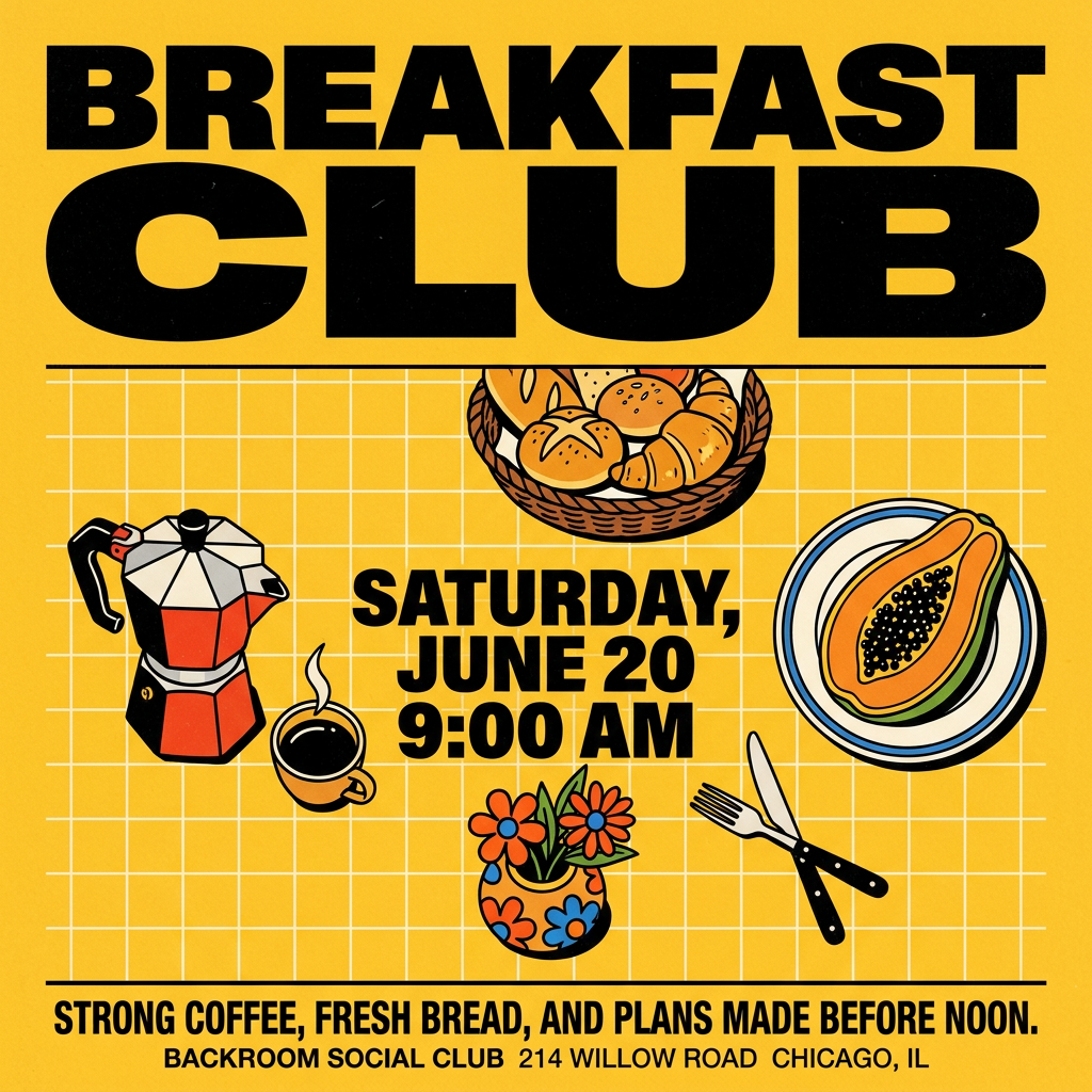
Turn your branding or event details into bold, nostalgic posters. It blends vibrant warm backdrops with a clean, retro square grid pattern to make any announcement look like a classic piece of mid-century graphic design.
Regenerate using your own assets.
From single assets to full campaigns
The real power of a Brandkit becomes clear when you scale from a single image to a multi-asset campaign. Manually ensuring consistency across a hero image, three social media variations, and a banner ad is tedious and error-prone. With a production platform, it's automatic.
Imagine you need a new ad for a skincare product. You could start with a single, striking ad using a template like the Minimal Vibrant Product Advertising Poster (Template: #myup-zpby-tzie), which automatically adapts to your product's colors. But what if you need a full campaign?
Minimal Vibrant Product Advertising Poster
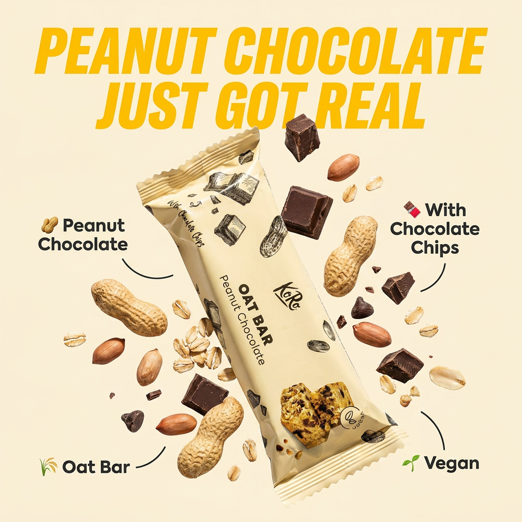
Drop in any product shot and watch it turn into a bold, high-energy square ad. It automatically reads your packaging to pull out the dominant colors and text, then builds a vibrant poster styled perfectly around your brand.
Regenerate using your own assets.
Instead of creating each asset one by one, you state a broader intention: "Create a full ad campaign for my new luxury skincare cream." MyUP will then produce a complete set of finished creations—a studio hero shot, a lifestyle context shot, social media stories, and more—all at once. Each asset will share the exact same logo, typography, and color palette defined in your Brandkit. For a complete, high-end product launch, the Luxury Skincare Product Ad Campaign (Template: #myup-vccl-cyv5) generates a full set of cohesive visuals from a single product photo.
Luxury Skincare Product Ad Campaign
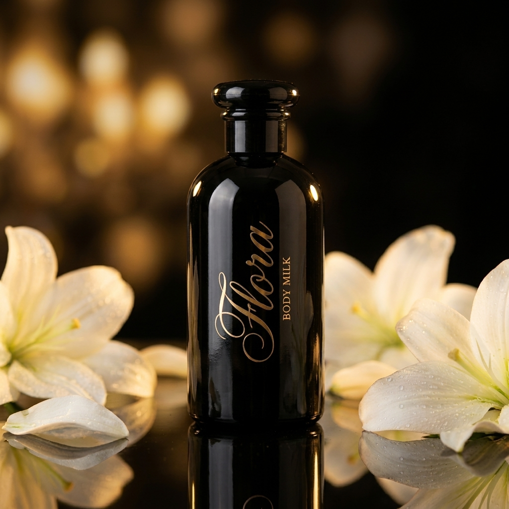
Create a polished luxury advertising set from a single beauty product image. This reusable 4-step workflow generates a clean studio hero shot, an elegant lifestyle scene, a macro product detail and a vertical social media composition while preserving the visual identity of the uploaded product. Designed for skincare, cosmetics and premium beauty products.
Regenerate using your own assets.
This is the difference between generating images and producing a campaign. It's a more strategic approach that ensures every single customer touchpoint is perfectly aligned with your brand, strengthening recall and trust. For more detail on this, see our practical guide to AI brand consistency across full campaigns.
Stop fixing, start producing
The endless cycle of generating, downloading, and manually correcting AI visuals is a symptom of using the wrong tool for the job. Hobbyist generators are for experimentation; professional creative production requires reliability, scalability, and brand integrity. By shifting your approach from prompting style to enforcing a Brandkit, you move brand consistency from a constant struggle to an automated foundation of your creative process. You can finally scale your content production without diluting the brand you've worked so hard to build. Create an account on MyUP.ai and build your first Brandkit from your website in under a minute.
