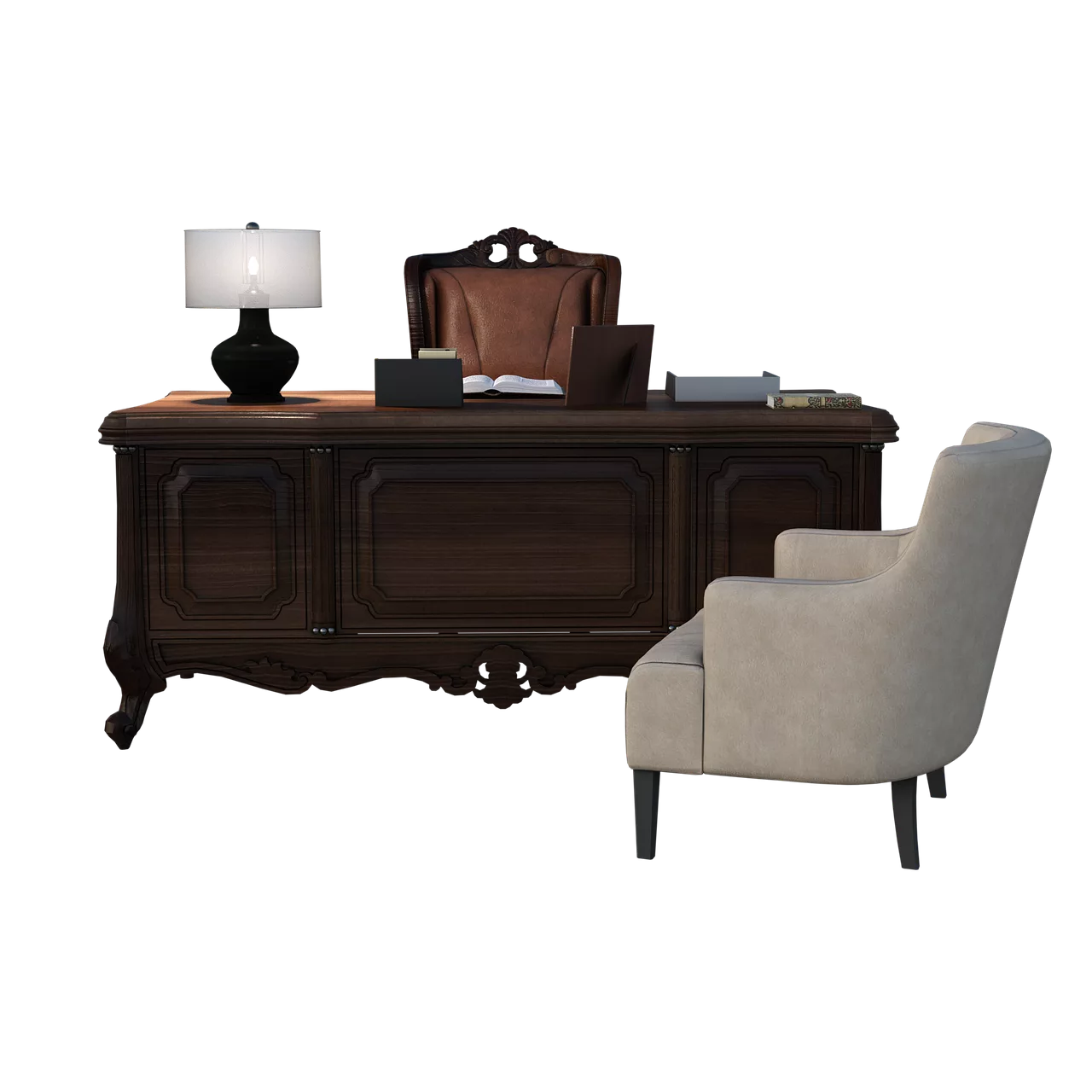
The wave of new, specialized AI tools for design is accelerating. The launch of Architexture AI on July 4, 2026, is the latest example, promising to solve the exact problem architects and designers face: turning a sketch into a photorealistic render. Yet, after the initial excitement, the results often share the same subtle flaws as general-purpose models. The lighting feels physically wrong, the materials look like plastic, and the final image, while impressive, still feels fake.
The problem isn't a lack of better models. The problem is the lack of a professional workflow. Architectural visualization isn't about a single, lucky generation; it's about control, iteration, and consistency. It's about communicating a specific design, not just creating a pretty picture. This guide breaks down why those renders look fake and provides a step-by-step workflow in MyUP to achieve the realism and control your projects demand.
The anatomy of an unrealistic render: four dead giveaways
Before fixing the problem, you have to diagnose it correctly. Most AI-generated architectural images fail on four specific points that instantly signal 'fake' to a trained eye.
- Physically impossible lighting: This is the most common failure. You'll see soft shadows where there should be hard edges from direct sun, conflicting shadow directions from multiple invisible light sources, or a flat, ambient light that removes all sense of depth and time of day. Realism is born from how light interacts with surfaces, and generic AI often gets this physics wrong.
- Flat, repetitive materiality: An AI might understand 'concrete wall', but it doesn't understand the subtle imperfections—the slight discoloration, the non-repeating texture, the way edges wear over time. The result is often a perfectly tiled texture that looks more like a 3D model from the early 2000s than a real building material.
- Generic or out-of-scale entourage: The people, plants, and cars used to populate a scene are often a dead giveaway. They might be the wrong style for the region, incorrectly scaled, or cast shadows that don't match the primary light source. This breaks the illusion of a real, lived-in space.
- Lack of atmospheric perspective: In the real world, objects in the distance appear less saturated and have lower contrast due to particles in the air. Many AI renders lack this atmospheric depth, making distant mountains or buildings look as sharp and vibrant as the foreground. This creates a flat, 'cutout' effect that feels unnatural.
The solution: build a reusable architectural style guide in MyUP
To solve these problems, you need to move from prompting to building a system. In MyUP, the solution is to use a Brandkit not for a company logo, but as a dedicated architectural style guide for your project. This is where you establish control and ensure consistency.
Instead of just storing colors and fonts, your architectural Brandkit becomes a library of project-specific visual DNA. You can define and save:
- Material Palettes: Create specific definitions for your key materials. Not just 'wood', but 'Danish white oak flooring with a matte finish'. Not just 'concrete', but 'board-formed brutalist concrete with subtle water stains'.
- Lighting Conditions: Define the exact lighting you need to evoke the right mood. Save styles like 'overcast London morning light', 'direct California afternoon sun', or 'soft, warm interior evening lighting'.
- Camera & Lens Styles: Codify your preferred photographic style. Define elements like 'wide-angle 24mm lens with deep depth of field' or 'telephoto shot with a shallow, blurred background'.
By building this style guide first, you stop relying on the AI's random interpretation. You are instructing it with a precise, repeatable system. MyUP executes the production based on your guide; you validate and refine the results.
Step 1: From sketch to a structurally sound first draft
Start with a simple input: a line drawing, a basic 3D model export, or even a rough digital sketch. The goal here is not a final image, but a well-composed base that respects your design's structure. In MyUP, you can upload this base image and use your new architectural Brandkit to guide the first generation.
Your prompt will combine the structural input with the style guide. For example: "Generate a photorealistic exterior view based on the attached sketch, using the 'Danish white oak' material and 'overcast London morning light' style from my Brandkit."
The result is a first draft that is already 80% of the way there. The structure is correct, and the core materials and lighting are aligned with your project's vision, not the AI's generic defaults. To quickly frame this draft for an internal review or a client check-in, you can use a simple layout.
Workflow code: #myup-k4td-9k6z
Minimalist Poster
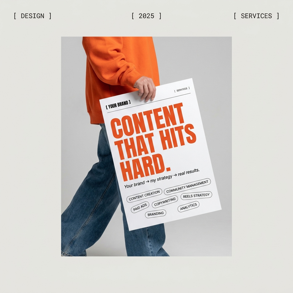
Give your social feed a clean, gallery-like aesthetic. This layout frames your images with structured mono typography and soft, neutral backgrounds for a high-end editorial look. It's perfect for minimal product launches or brand announcements.
Regenerate using your own assets.
Step 2: Iterating for realism with light, texture, and context
This is where the human control comes in. With your structurally sound base image, you can now iterate within the MyUP workflow to add layers of realism. This process is less about new prompts and more about targeted refinements. You can instruct the AI to make specific adjustments, such as:
- Refining lighting and shadows: "Adjust the shadows on the left facade to be harder and more defined, consistent with the 'direct California afternoon sun' style."
- Adding material imperfections: "Add subtle wear and slight cracking to the concrete edges of the planters to give them a more realistic, weathered look."
- Placing context-aware entourage: "Add two people dressed in business casual attire walking on the sidewalk, scaled appropriately for the scene. Ensure their shadows match the main light source."
This iterative loop is what separates professional visualization from simple image generation. You are not just rolling the dice again; you are directing the AI like a junior designer, refining the details until the image communicates the intended reality. This is a challenge for many creators, whether they are trying to generate realistic food photos or AI headshots that actually look like them; the principle of controlled iteration is the same.
Step 3: Creating consistent project views and presentation boards
The true power of a workflow becomes clear when you need to produce more than one image. A client needs to see the building at night, in the summer, and from the north corner. With a traditional AI process, each new image is a completely new and inconsistent creation. But with your MyUP architectural style guide, you can generate a full suite of visuals that are perfectly consistent.
By applying the same Brandkit to different views or prompts ('change to nighttime', 'render the interior living room'), you ensure the materiality, scale, and overall aesthetic remain locked in. The 'Danish white oak' is the same in every shot. The window frames are consistent. The mood is cohesive.
Once your renders are generated, MyUP helps you finish the job. Instead of exporting images and wrestling with another design tool, you can directly create client-ready assets. Use a workflow to place your new renders into a polished presentation board or a real estate marketing visual, with your brand's typography and logos applied automatically.
For a clean client presentation board, try this template:
Workflow code: #myup-n0bi-2wzk
Bold Editorial Grid Poster

Create striking 2x3 editorial posters with six seamless, flat-color square cards in a perfect 4:5 grid. There are absolutely no gaps between the blocks, giving your content a bold, high-contrast magazine layout. It looks incredibly clean on any social feed.
Regenerate using your own assets.
For a minimalist real estate marketing poster, use this workflow:
Workflow code: #myup-fy77-jljs
Minimalist Elegant Product Advertising Poster
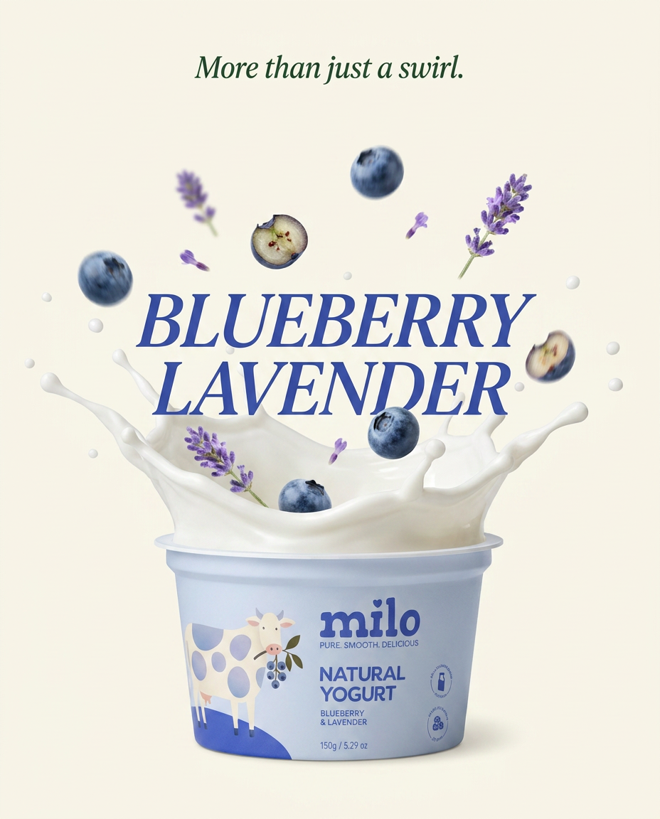
Turn any product shot into a high-end editorial ad. It places your item against a soft cream background with airy spacing and adds elegant, small serif typography at the top. Great for wellness or luxury brands wanting a calm, minimal aesthetic.
Regenerate using your own assets.
Stop chasing tools, start building a workflow
The promise of a one-click tool that reads your mind and produces a perfect architectural rendering is tempting, but it's a distraction. Professional-grade realism doesn't come from a magic button. It comes from a system of control and a repeatable process.
By treating your MyUP Brandkit as a dynamic architectural style guide and building a workflow around it, you move beyond the frustrating randomness of generic AI. You gain the control to define your project's visual DNA, the power to iterate with precision, and the efficiency to produce consistent sets of images at scale. This is the workflow that closes the gap between an interesting AI picture and a convincing architectural visualization.
