
You have the data. The numbers that prove a new feature is working, show market growth, or highlight a critical customer insight. The default is to drop it into a static chart for a slide deck or a social media post. It’s informative, but it’s also forgettable. You know an animated infographic—with bars that grow, numbers that count up, and icons that pop—would make that data stick. But then you think of the process: briefing a designer, waiting days for a first draft, and the sheer complexity of tools like Adobe After Effects. For most teams, it’s a non-starter.
That entire workflow is now being replaced. AI has moved beyond generating cinematic scenes and can now function as an automated motion designer, turning raw data into compelling, on-brand video content in minutes.
The old problem: great data deserves more than a static chart
For years, creating professional motion graphics has been a specialized skill, creating a bottleneck for marketing and content teams. The traditional process looks something like this:
- Step 1: Briefing. You hand your data points and key message to a motion designer.
- Step 2: Storyboarding. The designer sketches out a visual sequence.
- Step 3: Asset Creation. They design icons, charts, and backgrounds in Illustrator or Figma.
- Step 4: Animation. Each element is imported into After Effects and manually animated, keyframe by keyframe.
- Step 5: Revisions. You review the video, provide feedback, and wait for changes.
- Step 6: Rendering. The final video is exported, a process that can take hours.
This is a multi-day, often multi-thousand-dollar process for a single 15-second video. The cost in time, money, and creative friction means most important data never gets the dynamic visualization it deserves. It stays locked in spreadsheets and static PDFs.
The new reality: AI is your automated motion designer
The new generation of AI video tools has fundamentally changed this equation. Instead of being a passive tool that a designer operates, AI can now be the designer itself. You provide the raw inputs—the numbers, the text, the brand identity—and the AI handles the visual interpretation, layout, and animation.
This isn't about using a pre-made template where you just swap out the text, like in Canva or Visme. It's about automation. The AI generates a unique visual concept from your data, guided by the rules of your brand. The workflow shrinks from six complex stages to three simple steps, shifting control from a specialized animator to you, the creator.
The workflow: how to turn raw data into an animated video
Let's walk through the practical steps of creating an animated infographic with an AI workflow. The goal is to move from a simple data point like 'User engagement increased by 45% in Q2' to a short, shareable, on-brand video clip.
Step 1: Isolate your key stats and story
AI works best with clear, concise inputs. Before you start generating, decide on the single most important message you want to convey. Don't try to cram an entire annual report into one 10-second video. Isolate the hero statistic. For example:
- '78% of customers prefer our new packaging.'
- 'We reduced support ticket times by half.'
- 'Our app just hit 500,000 downloads.'
A simple, bold visual is perfect for a single, powerful data point. You can generate a clean, focused scene to serve as the foundation for your animation using a straightforward layout.
Workflow code: #myup-k4td-9k6z
Minimalist Poster
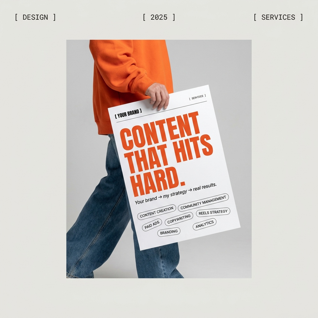
Give your social feed a clean, gallery-like aesthetic. This layout frames your images with structured mono typography and soft, neutral backgrounds for a high-end editorial look. It's perfect for minimal product launches or brand announcements.
Regenerate using your own assets.
Step 2: Structure your information with a visual layout
If your story involves a few related data points, you need a layout that presents them clearly without creating clutter. A grid-based or modular design can help organize multiple stats, giving each one its own space while maintaining a cohesive look. This structure provides a solid foundation for the AI to animate sequentially, revealing one piece of information at a time.
For instance, you might want to show three key results from a recent campaign. A structured poster format can create the perfect visual hierarchy for this information before animation is applied.
Workflow code: #myup-n0bi-2wzk
Bold Editorial Grid Poster
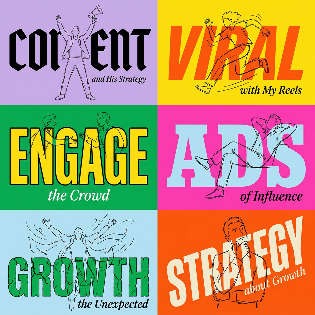
Create striking 2x3 editorial posters with six seamless, flat-color square cards in a perfect 4:5 grid. There are absolutely no gaps between the blocks, giving your content a bold, high-contrast magazine layout. It looks incredibly clean on any social feed.
Regenerate using your own assets.
Step 3: Ensure every frame is on-brand
This is where most generic AI tools fail. They might create a visually interesting animation, but it won't look like it came from your company. The colors will be slightly off, the font will be generic, and your logo will be nowhere in sight. This is the difference between a novelty and a professional marketing asset.
In MyUP, your Brandkit is the core of the workflow. It's a visual identity built once from your URL—storing your brand's specific colors, fonts, and logos. When you generate your infographic, the AI doesn't guess at your style. It executes it automatically. Every chart, icon, and piece of text is rendered using your exact brand assets, ensuring perfect consistency. The user validates the result, but MyUP handles the production.
You can start with a workflow that already has a strong visual identity to see how your brand elements would be applied.
Workflow code: #myup-egd6-d8uv
Modern Minimalist Food Promotional Poster
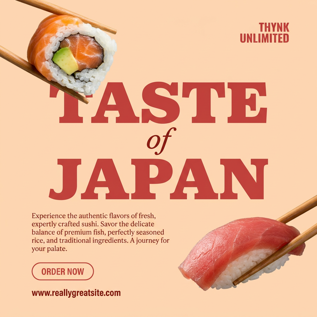
Turn your food photos into clean, modern social posters. It automatically grabs the lightest color tint from your uploaded dish to build a perfectly matched, soft background that keeps your feed looking cohesive and high-end.
Regenerate using your own assets.
Beyond the basics: what makes an AI infographic effective?
Just because the process is automated doesn't mean design principles don't apply. As you review and refine the AI's output, keep these points in mind:
- Clarity Over Complexity: The goal is to make data understandable at a glance. Avoid overly decorative elements that distract from the core numbers. One key idea per scene is a good rule of thumb.
- Pacing is Key: Good animation reveals information progressively. Ensure the timing gives the viewer a moment to read and absorb each data point before the next one appears.
- Typography Matters: The text must be instantly legible. This is especially true for video viewed on mobile devices. Using your established brand fonts is a start, but you also need to ensure the size and contrast are optimized for viewing in a feed. For a deeper dive, see our guide on how to create AI kinetic typography that's actually on-brand.
When to stick with a human designer
AI-powered workflows are incredibly powerful for producing short-form, on-brand data visualizations at scale. They are the perfect solution for social media content, internal reports, and adding dynamic elements to presentations. In fact, you can use these same principles to build an entire on-brand slide deck with AI.
However, this approach isn't meant to replace a skilled motion graphics artist for every task. If you need a long-form, narrative-driven data documentary, a complex character animation to explain a service, or a video that requires nuanced emotional storytelling, a human designer is still your best bet. Their expertise in narrative, timing, and creative direction is invaluable for high-stakes, bespoke projects.
Think of AI as your tool for speed and scale, freeing up human designers to focus on the complex, strategic projects where their skills make the biggest impact.
